Natalia Venkatesh
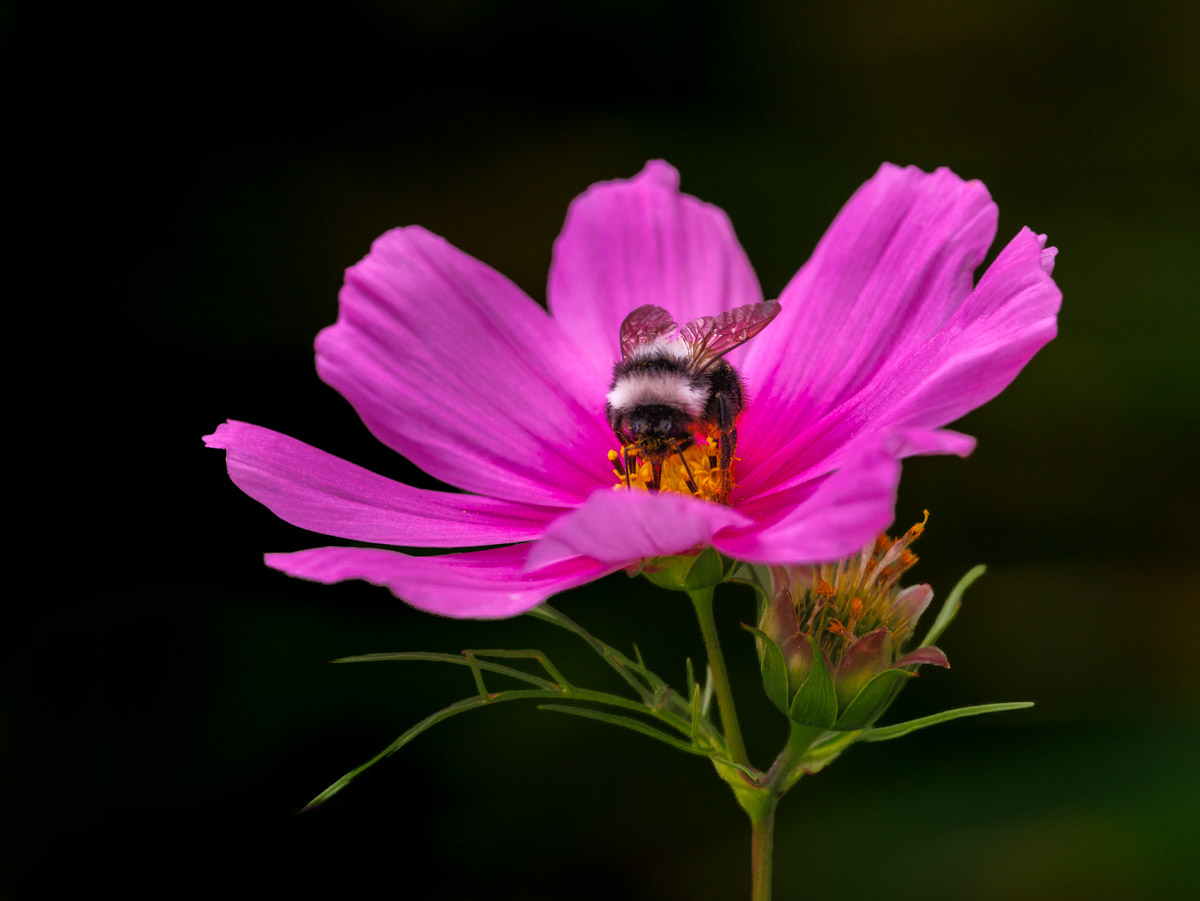
October 2026 - Pink Dish
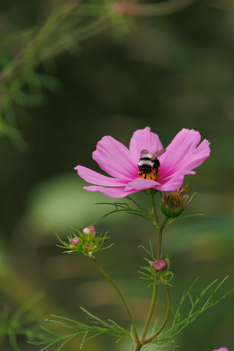
Original
About the Image(s)
I was travelling with the setup for landscape and astro photography, rather than macro. Unexpectedly, the place where I was staying had millions of cosmos flowers (rather fitting if you think I was gearing up for astro). I had a few hours on my hands, and the light was getting better. I started photographing flowers. My challenge was the wind and the lack of a macro lens. As it was windy, I had to go to
f/5.6 so I wouldn't miss many shots (probably could have gone to a higher f-stop, but I wanted to have a blurred background). That also allowed me to try to get as many details as possible in my image. I walked away with a few that are worth keeping.
Here I used my Canon R5 Mark II body with a RF 100-500mm lens (1/800 sec, f/5.6, ISO 640, 300mm).
5 comments posted
I like the way you have darkened down the background, it makes the Cosmos flower really stand out, and I like your positioning of the flower biased to the right side of the frame.
As photographers we all have our own preferences in how we see things. I would prefer to have the pink cosmos flower sharp front to back, as it is quite bright and the softness of the petals is kind of distracting. The comments of our group will be interesting regarding the petal sharpness. The bee is tack sharp and it is your center of interest.
As our webpage is black I cannot tell where your left border ends against the black webpage. A thin border would frame your picture from a composition standpoint.
Posted: 10/06/2026 05:22:26
Posted: 10/08/2026 11:38:04
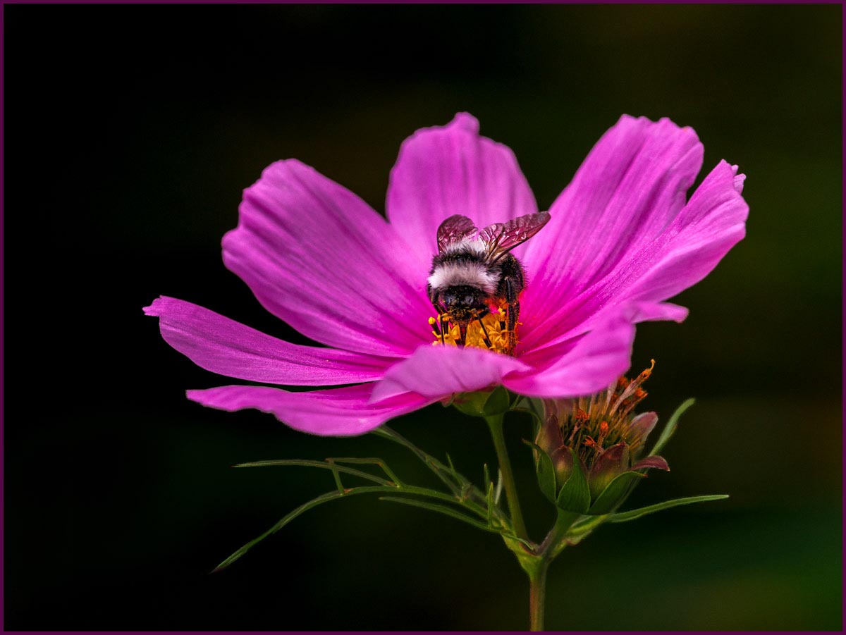
Now lets see if we can bring this to the next level. Here I might suggest bringing out a bit more of the native detail and texture you captured in your image by adding a bit more micro-contrast (contrast / texture sliders) to the petals, bee and smaller bloom off of the stem. This might also enhance some of the subtle shading and highlights in the stem and green leaves. I also suggest sharpening the image a bit in the pink petals, bee and smaller bloom off of the stem. Finally, as suggested earlier, I might add a think pinstripe border to separate the image from the presentation background.
I have included a version of this image where these suggestions have been applied to illustrate my thoughts. Let me know what you think …
Posted: 10/08/2026 20:18:21