Ruth Mayer
April 2026 - grater
Original
About the Image(s)
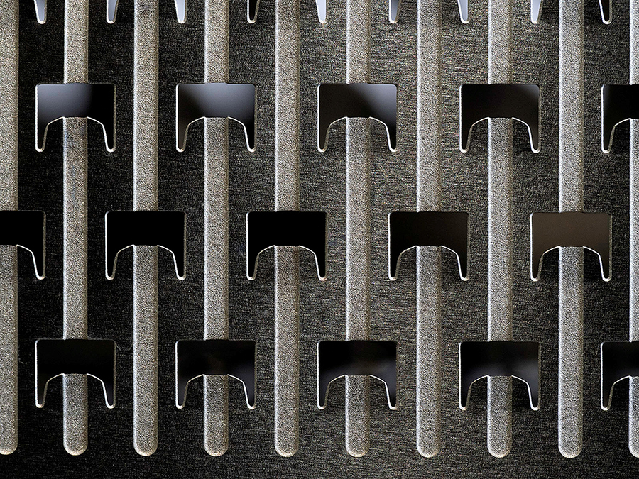
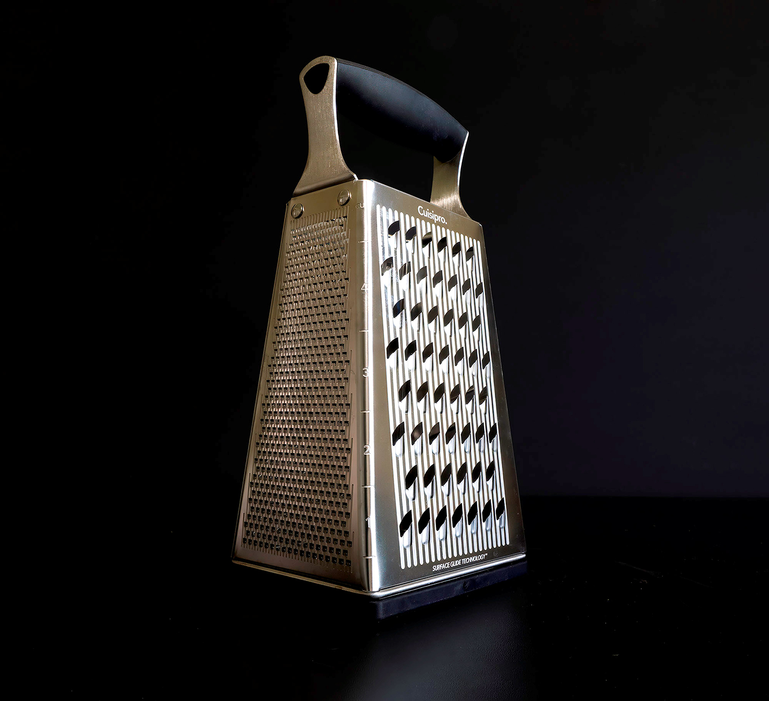
I went through my kitchen and found my cheese grater. At first I thought I would just take a photo of it, but I also tried a few photos with my macro lens. The pattern was fascinating and the closeup of the grater is my submission. I have included a photo of the grater for reference. I used a black background and ran it through topazAI. I was surprised with the texture as this is a shiny object but I like it. I did not change it to monochrome,
OM1 camera on tripod with 90mm lens at f10, 1/6sec and iso1000. I did not bracket
8 comments posted
Hi Ruth: A strong graphic design of an everyday item we all have in our kitchens and photographed well.
Composition wise you have centered the picture pretty well from side to side. If you wanted perfection you could crop ever so little from the left so it matched the right side perfectly.
Good seeing to visualize the possibility with this kitchen item in making an interesting designed picture.
You could experiment in making this into a monochrome, I doubt it would look much different from this original version. Posted: 04/09/2026 23:24:34
Thanks I will look at cropping it a little. I actually changed it to B&W and didn't see any difference so changed it back. Thanks for the comments. Posted: 04/14/2026 18:34:59
This image really exemplifies the essence of close-up / macro photography. Presenting the normal mundane world in such a way that we re-see reality in a manner we have not before. The fact that you, as the maker, were surprised at the native texture within, is a testament as to the impact of these types of images. I am glad you took our challenge to heart.
In this image we see several compositional elements in play. There are a lot of repetitive and parallel elements, wonderful tonal contrasts and an interesting variety of texture within. If one wanted to build upon these qualities further, one might consider darkening with each grater 'gaps' to make them more consistent across the presentation. I might also consider darkening the tips of the structures at the top to add consistency across the image.
As presented, this is not a monochrome image (since there are yellows and browns present is additional to gray scale) although it need not be to be effective.
By the way, I like the "Original Image" image of the grater as well.
I have included a monochrome version of the image in which these suggestions were applied, to illustrate my thoughts here.
Posted: 04/10/2026 18:37:10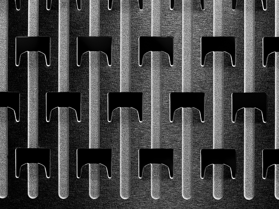
Thanks you for the comments, I do like the grater gaps darkened. It was a fun experiment. I will be taking more photos of mundane stuff around the house. Posted: 04/14/2026 18:44:42
Hi Ruth
Nice subject with great texture ,would like to balance sides
And please make a stroke line to isolate from background.
Posted: 04/14/2026 11:32:14
Nice subject with great texture ,would like to balance sides
And please make a stroke line to isolate from background.
Posted: 04/14/2026 11:32:14
In this case I respectively disagree. This specific image does not really need a stroke line to separate the majority of the image from the background. Adding the stroke line does add a bit more of a 'contrived' feel to the image and diminishes some of the spontaneity of the presentation. Posted: 04/14/2026 17:24:32
Thanks for the comments. Posted: 04/14/2026 18:49:17
Ruth, what a fun image you have captured! I would not have known that the photo was that of a common grater, so it is an excellent abstract. I do like tweaking it with a little cropping and the darker grater gaps.
The original photo is also a striking image. Superior captures! Posted: 04/14/2026 21:11:24
The original photo is also a striking image. Superior captures! Posted: 04/14/2026 21:11:24