Charles Ginsburgh

July 2025 - A Sugar Addicts ‘Lines’
Original
About the Image(s)
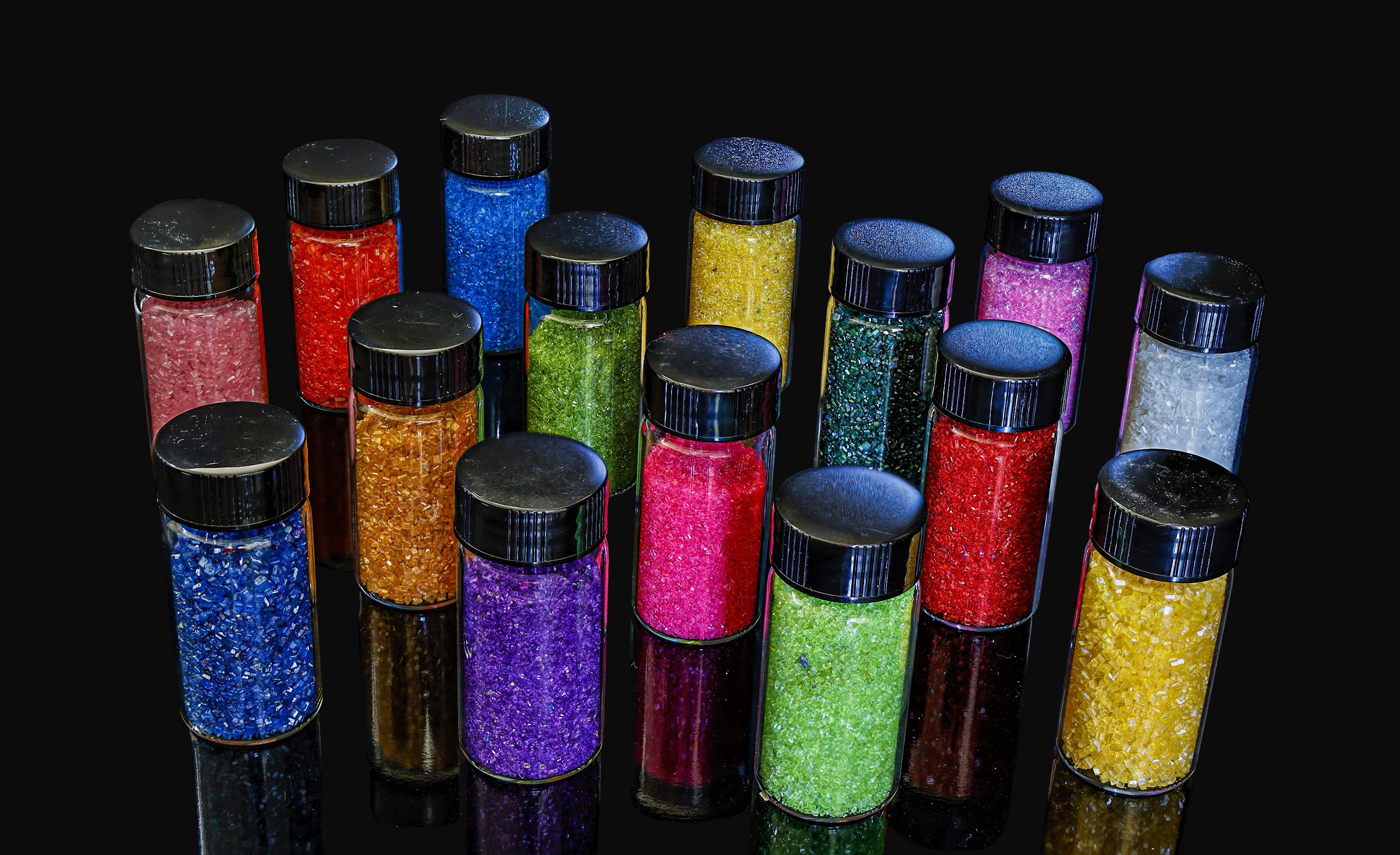
I had the urge to shoot something that was brightly colored that exhibited a large amount of native detail, and this is what I came up with. These are sugar crystals of varied color and crystal size, taken on a piece of black glass. It took a while to collect seventeen different colors of sugar (see insert), even though in this image I only used six colors.
This was shot as a stack of 35 images taken with my tripod mounted Canon R5 mark II camera with a Canon 100 mm f/2.6 macro lens (1 sec, f/8, ISO 800). No special lights or flash were employed. Stacking was done in-camera, and final edits in Photoshop to remove distracting bits of dust and specular highlights.
5 comments posted
Hi Charlie: This is a very colorful original picture with the various colors of sugar crystals in small containers are arranged perfectly so none of the colors clash with each other. This picture is a perfect example of the photographer spending the necessary time to shop and find all of these small containers of various colors of sugar to complete his artistic vision.
Then the time spent in setting up the display and paying very close attention to smallest details to make the photo a success.
Did I mention the time and effort to set up the camera on a tripod to make a stack of 35 images so everything is tack sharp in detail and composed perfectly.
In the finished picture the 6 lines of the various colors of sugar crystals are arranged on a diagonal spaced perfectly on large piece of black glass, then the colors blend in perfectly with each other.
KUDOS !!!
Posted: 07/09/2025 05:53:11
Hi Charles,
This is a very nice demonstration of the In-Camera stacking technique using the Canon R5ii.
Minimalistic demonstration of colors and textures.
Well done.
I would like to add the following (Although it does not apply to this image): I personnally use the RBG saturation histogram in my view finder instead of the B/W for the following reason: the light sensors have tendency to be very sensitive to red and will frequently over-saturate this channel, even if the B/W histogram looks fine. I realized that when I was taking pictures of red roses.... Posted: 07/14/2025 18:53:10
Charlie, what a great title! Arranging the colorful crystals on the diagonal certainly creates an impactful image. I have no recommendations. Posted: 07/19/2025 21:58:32
Hi Charles, an interesting image, well done! For my personal taste, I prefer selecting focus, so I added some blurry on the image to see the differences. Thanks for sharing! Posted: 07/23/2025 15:32:35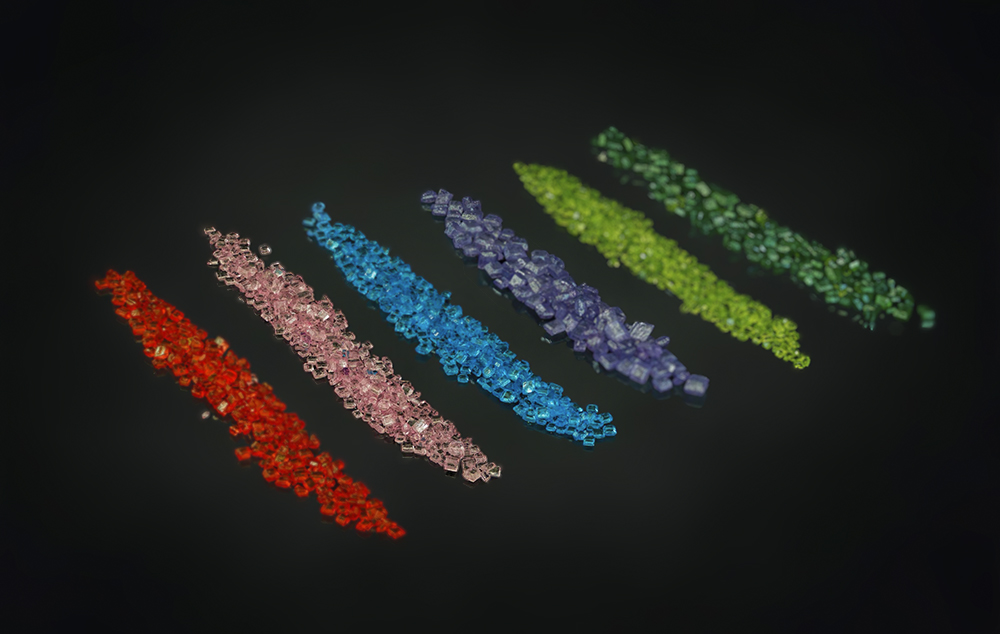
This is a different look to the image and reflects a differing vision than what the original image portrayed. In making our commentary we need to respect and acknowledge the maker's original vision. That is their own uniquely personal contribution to the image, and to my mind we have no right to suggest that it should be otherwise. We might feel otherwise, BUT in our comments, this should not be the main focus. Rather we should comment upon how to best accomplish the presentation of the maker's original vision.
This does not mean that your alternate vision is also lacking value, but it may not be what the maker intended, so we should not suggest that ours is better than theirs. So, when me make our comments, we should focus upon issues (good and bad) that impact the presentation of the maker's vision, and NOT what we think it ought to be. This is often a subtle difference in what and how we say things, and is a common trap that individuals starting upon the road of commentary falls into.
Posted: 07/23/2025 16:09:27