Charles Ginsburgh

February 2025 - Sugar Bowl
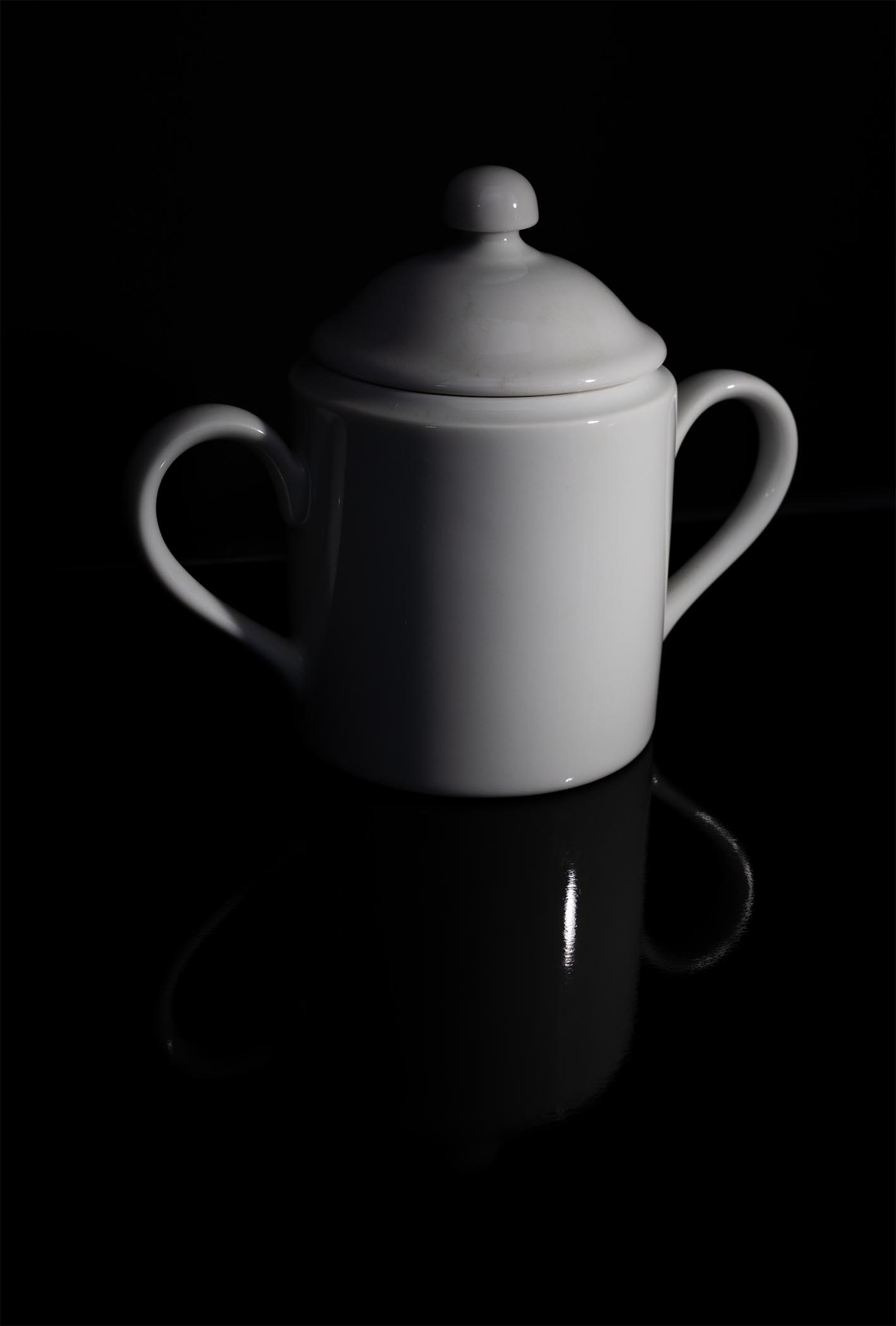
Original
About the Image(s)
With this image, I was responding a recent challenge to embrace a “Minimalist” approach to our images. Here one definition of Minimalism is “a design or style in which the simplest and fewest elements are used to create the maximum effect”. That coupled with the size of this object (the sugar bowl was about 5 inches high), meant that to my eye, this also was appropriate for our close-up / macro study group.
This was a simple unadorned subject taken on black glass with a single side light. This image was captured using my tripod mounted Canon R5 Mark II body with a 100 mm f/2.8 macro lens (1/3 second, f/16, ISO 250) to capture this lone image. Follow-up editing was done in Photoshop. The simplicity and cleanliness of the composition, the deep shadowing, and the partial exposure of the subject were all part of the grand plan here. In the original image the subject was much larger and took up over 80 % of the image (see attached original image). I added a significant amount of empty space around the subject to enhance the “Minimalist” feel in this image. What do you all think?
7 comments posted
Well planned out side lighting appears to be lit from a small outside window on a cloudy day. The very dark gray background was a perfect choice and just the right shape and size; then the dark reflection of the sugar bowl adds another point of interest. I do want to mention the small round light area behind the sugar bowl, it help to give some perspective and adds depth.
In this particular situation a thin white border would not fit in, would be out of place and ruin the "minimalist" feeling you want to present. Posted: 02/09/2025 07:35:14
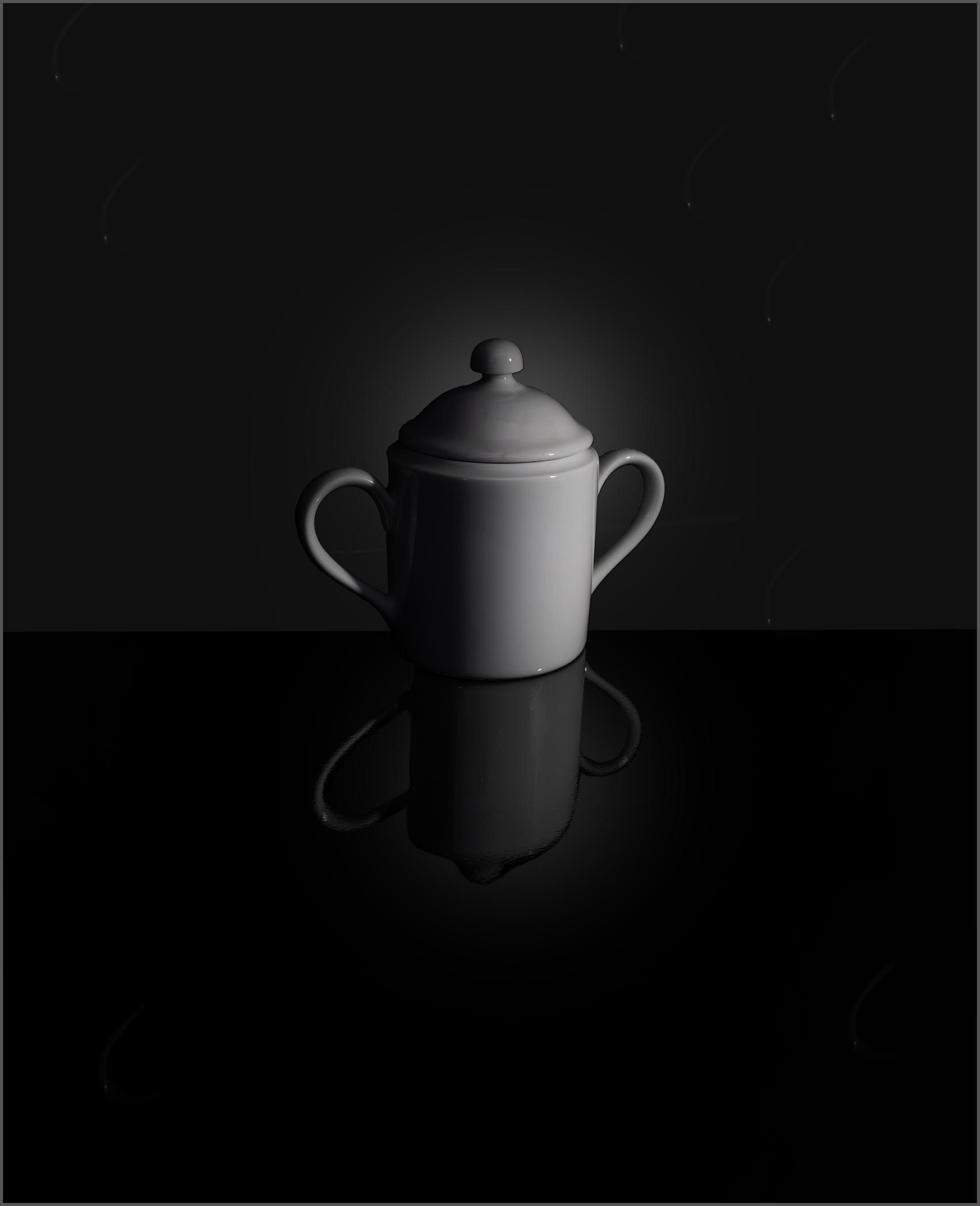
This image was captured indoors, with a single rather dim flashlight sitting on the base to the right of the bowl, as the sole light source. Since I did not have a lot of light, I employed a bit longer exposure (1/3 sec) to get the dramatic fall-off of light across the face of the bowl. Or at least, such was my plan.
The "glow" (brighter area behind the sugar bowl) was purposefully added in post processing, Note, also that the glow is also seen in the reflection as well, but to a lesser extent as we would expect in a reflection. I find that adding this subtle glow in the background goes a long way in the presentation, and it's not difficult to do in Photoshop. Posted: 02/10/2025 20:55:42
To me the original picture with the dark gray rectangular background and your closer in version are simply two different types of pictures. I prefer the original version as I think the dark gray rectangular background adds more perspective and depth to the picture.
In the last closer in version I am seeing in the background what may be some type of digital artifact. There are 7 of them with a white dot at the bottom with a muted curved line bending to the right. They are all identical in size and shape. Maybe my monitor is playing tricks !!
Posted: 02/11/2025 05:52:51
This is a very nice demonstration of the "minimalist" approached, with a side-lit portrait technique + reflections on a black surface.
Nicely done and very pleasing.
Posted: 02/14/2025 21:23:10