Alane Shoemaker
About the Image(s)
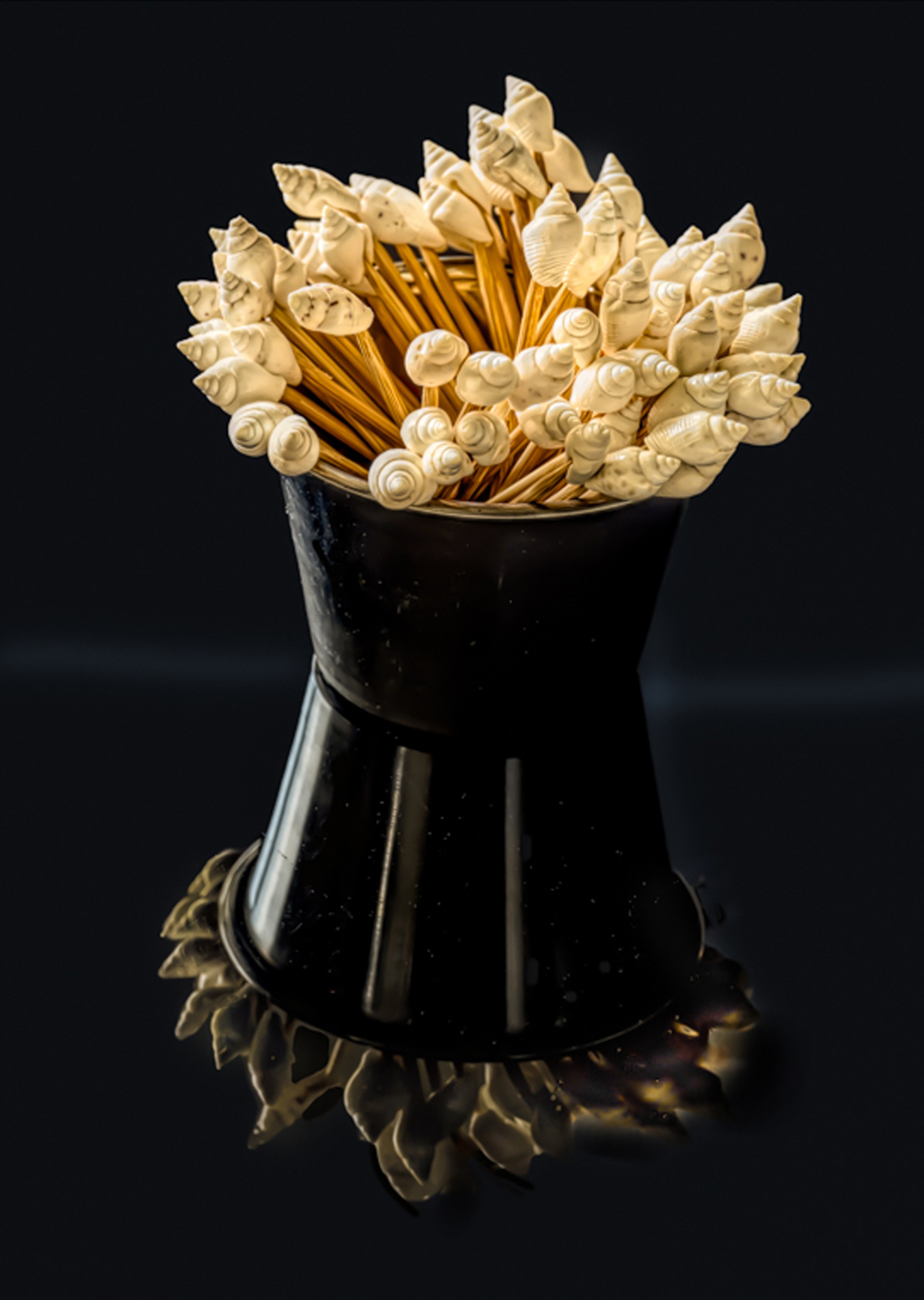
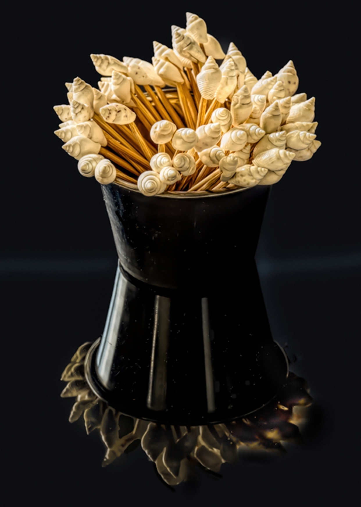
Here I used my Nikon camera with a NIKKOR Z MC 105mm f/2.8 VR S lens (1/20 sec, f/9, ISO 500) at 105 mm.
15 comments posted
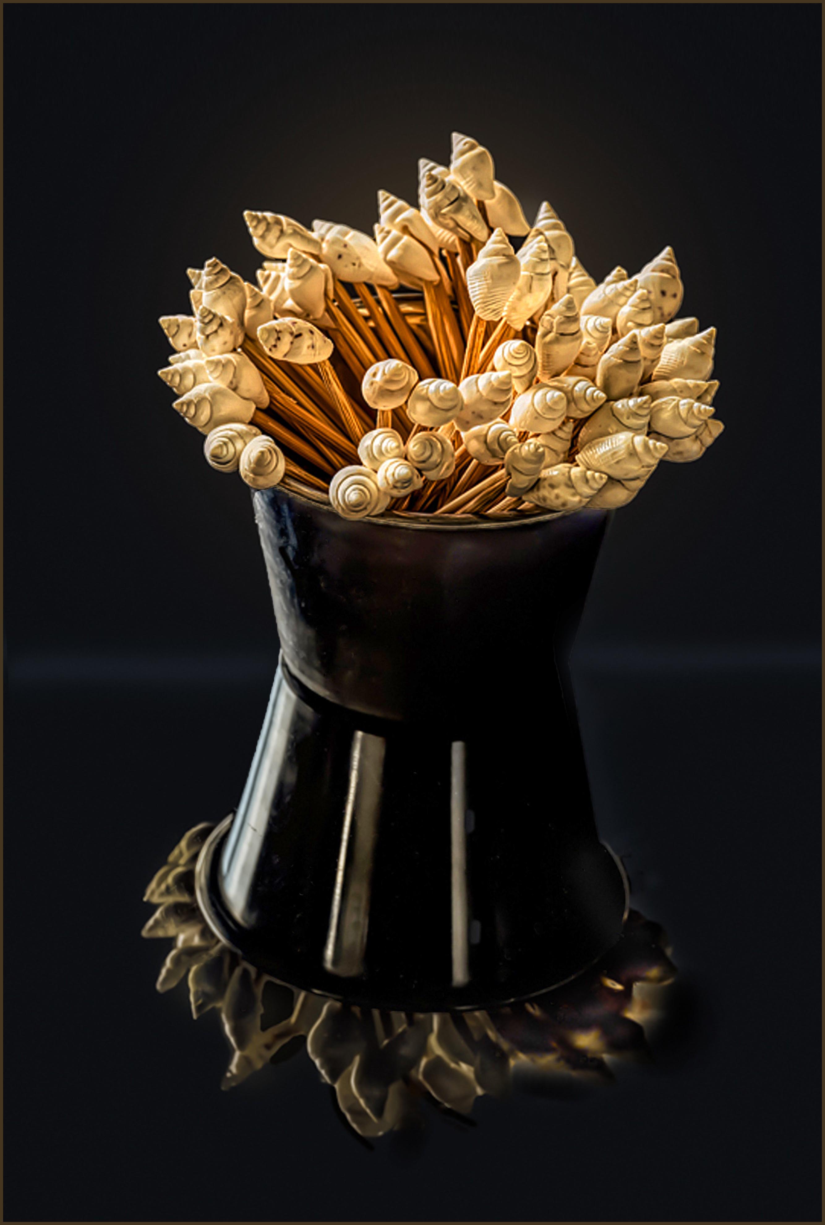
I really like where you are going with this image. Great subject set in an interesting setting. The use of the reflective base was a nice touch. The black vase on a black background was a real challenge and was handled quite well. As presented, this is an exceptional image.
Now let's bring this to the next level. I might add a bit of contrast to the heads and sharpen this area a bit. Also, the subtle terminator line in the background (an essential element here) needs straightening a bit. Also, you might consider lightening the cup surface just a bit to separate it a fraction more from the background. Note that when this was done though, many spots appeared on the cup surface that required some time and effort to remove (the remove tool worked wonders here). Finally, the crop is a bit tight on the top. Here I might suggest expanding your canvas some at he top to give a bit more space. This would balance the distance between the subject and border in the reflection with a similar distance at the top. In examples in which the dark image background might blend into the presentation format, you might also consider adding a thin pinstripe border to separate the image from the background upon presentation. In images such as this, when a dark background is employed, one might consider adding a very subtle glow behind the toothpick heads as well. I have created a version with these suggestions to illustrate my thoughts.
In my experience these types of edits are the 'finishing touches" that bring our images to the next level. I would be happy to set up a time to demonstrate how I might actually make the edits I suggest.
Posted: 01/02/2025 20:31:41
Charlie, thank you again for your helpful recommendations. I would love a demonstration at your convenience.
Thank you! Posted: 01/05/2025 16:13:46
Thank you! Posted: 01/05/2025 16:13:46
Hi Alane: You selected just the right container to place the decorative toothpicks in, it fits well.
The warm yellow tones of the decorations on top of the toothpicks goes very well with the dark copper color of the base of the black vase. A lot of design elements in the toothpicks and copper colored base. The reflections on the black vase add another point of interest, then the light horizontal line in the background seems to add depth. Really nice creative work... Posted: 01/03/2025 07:22:58
The warm yellow tones of the decorations on top of the toothpicks goes very well with the dark copper color of the base of the black vase. A lot of design elements in the toothpicks and copper colored base. The reflections on the black vase add another point of interest, then the light horizontal line in the background seems to add depth. Really nice creative work... Posted: 01/03/2025 07:22:58
Many thanks, Murphy! Posted: 01/05/2025 16:15:41
Hi Alane, Interesting subjects and interesting settings. I like the composition, well balanced. I am not good at shooting this kind of subject. I was wondering about the reflection for a while and was not sure whether it was the reflection of the cup or the second cup upside down. Thanks for sharing! Posted: 01/03/2025 14:29:50
Recently I demonstrated the technique of shooting on a piece of black glass (see past examples of such images), to yield interesting reflections. Several members have started to try this out, and this is but one example of this experimentation. Posted: 01/03/2025 16:38:27
Hi Charles, Thank you for your explanation! I have some questions for you: Does this reflection of the cup overpower the main subjects? Where do the white straight lights on the reflection of the cup come from (while there are no these lights on the main subject)? Posted: 01/03/2025 17:04:36
There is always a balance between the contribution of the reflection relative to the subject presentation the reflections come from. That is a balance that each maker needs to establish, according to the makers vision within the image. Often this intensity can be adjusted in post processing (or at least I do so). In this example I do not feel that the reflection overpowers the image or the presentation of the toothpicks, but you may feel otherwise.
I will let Alane address the question regarding the lighting ... Posted: 01/03/2025 17:30:57
I will let Alane address the question regarding the lighting ... Posted: 01/03/2025 17:30:57
Hi Charles, Thanks again! Posted: 01/03/2025 17:47:17
Xaio, I placed the container of toothpicks on a black piece of plexiglass and had lighting from the left side to get its reflection. Posted: 01/05/2025 16:52:29
Hi Alane, Thank you for your explanation. Interesting! I never thought the lighting had such dramatic effects on the reflection of the cup than the cup itself. Posted: 01/05/2025 18:06:22
Thanks, Pierre. Posted: 01/05/2025 16:52:51
Alane...This is a great subject and has many possibilities to experiment with such as one or two toothpicks to look as though they have fallen out of the container. One thing I would try and correct is the void in the toothpicks and space them more evenly. Also tone down that white stripe on the left side. I like how you have placed it on black reflective glass with the contrast of the light and dark. The crop is a bit tight and would add more depth to the picture if there was more space surrounding it. Very creative idea you had!! Posted: 01/07/2025 06:52:21
The suggestions in the zoom meeting were very good. I probably only would have noticed the need for straightening. Posted: 01/12/2025 21:42:31


