Murphy Hektner, APSA
About the Image(s)
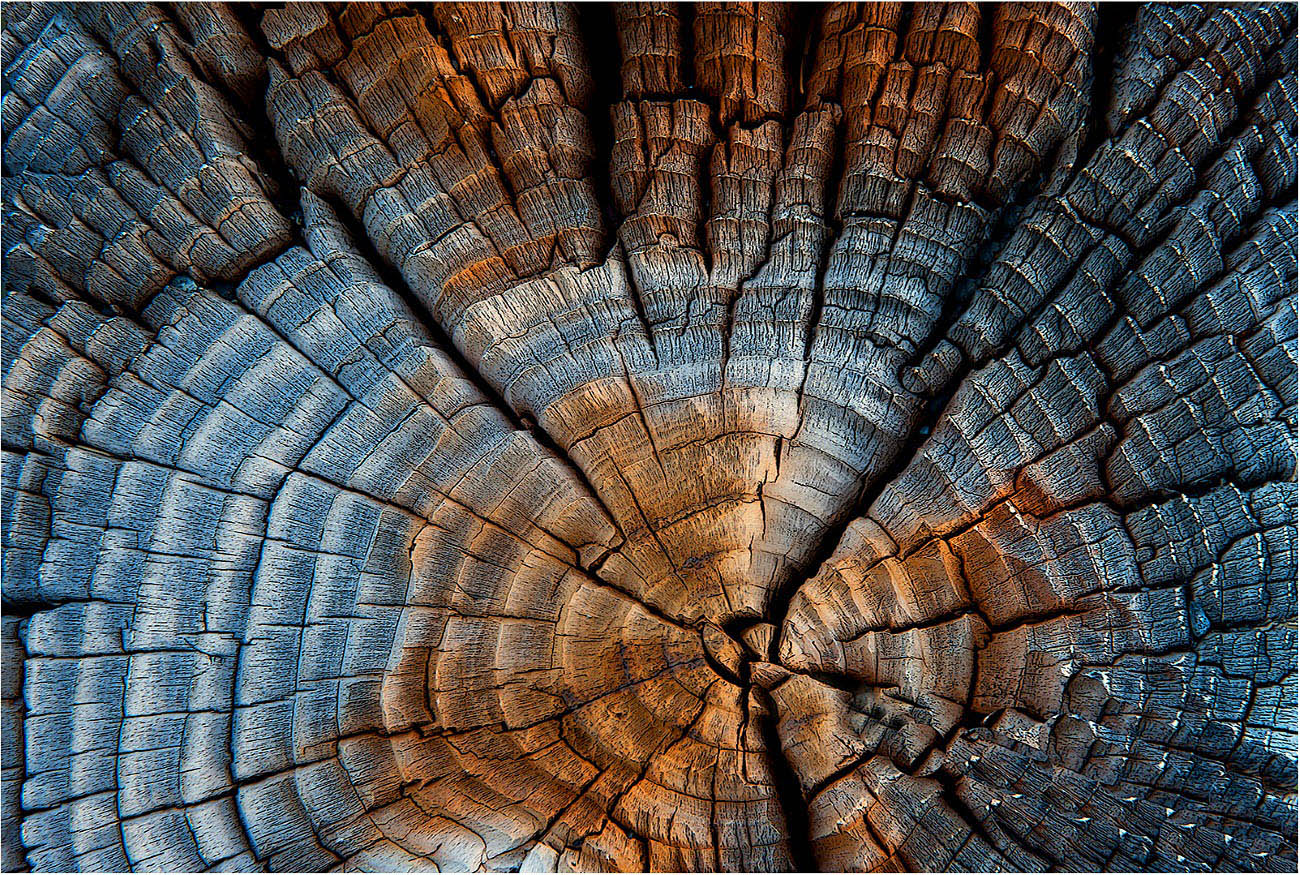
This image is of the top of a highway guard rail 6” X 6” wood post. The post top has been exposed to the weather elements for 52 years when the highway was created. The grain pattern of the wood post top has weathered showing the grain pattern of the wood quite well.
Here I employed my tripod mounted Nikon D700 camera with a Nikon 24-70 zoom lens @ 70mm to capture this single image. Post processing in Elements.
The wood post top was medium gray, I have added colors to make a more creative and interesting wood design in the wood post top.
5 comments posted
Nice presentation of this design. Since it is identifiable as to what it is it may be less of an 'abstract' design, but this does not diminish the image in any way. Great composition, color and clarity. I like the color treatment here. Did you add color, or did you enhance existing color with your efforts? In this case I don't feel that the pinstripe boarder adds anything to the image, but that is a maker's choice Posted: 11/01/2024 20:26:48
Hi Charlie: Am pleased you liked my wood design. In answer to your question on how I did the color treatment; The post top was medium gray in the original due to being exposed to the weather elements for 52 years; all I did to add colors was to push the saturation slider to the right until I achieved a pleasant color balance, and then added a small amount of contrast. As I shoot in RAW I also warmed the Kelvin color temperature just ever so slightly.
Regarding filters, I added an Elements filter Poster Edges at its lowest setting, this filter adds texture and some extra sharpness. however does not add color.
That about sums it up Charlie.
Posted: 11/01/2024 22:56:11
Regarding filters, I added an Elements filter Poster Edges at its lowest setting, this filter adds texture and some extra sharpness. however does not add color.
That about sums it up Charlie.
Posted: 11/01/2024 22:56:11
Hi Murphy,
Very nice composition with details, sharpness, and texture. My only suggestion would be possibly decreasing the shadows on the right side.
Great work. Posted: 11/15/2024 21:25:23
Very nice composition with details, sharpness, and texture. My only suggestion would be possibly decreasing the shadows on the right side.
Great work. Posted: 11/15/2024 21:25:23
It's a very impactful image. Thanks for the additional notes concerning it. You have dropped off the brightness in the periphery of the image. That's great. Posted: 11/15/2024 22:18:43
Hi Murphy! Old wood has so many possibilities and I think you have produced one. Nice subject and bumping up the color saturation was a great idea! Great shot!!! Posted: 11/16/2024 06:30:39
