Alane Shoemaker
About the Image(s)
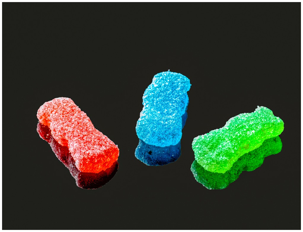
I photographed a favorite Halloween treat - Sour Patch Kids - using my macro lens, tripod, black plexiglass, and available daylight.
Here I used my Nikon Z 50 camera, with a NIKKOR Z MC 105mm f/2.8 VR S lens (1/10 sec, f/9, ISO 500) to collect 25 focus slices. I Photo stacked 25 images in Helicon Focus and edited in Photoshop Elements, Topaz, and Lightroom.
This round’s discussion is now closed!
8 comments posted
Great job in responding to my challenge. This is a simple yet impactful presentation. The subjects and reflections stand out nicely in terms of composition, color and clarity.
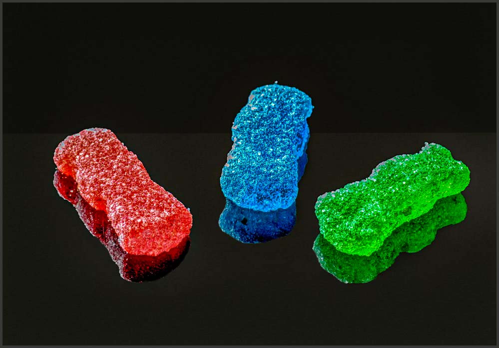
Now some work remains in terms of the post processing to enhance the image some.
• Here I feel that the candies and reflections are overexposed. Reducing the exposure and highlights in post-processing will help
• I like to make my reflections darker than the objects being reflected. This is naturally the case as light energy is lost in the reflection process making reflection naturally darker
• Removing the light halos around the reflections via cloning will allow the reflections to blend in more effectively
• Images on a black background tend to look as though they are floating in space. I often add a subtle horizon line to my images to give a sense of a surface that the subjects are on.
• The detail at the end of the red "sour" candy is lost. One might clone back this detail on int's own layer and adding some of this back with a partial layer opacity (50-60 %)
• Finally, I don't believe that you need as much empty space in this image. Might I suggest cropping in a bit, especially from the top.
I have included an image where I made these edits to illustrate my thoughts.
In my experience almost all stacked macro images need some sort of post processing to really maximize the image's potential. These suggestions are based upon many images' worth of trial and error. It is fine though, if you don't agree with me here. Nice Job!
Posted: 11/01/2024 20:24:57
Charlie, I so appreciate all your suggestions. Your image with the edits makes a big difference!
Posted: 11/25/2024 21:36:41
Posted: 11/25/2024 21:36:41
Hi Alane: Very colorful image against a dark background. In my humble opinion the white border is too thick and comes on too strong
Charlie had made some viable points with re-working the background and adding a very subdued border as that finishing touch.
Posted: 11/02/2024 19:06:39
Charlie had made some viable points with re-working the background and adding a very subdued border as that finishing touch.
Posted: 11/02/2024 19:06:39
Thanks, Murphy, for your recommendations. Posted: 11/25/2024 22:00:40
Nice image with sharp reflection on the black surface. Very clean image - no dust spots, no fingerprints. The adjustments suggested and illustrated by Charles are very appropriate. I also prefer the image without a border - a thinner border might be better.
Great work. Posted: 11/15/2024 21:17:53
Great work. Posted: 11/15/2024 21:17:53
Thanks, Pierre, about the border. Posted: 11/25/2024 22:00:04
This is a very nice display of the "odd" number of candies. I like the colors chosen and the display on the reflective dark glass. That is not an easy task because the lighting is what makes the reflection, thus the result of the final picture. The 25 stacks are focused well with good coverage for all three of the candies showing the sugar detail on each one. One suggestion I would have is to crop down from the top just a bit. Great image! Posted: 11/16/2024 05:46:44
Thank you, Barbara, for the suggestion about cropping. Posted: 11/25/2024 21:59:28

