About the Image(s)
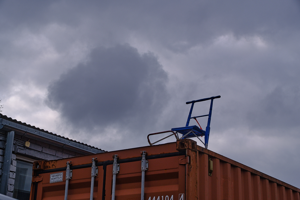
Here is ”Climate Change”. I took the image last Sunday on our camera club’s monthly photo walk that circled round an industrial area. In a storage yard we stopped to stare at the incongruous sight of a lonely kick sled on top of a container. Fuji X-T4, 39.7 mm, f/8, 1/550 s, ISO 160, handheld. I wanted to show it as a minimalistic silhouette against the rather dramatic sky, turned the image into B&W and adjusted tones and contrast in Capture One. I took a break to watch the news broadcast where the main topic were the catastrophic wildfires raging in France and Spain. I went back to the image and added an orange Recolor filter in Affinity to make it a statement. - Technically, I think that toning the image with a single color should by definition result in a monochrome. When I picked a spot anywhere in the image with the HSL color picker and turned off the saturation of that hue, I was back with B&W. I have never been able to understand the math behind testing the channels of the pixels. I would love to learn how you do this!

Shari Garnsey
Hi Kirsti - your choice of Red as opposed to the traditional B&W certainly gives this a more ominous feeling. I love your idea of the silhouette, but I think the sled is a bit overpowered by the tops of the train cars. Since all of that is just a black profile, the weight of the train cars takes away from the sled silhouette. I am not sure what you mean by testing the channels of the pixels - I too want to understand. Posted: 08/13/2026 18:26:30
Kirsti Näntö-Salonen
Thank you very much, Shari! I see the problem - you are absolutely right about the heavy black mass. I wonder if cropping from the bottom as much as possible might help? - I think that the general idea is that the ratios of R, G and B should remain the same through the image if it is truely monochrome which of course does not matter in real life, but as you said, it would be nice to understand! Posted: 08/14/2026 05:13:45

Ed Ford
Hi Kirsti,
Wow! I do not really want to get into the monochrome debate of what is or is not. For my part, were I a judge, I would accept this a monochrome as there is only one color. Your choice of color really captures the sense of heat or perhaps as you said the fires. Having lived in Southern California and seen what some of those wildfires out there can be I can identify with your choice.
I find mixed thoughts looking at this compared to the original. The silhouette presentation you chose does work. At the same time the detail in the containers in the original help give a sense of context to the image. Perhaps keeping more of the light in the lower part of the image while adjusting the tone as you did in the upper part would work also?
Still, a wonderfully creative presentation with a very vivid imagery. Thank you very much for sharing it with us Kirsti.
Posted: 08/13/2026 18:32:38
Kirsti Näntö-Salonen
Thank you very much, Ed! I do agree - the original with identifiable containers makes a good story, too. What I had in mind with the silhouette was just to show an uphill route that the sled was facing. I'll try both making it lighter and cropping off the bottom. Posted: 08/14/2026 05:28:38
Ed Ford
You are welcome Kirsti. I like the concept but at the same time it does leave a big black featureless area. That might be relieved by putting a frame around the image. I look forward to more of your work. Posted: 08/15/2026 15:29:54
Kirsti Näntö-Salonen
Thnaks, Ed - I´ll test that, too! Posted: 08/15/2026 17:47:15

Barbara Gore
Hi Kirsti. I love the simplicity of this image. For me, the silhouetted foreground is nicely balanced by the sky. I especially like the sled sitting on top of the container as its placement helps to counterbalance the large dark cloud on the left. The orange filter works well, adding a nice pop of color. Although does this mean the image is no longer technically considered monochrome? Regardless, it's a great example of creative thinking. Posted: 08/15/2026 14:46:12
Kirsti Näntö-Salonen
Thank you so much, Barbara! I think that it was the cloud drifting to just that place that made me take the photo. - Maybe the "less is more" works well in this kind setting? You are so right: the technical dilemma only comes up in the camera club competitions, otherwise red is just red! Posted: 08/15/2026 17:41:43

Robert Cordivari
Hi Kirsti,
You certainly have conveyed the feeling of heat in this photo. I think the empty sled makes me think that someone has fled the area due to the conditions. I also like the scalloped diagonal lines running from left down to the right, and then the continuation of the lines across and down again, avoiding a static photo. Maybe just a little more detail in the black area? Or does that take away from the negative space? I don't know - I think it could work either way. A very creative photo that definitely makes a statement, and a very timely one for sure.
Rob
Posted: 08/15/2026 17:29:17
Kirsti Näntö-Salonen
Thank you Rob, I am so glad that the message comes through! I feel myself that it either has to be a full silhouette, or show a significant amount of detail. Posted: 08/15/2026 17:44:57
Robert Cordivari
I agree and with those choices I like the way you have it now compared to opening it up all the way.
Rob Posted: 08/15/2026 18:54:04
Steve Cole
The red tone is something I would not thought of doing. It does provide a mood (to me) of conflict in nature that is not natural so I guess i would call it a creative interpretation of the scene though your vision of the scene is an artistic application. Posted: 08/24/2026 19:58:04
Kirsti Näntö-Salonen
Thank you, Steve! You are absolutely right: it was the feel of conflict I hoped to convey. I am glad if it comes through. Posted: 08/25/2026 04:47:54