Kirsti Näntö-Salonen
April 2026 - Aging
Original
About the Image(s)
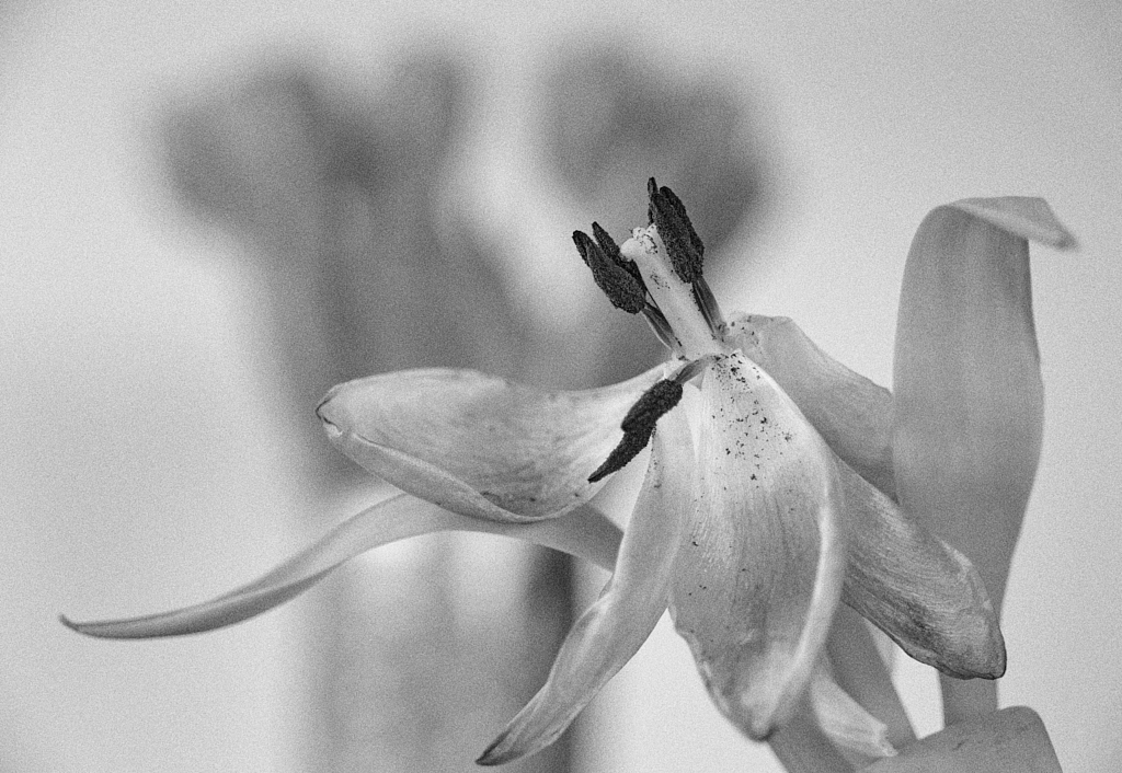
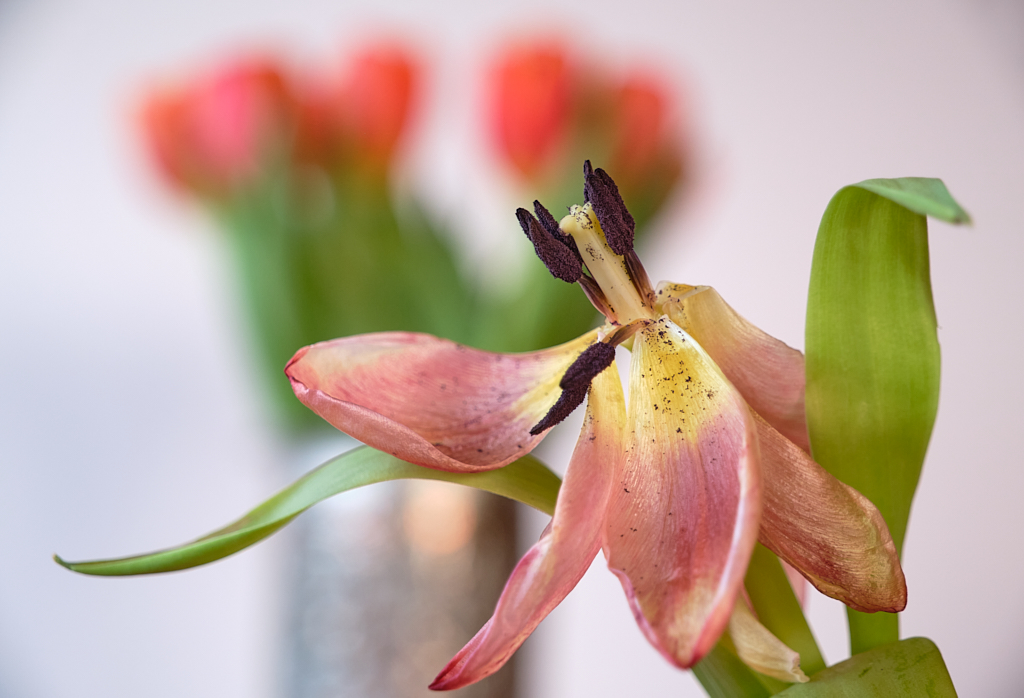
I have been playing with tulips lately, for our photo club?s April theme ”Change”. Here is ”Aging” that I originally thought would be in color, but I found that I absolutely hated that ugly dull yellow and the sickly brownish magenta in the old tulip?s petals that seemed to rip away all her dignity. I think that in B&W it is easier to see the character and beauty of her expressive petals and leaves. Her time of standing straight and vibrant in a silver vase may be over, but she becomes more and more interesting every day, Fuji X-T4, 59.9 mm, f/4.5, 1/80 s, ISO 400. I turned the image into B&W in Capture One, and used one of the NIK Silver Efex Classic Portrait presets with low contrast and added grain as starting point for the finish. I added some contrast locally to the flower. What do you think?
6 comments posted
I like this image - the clarity of the tulip in front and the bokeh of the plants in the background. In the past I would have blackened the background highlighting the flower in front. However I do like how you have processed the image.
A very nice image, thank you for sharing with us. Posted: 04/12/2026 22:05:50
I like the placement of the subject against the out of focus background. And I understand how you chose to show more beauty in the dying flower by keeping it monotone. Very well thought out, as always! Posted: 04/17/2026 00:25:26