Albert Zabin
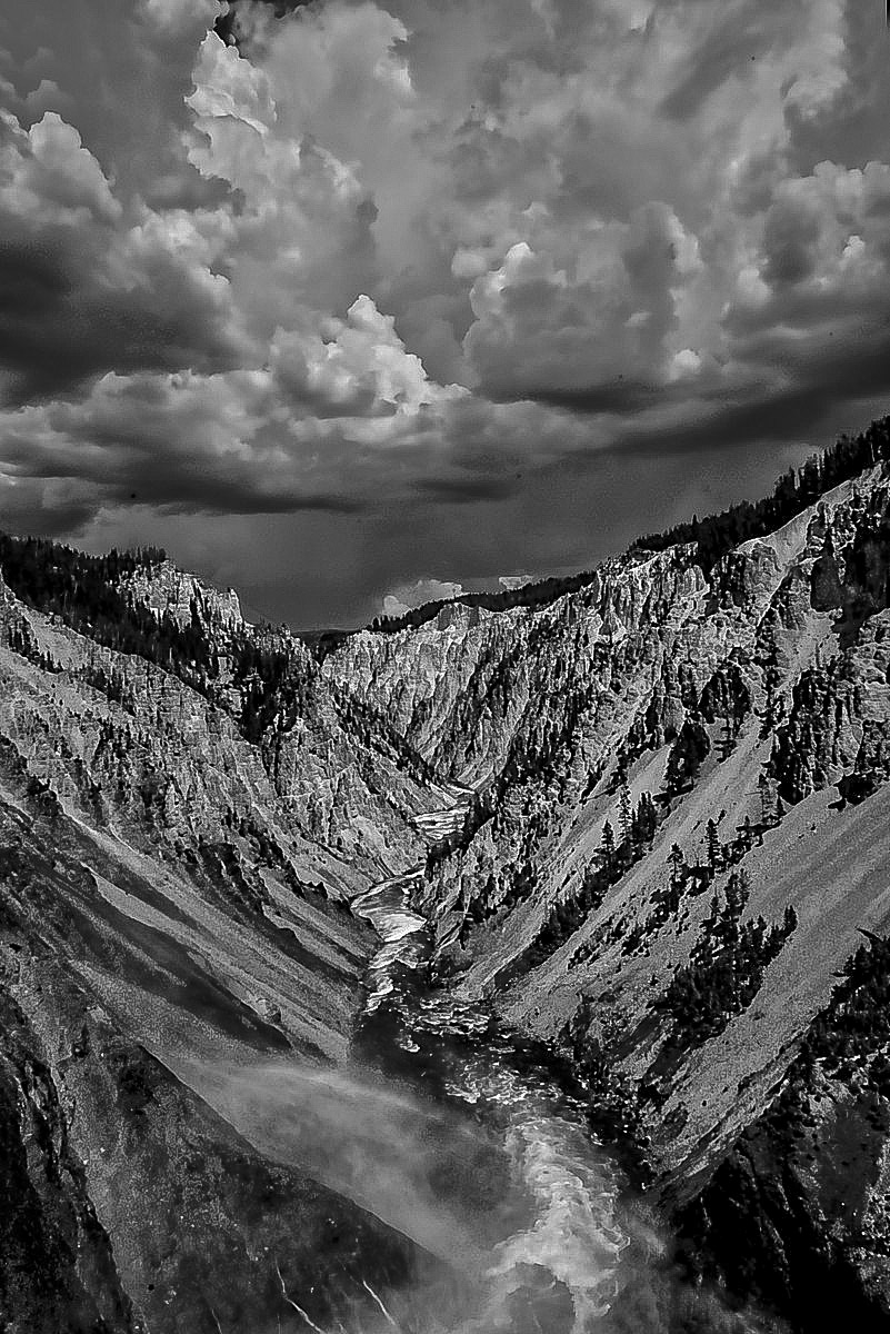
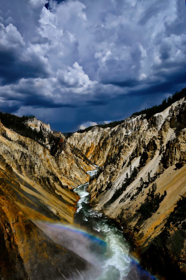
July 2025 - Ddarkening Sky Over the Grand CAnyon of the Yellowstone
Original
About the Image(s)
The great American painter, Thomas Moran, was enthralled by the colors The Grand canyon of the Yellowstone National Park, and when the light is right they are spectacular. In the original ven without much digital manipulation the colors stand out. The blue sky is not accurate (I'm not sure why the sky's color is so over saturated.) I was entranced by the arriving storm, nature's composition and the texture of the canyon walls, Nikon D800. 24-120mm lens 80mm, f/19 aperture controlled.
3 comments posted
Hi Al, again an awesome image of a magnificent scene in a perfect composition! This time, I would prefer the original, with the rich colors. The tones of okra and ink blue complement each other in such a dramatic way, making the threat of the arriving storm palpable. The lovely colors of the rainbow in the foreground also inevitably get lost in the B&W conversion. Posted: 07/08/2025 09:00:35
Hi Al. What a beautiful location for photography. I share Kirsti's preference for the color version over the b/w. The complimentary blues and yellow/orange tones highlight the natural features of the canyon. Although you mentioned that the sky's color isn't entirely accurate, I find the deep blue stormy sky quite effective. It adds a dramatic mood that enhances the image. I'm a bit surprised that with an aperture of f/19, the original photo doesn't show more DOF. Regarding the b/w version, I think it works overall, but the sharpening applied in PP gives it somewhat of a harsh texture. For me, I prefer a smoother, natural look, so reducing the clarity and sharpening would help soften the edges. Posted: 07/10/2025 13:07:33
Hi Al. In this I differ a bit. I like the B&W version a little better. The color version is certainly dramatic, but still there is something in the B&W version that speaks to me.
I agree with Barbara - the B&W version looks heavily (to my eye) over sharpened. I chose to play with the original in PS 2025, converting to monochrome, adjusting the color sliders and also a crop to remove some of the sky. Your thoughts?
Thanks very much for sharing it with us. Posted: 07/19/2025 01:49:08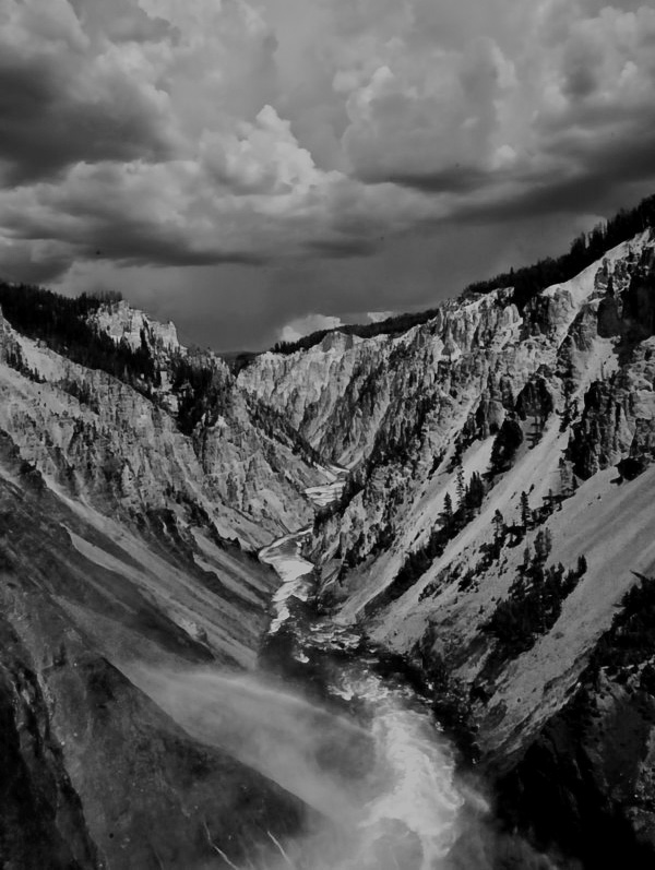