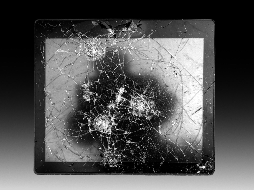
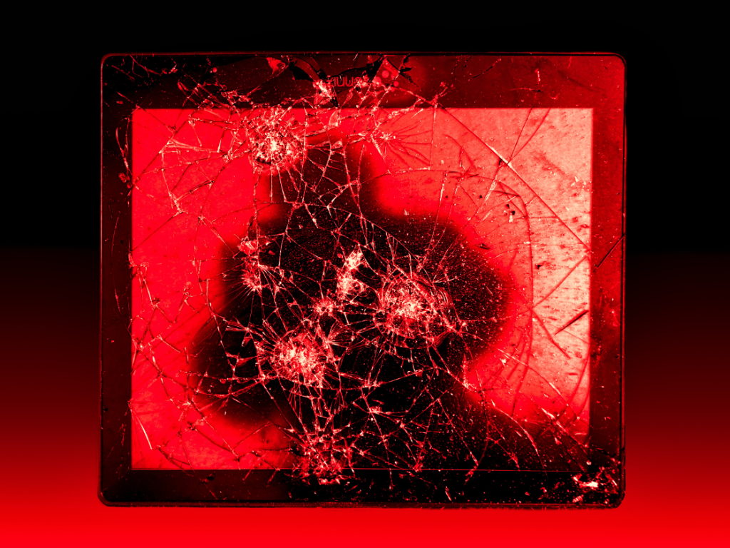
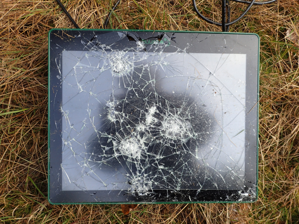
One of our favourite walking routes goes past a tennis hall. One morning, I stumbled on a cast-off monitor on the ground by the wall. I guess that it had received its share of hits of stray tennis balls and was discarded to wait for proper recycling. The dark shape on the screen is my shadow. - Olympus TG-3, 4.5 mm, f/2.8, 1/160 s. - I thought that it might make a statement against the current toxic discussion atmosphere in social media. In Affinity Photo, I masked the monitor, added a gradient fill layer for a background, and adjusted Levels and Brightness. I finally added a blood-red tone with the Recolor adjustment. I think that red version looked good as a glossy print that I made for the camera club competition, but I am not sure if the black-and-white is actually better. What do you think?
This round’s discussion is now closed! 6 comments posted
Robert Cordivari
Hi Kirsti,
I certainly love the creativity and originality of your photo - that's a great eye on your part to see a photo in that discarded device.
I really like the complimentary oval shape of the device itself, the cracks in the glass, and your outline. There is a great contrast between those harmonies and the tension the cracked glass represents.
I think you did a great job of redefining the background also. I can't suggest anything within the photo that could improve it.
Very interesting photo! Posted: 03/10/2025 14:53:37
Kirsti Näntö-Salonen
Thank you for the thoughtful analysis, Robert! For me, the first sight scene felt such a strong message that I did not stop at thinking of the elements at all. Posted: 03/12/2025 00:33:41
Jeff Manser
Hi Kirsti - What an original, creative shot you've made! I would not have come up with the connection to the toxic discussion atmosphere in social media but knowing that was the thought behind it makes me see how perfectly it fits together. I think the image looks great in B&W and have no suggestions for modifications to consider. That said, I think the original, red version of this shot reflect the toxic atmosphere theme you laid out even more strongly. Great job! Posted: 03/10/2025 21:37:57
Kirsti Näntö-Salonen
Thank you, Jeff! Isn't the effect of color surprisingly strong! Posted: 03/12/2025 00:43:36
Barbara Gore
Hi Kirsti - I prefer to study an image before reading a description, as it allows me to form a connection and understand what the image conveys to me. Upon examining the B/W image, several thoughts emerged such as disruption, fragmentation, vulnerability, or perhaps just discarded junk. Without knowing the intended meaning, it allowed me to look beyond the broken glass. For me, the red image evokes a sense of toxicity or danger similar to the intended vision. In contrast, the black and white version enabled me to focus on textures and tones. Both are creative and the post processing was well executed. Nice job. Posted: 03/11/2025 10:31:00
Kirsti Näntö-Salonen
Thank you, Barbara! I think that you put into words the difference between the B&W and the colored version that I have been trying to figure out myself. Posted: 03/12/2025 00:15:34