Barbara Gore
March 2025 - Harbofing Safety
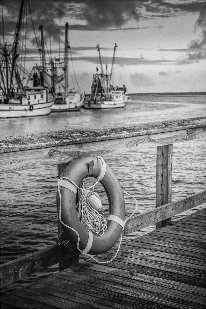
About the Image(s)
This image was taken in 2021 and converted to B/W last year. All post processing was done in Nik Silver Effect with some dodge/burn in PS.
A stroke was also added in PS. Canon R5 settings (ISO 50, 47 mm, 4.0, 1/20 sec). Tripod mounted.
This round’s discussion is now closed!
5 comments posted
Hi Barbara, I love the way the image carries the message of risk and safety. The diagonals that lead towards open waters and the slightly blurred row of boats in the background give the lifesaver the context. I think that the depth of field is just perfect.- I wonder if a tiny bit more contrast might show the fine textures even more clearly without affecting the mood, but this is a matter of taste. Posted: 03/09/2025 03:30:01
Thanks for your feedback Kirsti. I will take a look at the image again. Posted: 03/11/2025 10:54:26
Hi Barbara - What a beautifully composed image you've made. I love the way the image has been processed. The photo makes me think of a pencil drawing. You've got a great tonal range and there's definitely a storytelling element to the shot. I have no suggestions to offer. Great shot! Posted: 03/10/2025 21:29:20
Thanks so much Jeff. Appreciate your feedback. Posted: 03/11/2025 10:55:00
The depth of field is very effective with the water and the boat just slighlty out of focus as to not compete with the life preserver. I thought more water color than pencil drawing, especially in the ships and the water. The lines of the boardwalk/dock work perfectly to lead the eye into the image, and I really like the pattern on the wood just above the life preserver.
Lastly, I don't think the sky can be overlooked -it has an ominous feel but not enough to overpower.
Great shot.
Rob Posted: 03/14/2025 15:21:00
Lastly, I don't think the sky can be overlooked -it has an ominous feel but not enough to overpower.
Great shot.
Rob Posted: 03/14/2025 15:21:00