Robert Cordivari
About the Image(s)
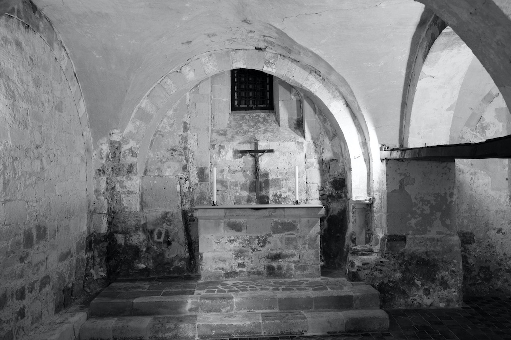
itle: Chapel, Westminster Abbey basement
F/5.6
37mm
1/8 sec
I wanted to emphasize the starkness and coldness of the chapel.
9 comments posted
You captured what impressed you. The tonal balance isgreat because you captured the full Ansel Adam's 0-10 tone scale. The composition is fine except I think the right side is distracting/ It looks like some sort of a tunnel. Iwould drop out the partial arch and right side. Posted: 01/08/2025 21:47:37
Thanks, Al. I wavered between crop or no crop. I'll take another look at the crop options. Posted: 01/09/2025 20:30:26
Hi Robert, I think that you have captured the serene spirit of the place, by letting the lovely light show the simple centered composition. - I agree with Albert about the crop. Posted: 01/10/2025 14:38:54
Thanks, Kirsti. I suspected I'd have cropping issue when I took the photo. Posted: 01/11/2025 17:04:37
Hi Robert. Old ruins always grab my attention. You've done a great job conveying a sense of abandonment and coldness in this photo. The varying shades of gray enhance the image nicely. While old structures can appear crooked due to shifts in foundations, for me, I'm always looking to straighten anything when it comes to architecture. I agree with the others about the tunnel-like appearance on the right side of the frame and think cropping it in would give the image more balance. However, I find the bright white section of the arch stand out more to me. Thanks for sharing. Posted: 01/13/2025 17:31:33
Thank you, Barbara. The picture could use some straightening - I need to pay closer attention to my level guide. I think cropping will lose the effect I was after, but I see where the distraction lies.
Thanks for your comments.
Rob Posted: 01/13/2025 23:47:20
Thanks for your comments.
Rob Posted: 01/13/2025 23:47:20
I can appreciate the motivation you had to photograph this scene. The simplicity is so compelling. The implied contrast with the insanely ornate altars we have all seen, immediately comes to mind. For me, the simplicity of the scene is what gives it impact. The texture is also an important element adding to the image's impact. The right side of the image pulls my interest away as I start to wonder where does that go and what's out there. As others have indicated you may want to consider cropping in from the right. Also, you may want to bring down the brightest spots on the right of the arch. Very well seen and I believe your image communicates the starkness and coldness of the setting. Posted: 01/17/2025 23:03:26
I like your concept Robert. It tells me a story of contrasts. The love expressed by the events surrounding the crucifixion compared to the rather cold damp almost crypt like atmosphere is stark and very effective to my mind. The one thing that mitigates (to my eye) the depressive atmosphere is the light from the right side. Again, the story - there is more than the cold, damp aura which was made possible by the crucifixion.
If I were to crop the image it would be to keep the crucifix centered but cropped tighter to give it more prominencel adding to the story. No other suggestions to make.
Well done and thank you for sharing it with us. Posted: 01/19/2025 21:05:24
If I were to crop the image it would be to keep the crucifix centered but cropped tighter to give it more prominencel adding to the story. No other suggestions to make.
Well done and thank you for sharing it with us. Posted: 01/19/2025 21:05:24
Thanks, Ed. The consensus is that a crop is needed and I agree. I will play around with the cropping in an attempt to keep as much as the original feel that I was looking for. Your input, with all of the others, is much appreciated.
Posted: 01/20/2025 01:28:54
Posted: 01/20/2025 01:28:54
