Robert Knight

October 2026 - Samual Stone
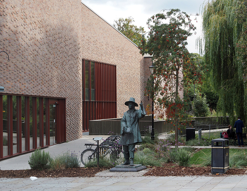
Original
About the Image(s)
This is the statue of the Rev Samuel Stone in our local town of Hertford. He sailed to America in the 17th century and co-founded Hartford, Connecticut. I am taking more pictures of architectural subjects and trying to take a fine art approach to them. I have been looking at the pictures of Joel Tjintjelaar, Noel Baldewijns and Julia Anna Gospodarou and really like what they produce so I am on a steep learning curve. I decided to take this picture and see if I could make the statue stand out by converting to black and white, isolating various aspects of the statue and its surroundings and making local adjustments. The image is cropped, the cycle store and the litter have been removed and I applied mostly exposure adjustments to the various areas. All comments gratefully received.
3 comments posted
You did a great job of removing the bike rack. And, the conversion to black and white seems the right way to go. I do agree with the suggestions from Cindy and David on getting a bit closer, and possibly at a bit different angle.
I looked at Julia Anna Gospodarou's work on the web, and was impressed with her ability to showcase only what really matters in her photos, and make everything else "disappear". In many cases, she clearly did it with postprocessing. Looking at what you have done with this image so far, I'd say take another look at some of her cityscapes and architecture images. See if you can apply some more of her exaggerated editing to this photo, and I bet it will look even better. Posted: 10/08/2026 01:00:52