David Terao
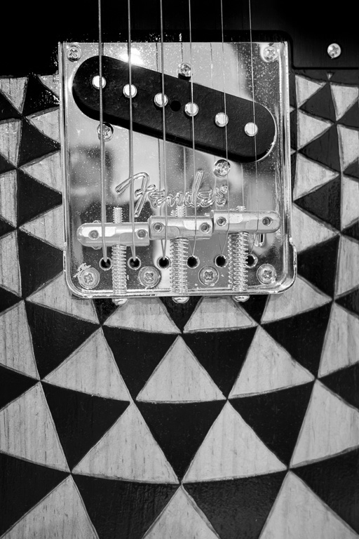
July 2026 - Fender Telecaster B&W
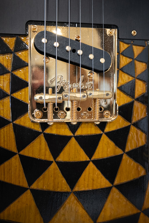
Original
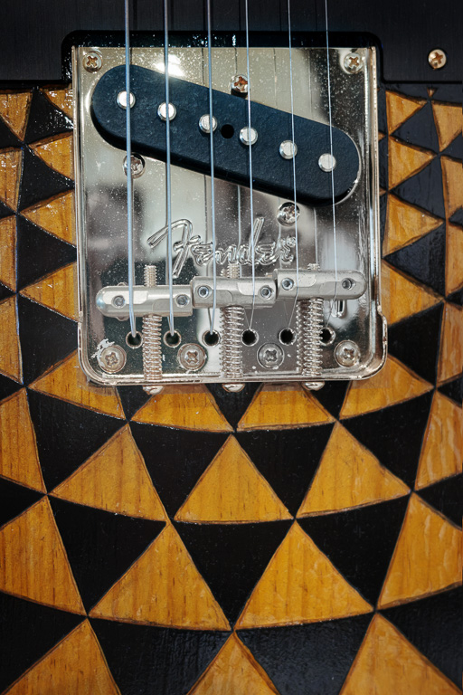
Original 2
About the Image(s)
While I was in California, I visited the Fullerton Museum Center where they were having an exhibit honoring the late Charlie Davis. You probably never heard of him, but he was the unsung hero at Fender Guitars (Fullerton, CA) who made guitars in the 1960's played by many famous bands and musicians including the Beach Boys and Jimi Hendrix. I shot this close-up of an unusual Fender Telecaster and converted it to B&W because of its striking pattern. Shot with a Ricoh GR IV camera and processed in Lightroom and Photoshop.
I'm also including an alternative color version of the image. From a "fine-art" photography perspective, which do you prefer?
8 comments posted
Hi, David,
I think I like the alternate COLOR version the best. As you said, this is a unique design. While the strings and adjustment pieces look striking in monochrome, I think the color version tells more of the story. To me, in monochrome, the light-colored wood does not work well. It almost looks like a soft focus to me. I like Original #2. Posted: 07/02/2026 04:16:11
I think I like the alternate COLOR version the best. As you said, this is a unique design. While the strings and adjustment pieces look striking in monochrome, I think the color version tells more of the story. To me, in monochrome, the light-colored wood does not work well. It almost looks like a soft focus to me. I like Original #2. Posted: 07/02/2026 04:16:11
Thanks, Paul. Yeah, I'm leaning more towards the color version myself now. Posted: 07/02/2026 11:57:51
Great design and lines which are well presented in your crop of this guitar. While I do like the monochrome, I agree with Paul - I like the original 2 the best. For some reason, the color version seems sharper, with better focus. I like the composition very much. My only suggestion is to clone out the small screw in the upper right. Everything is symmetrical except that. Posted: 07/02/2026 14:20:30
Thank you for pointing out the screw. Sometimes you just get oblivious to the obvious. I will clone it out. Posted: 07/02/2026 14:56:05
David, I like two of your images for different reasons. With my Fine Art hat on I prefer the B&W version. With my traditional hat on I like the original because I associate guitars with a bit of colour and I particularly like wooden guitars, which I assume this is, but if it's not I like the pattern anyway. On my monitor there is a bright spot behind the second string which I think would improve the image if you toned it down a bit. Posted: 07/05/2026 22:51:21
Thanks, Robert. I fixed the blown out spot that I didn't even notice before you pointed it out. Posted: 07/05/2026 23:02:11
Hello David, I think in all the cases the composition of the photo is what makes it so engaging. That said my eye is drawn to the Black and White version. My eye just rests on that version and is drawn to the bridge (I think that is what its called). Posted: 07/10/2026 11:58:01
Thank you, Patrick. I, too, prefer the B&W version because the orange, wood color seems to fight with the silver bridge and metal plate. Posted: 07/10/2026 13:08:42