Robert Knight
April 2026 - Camden Market
Original
About the Image(s)
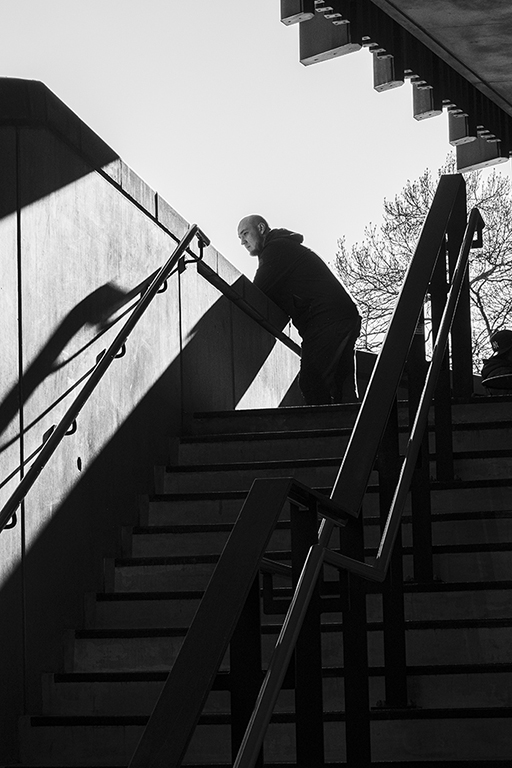
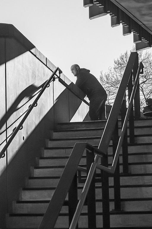
Camden market in north London is very popular for street photography and I went with a group and an experienced street photographer as a guide. We were looking for ideal spots and came across this flight of stairs and the man looking over the wall at the top. The market was packed with shoppers and photographers (hundreds of people taking shots on mobile phones) and no-one seemed bothered about being in photographs, in fact some of those in more unusual clothes actually invited us to take their photo. That wasn’t really the purpose of the exercise but we did it anyway and emailed them their picture if that is what they wanted. In this picture, I liked the various diagonals and triangles and the man added an extra dimension. I converted it to B&W and adjusted the highlights and then the shadows to bring out more detail in the stairs. Taken at 1/500 sec, f8, ISO 500.
4 comments posted
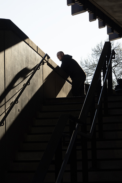
One thing I wish I could see changed is the dark wedge shadow on the top left. I don't like it because the angle doesn't match the other leading lines, and it is SUCH A BIG CONTRAST in a part of the photo that has no other interest. I'd love to see it with the shadow removed (as if that part of the wall was in the sunshine), and leave the horizontal and vertical line underlying the shadow. That would add a little interest in that part of the image, remove the distraction of the contrast. BUT, I am not sure it is possible to raise the exposure in that area enough. Not that it is allowed under the PSA rules, but that seems to be a challenge for AI Remove tool..."Remove the shadow, leave the wall".) Wonder what it would do? Posted: 04/05/2026 01:55:41