David Terao
April 2026 - Crocuses
Original
About the Image(s)
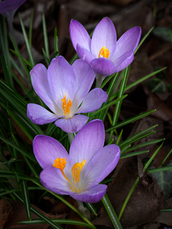
This month, I found some crocuses growing in a local park. They tend to grow for only a short time early in March, and they tend to grow in large clusters. I was fortunate to find this group of three that made a pleasant composition. In post processing, I used Photoshop and Nik Collection (Viveza) to clone out some distracting leaves and darken the brown leaves.
8 comments posted
A beautiful trio of flowers with gorgeous color and clarity. The focus and details are great as is the composition. Darkening the background and removing the white object to the right helped reduce the distractions. This is really lovely. If I were to suggest anything, it would be to remove the crocus in the upper left, although significantly darkened and blurred, my eye still looked there after I feasted on the main subjects. Posted: 04/04/2026 19:38:47
Thanks, Cindy. Yeah, I agree! Posted: 04/04/2026 20:24:49
A lovely and simple image with good editing to bring out the colors of the flowers. The three flowers sit nicely in the frame. Constructive criticism would be that a more active or interesting angle would make it less flat. Posted: 04/04/2026 21:02:55
Thank you, Mike. I'm not sure what you mean by, "a more active or interesting angle." Can you elaborate a little more? Posted: 04/04/2026 21:25:46
I suppose I mean that the straight above angle is a natural/default angle that we typically see flowers when we bend down to see them. By getting down low or shooting through some foliage creates a sense of discovery, like you're peeking at them. Posted: 04/04/2026 21:31:37
I love to shoot crocus, as they are so vibrant and delicate. This is a very lovely grouping. Good job on editing them to remove the distracting leaves.
A suggestion slightly different from Cindy's on the violet color in the upper left corner...rather than remove it, just change the hue more to the brown side. The same could be said for the lower left corner, which seems to have a slightly violet cast.
When I first read Mike's comment about the angle, I thought, "Yeah, taking the picture from just a few inches to the left might have introduced a little more of an arc to the line of the flowers." But, that wasn't what he meant. I am not sure that lowering the camera toward the ground would improve the image. The strong contrast of the orange and violet may be minimized or lost. Posted: 04/05/2026 01:21:04
Thanks, Paul. Your eyes are much more sensitive to colors than mine to see such subtle color variations. I trust your judgment. Posted: 04/05/2026 11:58:59
Well, I was a textile dyer early in my career, and spent pretty much 40 years in the color business one way or the other. BUT, it might just be my monitor, too. But, I see a little violet tone in both corners, although the one Cindy mentioned is more pronounced. Posted: 04/06/2026 02:00:42