Cindy Lynch
About the Image(s)
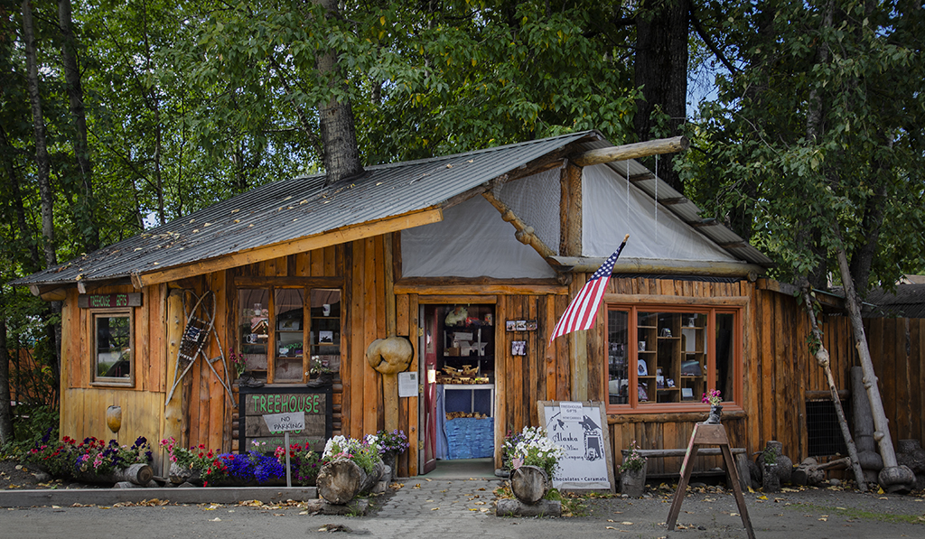
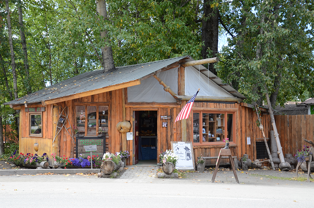
I took this a while ago but didn't do anything with it. I was looking through old photos nd decided to post process this. I cropped out the light road in the front and darkened it. I cropped in on the sides some and adjusted the contrast and clarity. I then lightened the interior quite a bit to show what was inside. Settings: f/8, 1/100, ISO 180 and 35 mm focal length.
3 comments posted
Your post processing has really brought this image to life and the elimination of the bright road in the foreground concentrates the eye on the building. The building is attractive too and the signs are in keeping with the building. Modern signs often spoil these older buildings. One tiny point is that the leg of the plant stand disappears off the bottom of the picture. I would have cloned a small bit off the bottom of it. Very attractive image. Posted: 11/03/2024 10:52:31
You really brought out the potential of this image by equalizing the tonal qualities. The browns and greens are all of a consistent brightness and complement each other well, thus, creating a warm and comforting scene. There is so much to look at that I didn't initially notice the tree growing out of the roof! I was also intrigued by the two trees leaning against the building on the right side, not to mention the building is a log cabin. I guess that is why the building is called a "tree house." Posted: 11/03/2024 11:47:42
great that you noticed this scene a while ago, and post process it, it's better than the original, may be it's a good on the wall images. Cue, a tree house. Posted: 11/12/2024 15:02:40

