Mo Devlin
April 2025 - Mud Prism
About the Image(s)
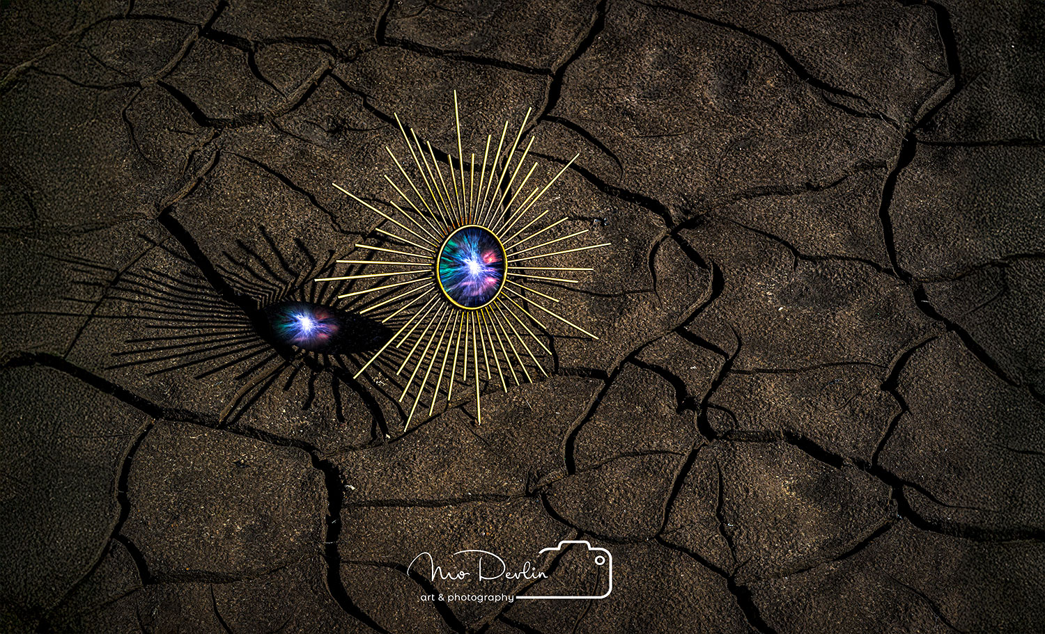
Locally we have the Francis Walter Dam that was drained to repair the dam. It’s an ever-changing environment with the various weather patterns. During the summer we had a prolonged drought that turned much of the surface into something close to a moonscape. I thought the cracking mud provided an interesting tableau for my mirror photos. The mirror was a five-dollar bargain basement type. It’s five exposures at .07ev., f16, ISO 200. The color center was added using photoshop. It was really a simple edit that, in this case, paid off with a mystic kind of resonation.
6 comments posted
Mo, I'm not sure of your intent in this photograph here, it comes across as just a tabletop image of this piece of costume jewelry. As presented, it is too centered in the composition, would be better cropping off the right side, which removes the distracting shadow line. If you want to depict the cracking mud that you mention, perhaps a shot of a larger space including a bit of a backdrop would work better. Posted: 04/07/2025 19:39:51
Sorry I didn't want to sound too negative, just trying to give you suggestions. Posted: 04/07/2025 19:41:21
I don't mind the comments. That's what it's all about. This is a sure of the beholder thing I guess. I don't happen to agree with it. But I do appreciate the candid remarks. Posted: 04/14/2025 19:20:51
You certainly have a style with your very graphic interpretation, which is pretty cool. I often wonder what my style is (emoji of someone looking off into space thinking). Back to the image, overall I like it and the jewelry makes an interesting subject with the shadow and color within. The background is very nice, lots of texture but not overdone. I guess the only thing I am struggling with is the subject is bit centered as Don mentioned. If you moved it left, you would cut off the shadows, so not quite sure of the resolution. Posted: 04/16/2025 18:01:36
An interesting image on several levels. On the basics, the blend looks smooth and the tones look natural. You mentioned this as a five dollar bargain basement mirror, which definitely throws the entire concept of the scale of both the mirror and the area surrounding it up in the air. That one aspect starts the mind down several different paths. The lighting works well in setting the mirror piece as the dominant element and your manipulation of the actual mirror surface to create the "glimpse into an alternative reality" (?) definitely gets the viewer wondering. I am inclined to agree with the others in that the current composition feels somewhat static to me visually. The shadow is essential, so perhaps trimming to more of a panel would alleviate that. I do find your watermark to be distracting both on location and intensity. Any thoughts of moving it more to the lower right corner and dropping the opacity so that, while it is there, it won't compete with the mirror? Posted: 04/19/2025 02:34:27
Rick...thanks for the comments. I used to put the watermark lower corner. It's in the center primarily to facilitate viewing on Instagram, which want a square photo. But that's a solid point. Personally don't like the centered location. I sold three very large prints of this photo and moved that watermark to the bottom right. Thanks again. Posted: 04/21/2025 13:36:00