Hazel Price, QPSA

August 2026 - Floating Flowers
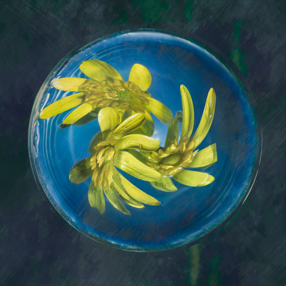
Original
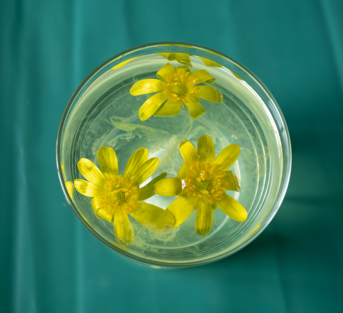
Original 2
About the Image(s)
Sorry I am a bit late with this. It is something I experimented with a
while ago, floating some buttercups on top of a glass full of water and
added some drops of paint. I changed the colour and used some textures
for the second image and then used the twirl filter on the third one.
6 comments posted
Hazel, what an intestine experiment This is something we all could try and it is very successful. What fun! I kind of like the buttercup color originally as the blue makes is darker and not quite a standout. I would like to see it in the original color, Otherwise, I congratulate you on finding a new way to present flowers. Thank you for the idea. Posted: 08/06/2026 18:55:21
Joan has said it all. I too love the technique but prefer the bright yellow original. Posted: 08/10/2026 16:06:31
Hazel, You've done a great job with an intriguing background and the exploration of various handlings of the flowers. I find the twirl filter distracting from the natural beauty of the flowers. I could see a series of these on the wall at a show. Keep experimenting! Posted: 08/16/2026 19:11:04
I like the coldness of the blue. It is almost as if they are frozen in ice. It is fun to play with ideas. Nicely done. Posted: 08/17/2026 10:25:33
These are well done Hazel and a very interesting concept with flowers in water. In my opinion, the image appears a bit flat with an even toning throughout - you might want to consider in adding some contrast to add more depth to the image. You can achieve this by using either curves adjustment layers or use Color Lookup. I believe this would give it a more surreal look. Posted: 08/18/2026 11:04:10
Creative concept that I like. It would be interesting to see the results of more contrast. Well done Posted: 08/18/2026 17:02:38