Tom Kredo, EPSA, SPSA
About the Image(s)
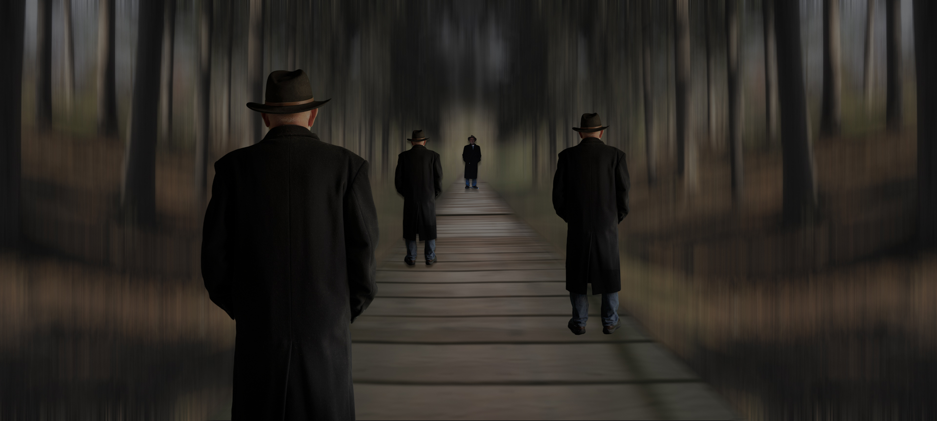
I was trying to invoke an idea where
I was looking back at my past selves to see where I've been.
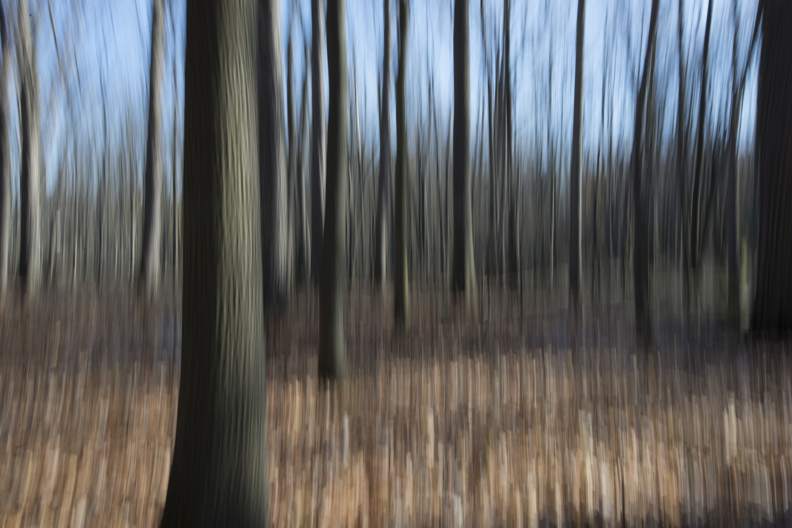
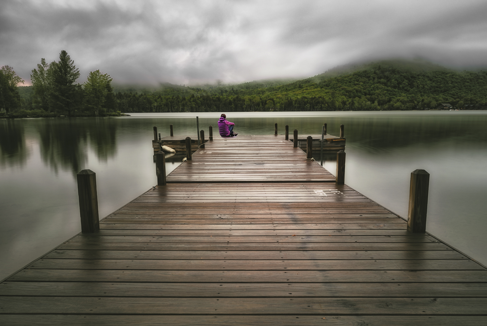
I took a walkway from a lake I vacationed on, and merged it into some
trees that I did a vertical blur.
4 comments posted
Tom - Mission accomplished. This is truly other-worldly. What a great idea. THe crispness of the dock and ghosts against the blur of the wooks really works. I think the color choices further enhance the overall feeling. Wonderful - I wouldn't change a thing. Posted: 11/02/2024 13:07:05
(Groups 9 & 20 & 97)
I love this! Very cool, and you did invoke the idea you were going for.
Posted: 11/05/2024 01:25:17
Posted: 11/05/2024 01:25:17
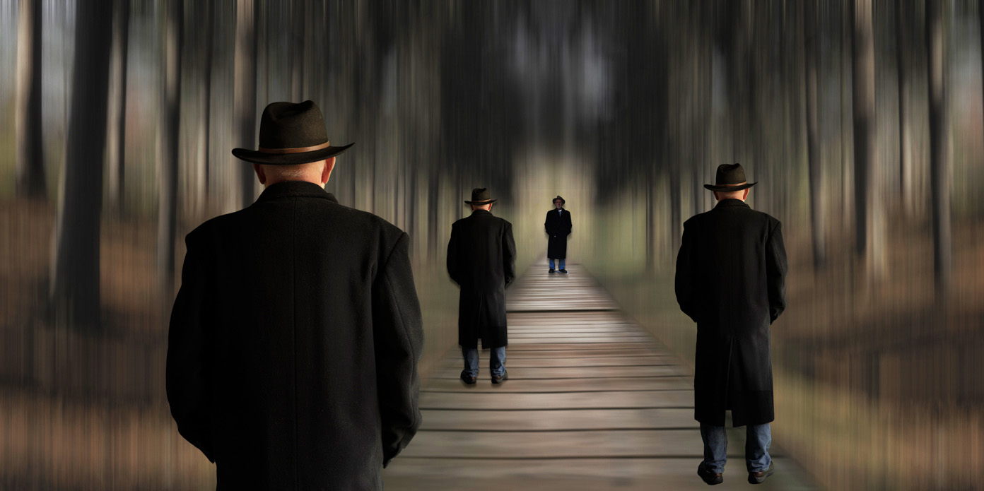
Tom, You never cease to amaze me how you pre-visualise an idea in your mind's eye and then execute it to a successful conclusion. Compositionally, I like the way that you have three versions of yourself looking along the catwalk into the scene towards another version of your good self in the distance looking back towards you the photographer. Structurally, I like the blurred background which adds to overall aesthetic. The image looks a little under-exposed which is fine if that is what you wanted. I found a little distracting the shadow on the bottom right-hand-side of the catwalk plus the symmetry and duplication of the background left/right. I offer the version below where I have adjusted the exposure, cropped tightly and offset the crop to minimise the symmetry and remove the shadow. In this version, it is not so obvious that the background left/right are not horizontal flipped versions of the same view. Posted: 11/07/2024 22:50:02
Tom, This is one of my favorite of your recent creations. The contrast of the sharp figures with the ethereal blurred forrest is very effective. I agree with Brian regarding the bottom right shadow. I do wonder if a subtle drop shadow may better integrate your figure on the right as he feels a little pasted on. Posted: 11/15/2024 05:43:14


