Brad Becker
About the Image(s)
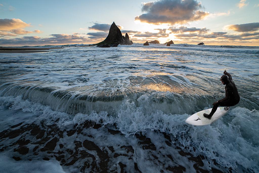
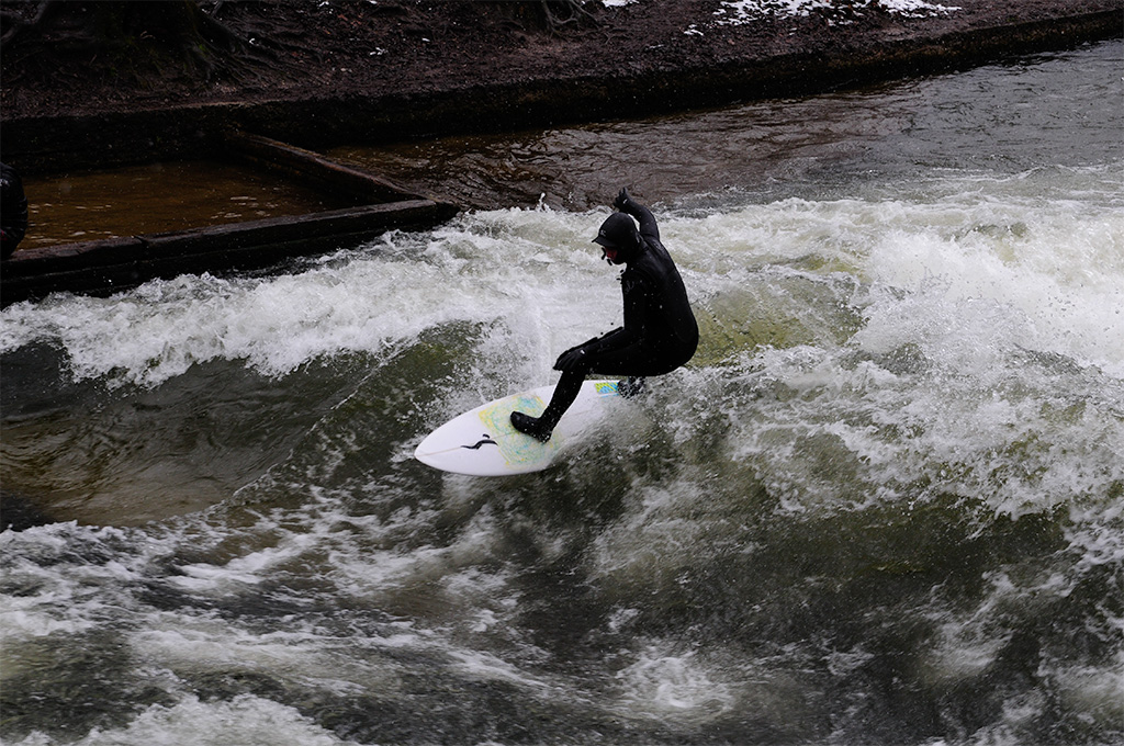
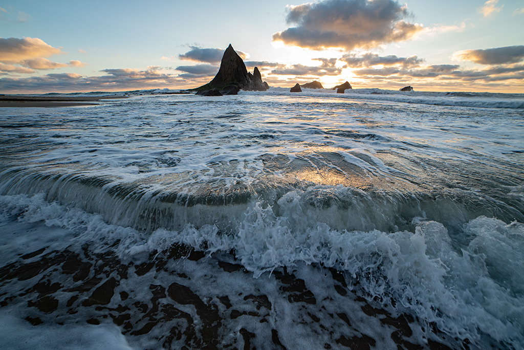
This is a simple composite. I added this surfer to create some balance to the image. I painted some orange light onto his face to attempt to integrate him into the sunset image.
3 comments posted
Hi Brad. Pleasing image. I don't really notice the facial highlight here. But I did take the shot into PS, and was able to get a bit of texture on him and also the pyramid rock in the distance. I find the setting and exposure nice, the color on the surf very good, and focus is very good. For me, there is a lot of surf. I might like to see the scene cropped on the left to eliminate the first large cloud. The pix does not suffer from that, and I think the surfer stands out a bit more. Posted: 11/02/2024 13:04:28
Melissa, The highlights don't show as well after the compression used to post. It was on the more subtle side. The original surfer image was much darker. I agree with your cropping idea. The original wave image is a wide angle photo in which I focused on the break crash. once I tried to add a subject it changed the focus. I will play some with cropping, thanks. Posted: 11/03/2024 20:26:53
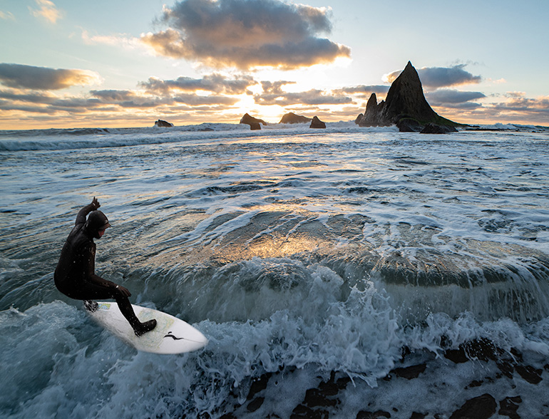
Brad, I believe that I have seen this background previously in one of your images. You have certainly captured the sense of openness of the seascape and movement in the water. I love the quality you have recorded in the tumbling water. There is a symmetry to parts of the images which reduces the overall visual dynamic despite the fact that we can see all the movement in the water. I feel that the image would have more impact and appeal if it was cropped and flipped horizontally per the version below. Posted: 11/07/2024 21:57:08


