Lisa Cuchara
About the Image(s)
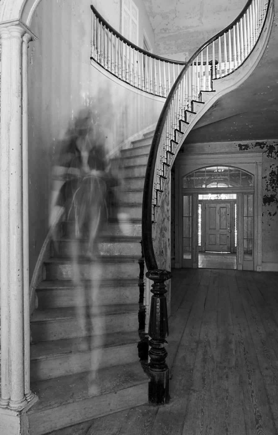
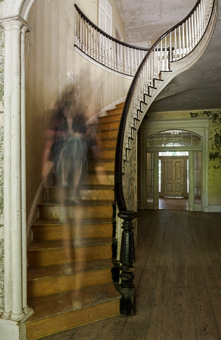
Taken with the 12-100mm lens on the OM1 mark ii. I went to a photo shoot
at an old house, with too many photographers, some of which had models,
making it hard to get images with compositions without people in them.
Rather than feel frustrated I decided to make lemonade and do some long
exposures to make ghosts.
Converted to BW in post
4 comments posted
Lisa - smart thinking. I always want to hear the juicy details of how these ghost shots are made. But yours came out of the box this way. I would say you did make lemonade. And I think it was really creative thinking. Actually, I feel the color is a little messy - too many different competing colors. But when you converted, it made the light at the trop of the stairs look "heavenly", like she really was entering from "above". Focus is perfect. And I like the framing of her by the pillar on the left and the railing. Tasty Lemonade !! Posted: 11/02/2024 12:53:23
(Group 32)
Looks great, but the title should be "Ghost descending a staircase." Posted: 11/05/2024 22:43:26
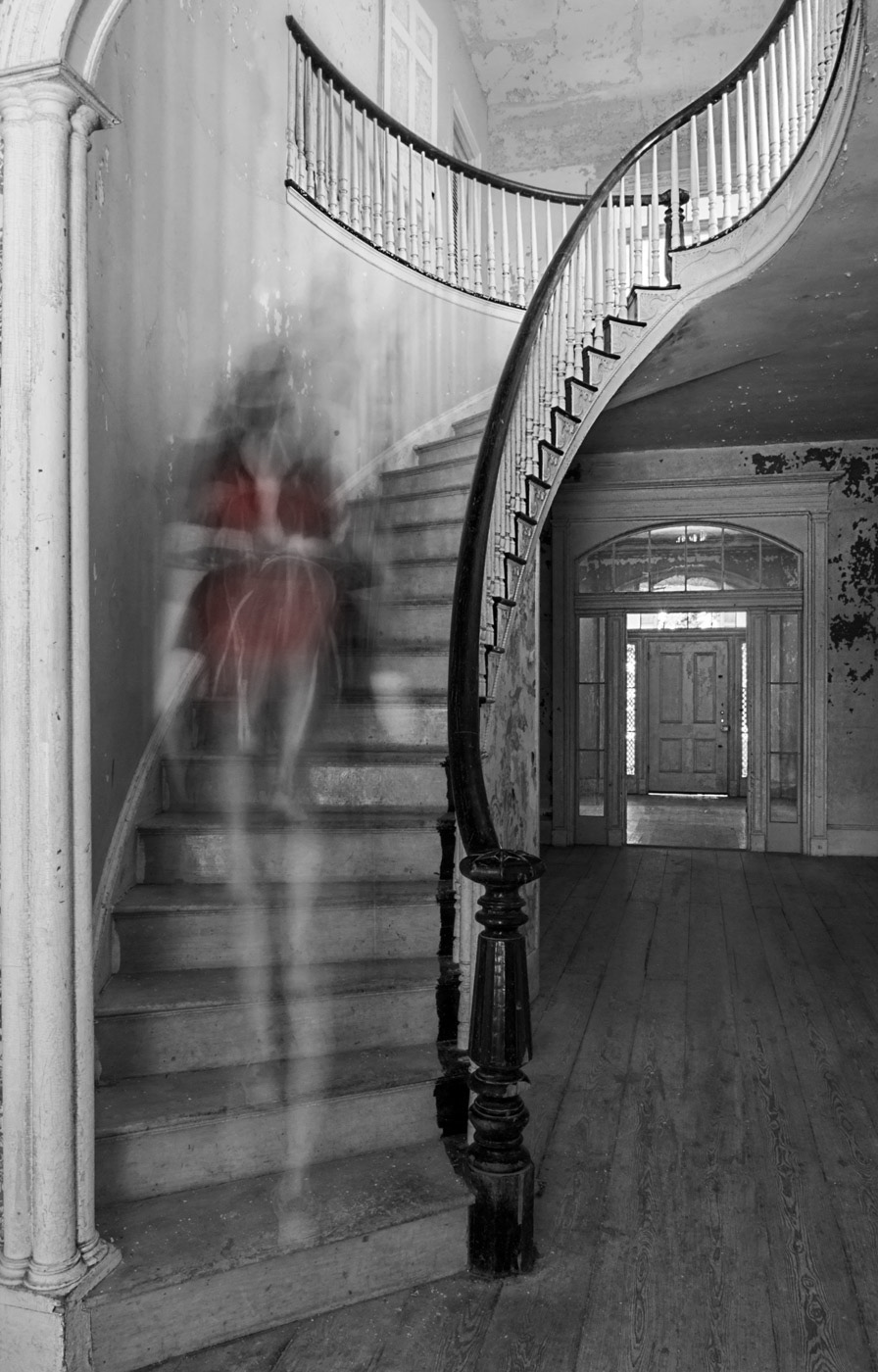
Lisa, This is a most pleasing image made all the better by your conversion from colour to monochrome which enhances the overall aesthetic, elegance, intimacy and visual story of the composition. It looks a pretty good venue for photographing models, fashion and the like. Compositionally, I like the way that the person is descending the stairs with her head turned towards the door which is the brightest part of the image and consequently our eyes are drawn to the light outside. The column on the left-hand-side reinforces this by creating a good visual blocker to stop our eyes wandering out of the frame. I like the shapes and patterns of the staircase; the geometry of the individual steps and risers plus the analogue shapes pf the bannister rails. I wanted another element in the picture and to show a flavour of what I mean, in the version below I have painted some red at low opacity onto her dress. This provides another focal point and helps to balance the effect of the bright light around the door frame. Posted: 11/07/2024 23:25:53
Lisa, I like what you've done with what you were dealt. The choice to desaturate the image works nicely. One direction I might consider would be to darken the upper level some or add some atmosphere to create a slightly spookier feel. Something about a brightly lit upper level feels off with your theme Posted: 11/15/2024 05:45:31


