Julie Deer

August 2026 - Art Deco Building
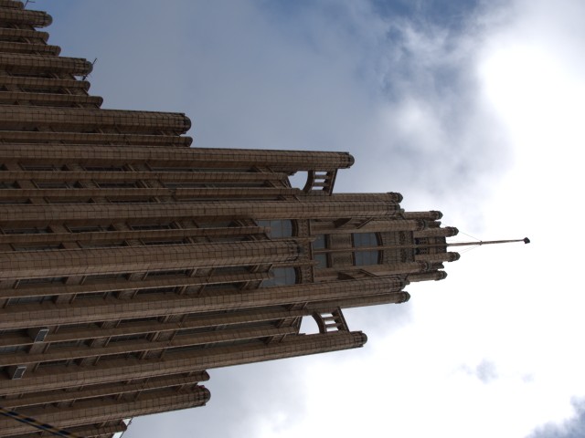
Original
About the Image(s)
We went to Melbourne in Victoria last year and took a quick trip into the CBD. This is the Manchester Unity Building which was completed in 1932. It took two years to build. Because Australia was moving through the Great Depression, it was decided to continue with this building as an act of faith in the economy.
I chose to present the building in monochrome to bring out the architectural detail.
Please tell me what you would do differently.
10 comments posted
Hi Julie, this is very interesting architecture! You did a nice job of capturing it, cropping, and keeping it straight, and good idea to convert to B/W. The original has some nice, dramatic clouds in it which would be nice to bring out in the B/W version. Can you also add some kind of shading on the left and lightening on the right to add depth and drama? You could also play with making the image symmetrical and see if you like that better or not. Posted: 08/05/2026 14:59:04
G'Day Janice. I like your thoughts. I didn't want to bring the clouds out too much as I thought it may make the image too busy, but I'll have a rework to see what it is like. I will also play with your shading idea. Posted: 08/06/2026 07:17:29
(Group 32)
This is a striking choice and I find the asymmetry appealing.
It might be a bit light.
Also, I suggest you leave a little of the vertical convergence to signal to the viewer that you are looking upward at a towering building. Posted: 08/06/2026 04:35:13
It might be a bit light.
Also, I suggest you leave a little of the vertical convergence to signal to the viewer that you are looking upward at a towering building. Posted: 08/06/2026 04:35:13
Hi Stephen, Thanks for your ideas. I will have a rethink. Posted: 08/06/2026 07:15:11
Interesting building. Capture is OK, not so sure about the treatment, but that's me. I tend to think include more detail of the sky would be better. Posted: 08/07/2026 19:57:10
G'day Don. Thank you for your comments. I certainly will play with making it darker and bringing out the sky a bit more. Posted: 08/09/2026 02:57:16
Hey Julie. Now you are talking my kind of photography... Buildings. Don't worry about Vertical convergence. Most great Architectural Photographers fix the aspect. If you don't fix it, your eyes will. The thing I really like about your image is the stark contrast and how the frames (windows or whatever) are really. highlighted. In this kind of a shot, it is your call how you want to present it. I kind of liked the clouds but I liked the contrast better. I did open it in ON1 noNoise and it sort of brought out the panes. Your image got this ameature architectural photographer's attention. Well Done. Posted: 08/09/2026 03:05:16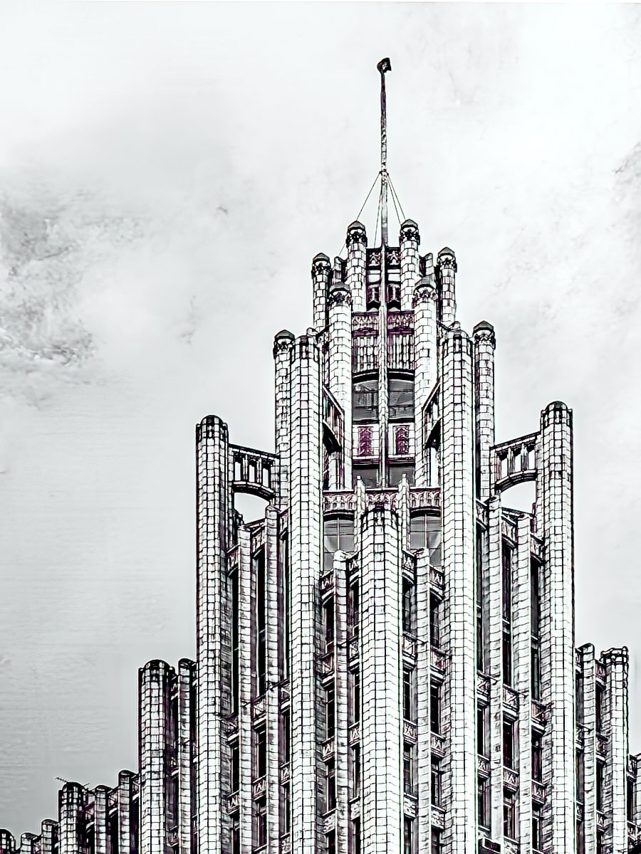
Julie - I really like this and monochrome was a great choice. It has symmetry while still being unique with that little bit of weight you kept on the left side of the frame. I agree with the comments that it is a little light, although the lightness makes it a little abstract - almost like a line drawing. Nice image! Posted: 08/09/2026 18:10:13
Hi, Julie,
Nice picture of this architecture; the details of the building is amazing. It's very eye catching. The balance of light and darkness is about right to me. I think the cloud in the original won't add much to it. Posted: 08/11/2026 22:30:21
Nice picture of this architecture; the details of the building is amazing. It's very eye catching. The balance of light and darkness is about right to me. I think the cloud in the original won't add much to it. Posted: 08/11/2026 22:30:21
(Groups 2 & 56)
I was just passing by and I saw your image.
Like Andrew, I am not so sure about the post treatment.
An interesting concept.
As someone once said, "If you have the sliders in Photoshop then you might as well use them to their fullest!" Posted: 08/23/2026 07:21:29
Like Andrew, I am not so sure about the post treatment.
An interesting concept.
As someone once said, "If you have the sliders in Photoshop then you might as well use them to their fullest!" Posted: 08/23/2026 07:21:29