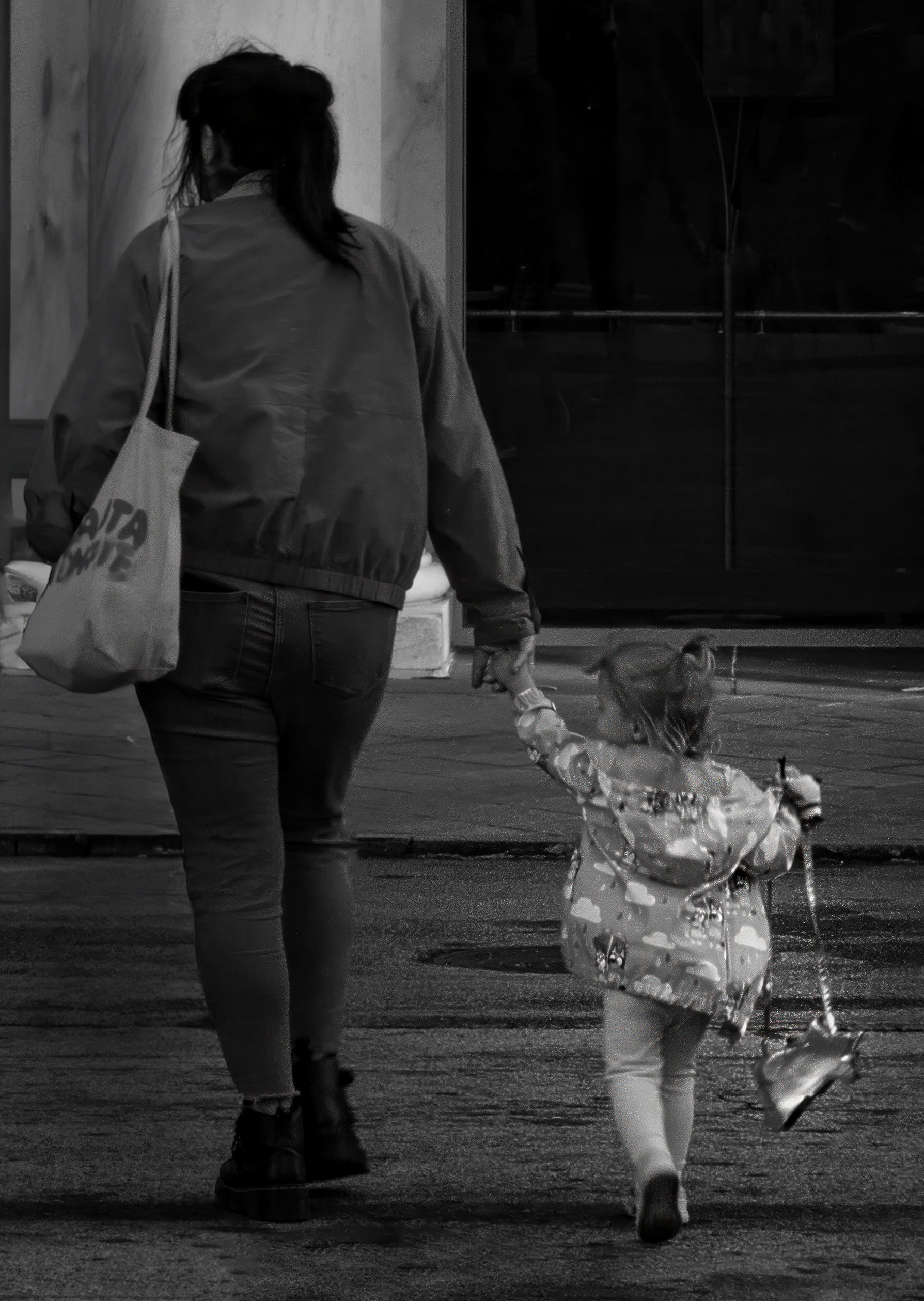
Details: Nikon Z8 with NIKKOR VR 16??“80 mm f/2.8 ??“ 4E; 1/60 sec at f/22, ISO 400
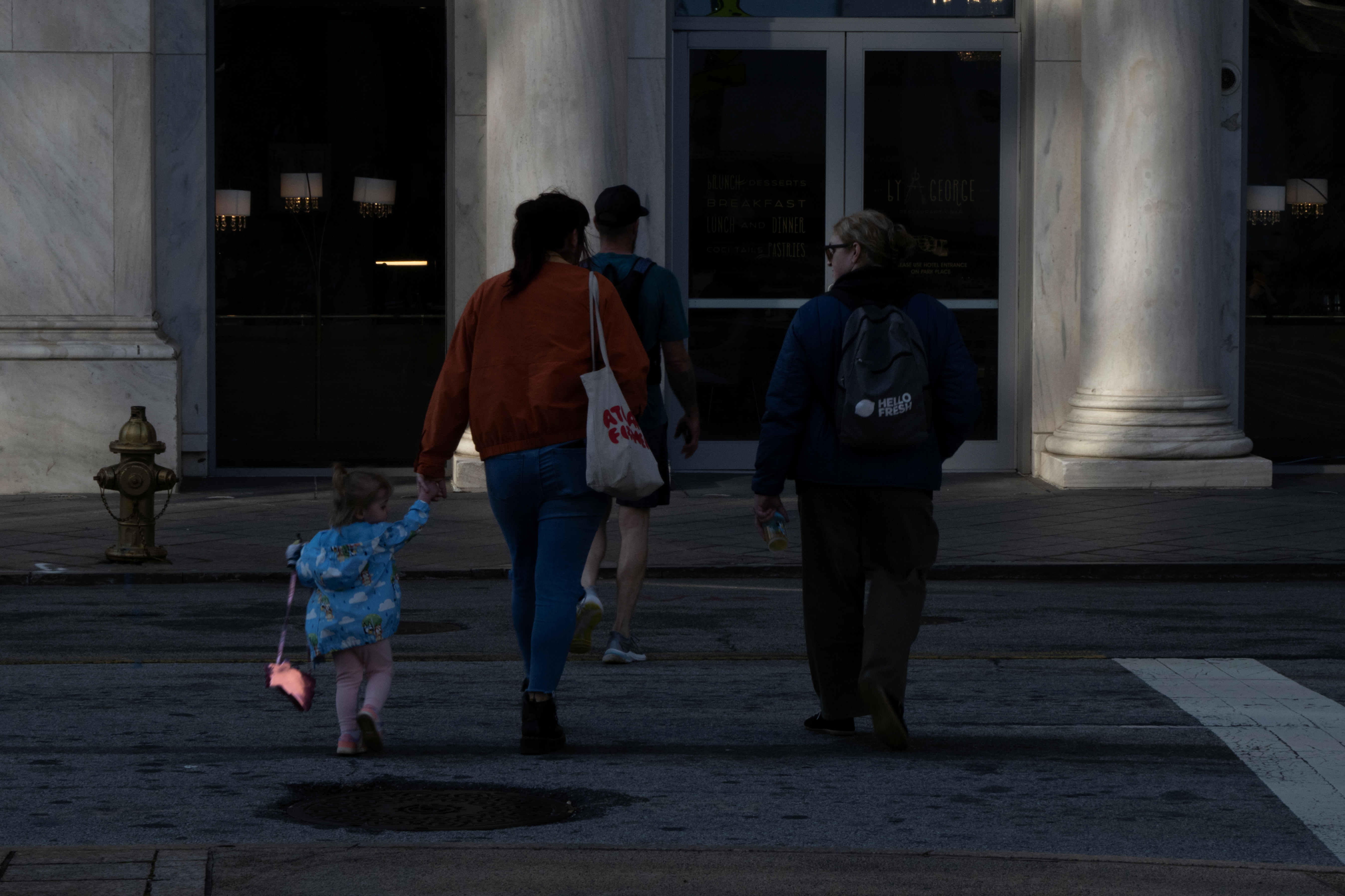
How I did it: I was exploring architecture in downtown Atlanta and saw this little one and her sassy purse. Although the subjects are all in the shadow of a high rise and facing away, there was something in the dynamic of the hand holding, the purse and size differential.
Challenges are the busy background, the blur from distance and slow shutter speed and the shadow. I cropped the image and flipped it with the goal of isolating the scene to tell the story. (This includes reflipping the text on the mom’s bag so the letters aren’t backwards). I also removed everyone except the little girl and her mom, then made some adjustments in Camera Raw. Lastly, I sharpened some with Topaz to see if I could improve the subject just a bit.
Note: I was shooting in monochrome in camera, but of course it translated to color when I uploaded and I decided to leave it for these purposes.
Looking for any additional post processing suggestions to improve the story - thanks!
3 comments posted
Janice Solomon
Hi Shari, this is a cute photo. I can see that you did a lot of work on it to remove distractions in the background, and you did this well. I think the story is that the little girl is imitating her mom, both looking left, both have their legs in the same position, both carrying purses. But if the purses are the story, then you might want to draw more attention to them by making them the brightest objects in the image. Also, the mom is unnaturally much darker than the girl, but they're standing in the same place and lighting. I recommend making the parts of the story the brightest and darkening the unimportant parts (especially the white column next to the mom's hand). Posted: 12/12/2025 19:06:41
Andrew Hersom
You have done a good job in simplifying the image and removing the person in front of the mother. I think the view of "backs", though, doesn't really work. Perhaps the crop is also too tight. Overall the image is 2 stops underexposed and would be better brightening. Posted: 12/18/2025 14:27:23
Catherine Honigsberg
Hi Shari. I like the detail in the background of the original. The dark background seems a little dangerous for them to be walking there. I would lighten up the Mom as well - she will still stand out as sassy! Posted: 12/18/2025 17:20:57