Andrew Hersom, APSA, EPSA, EFIAP
March 2025 - Riveted
About the Image(s)
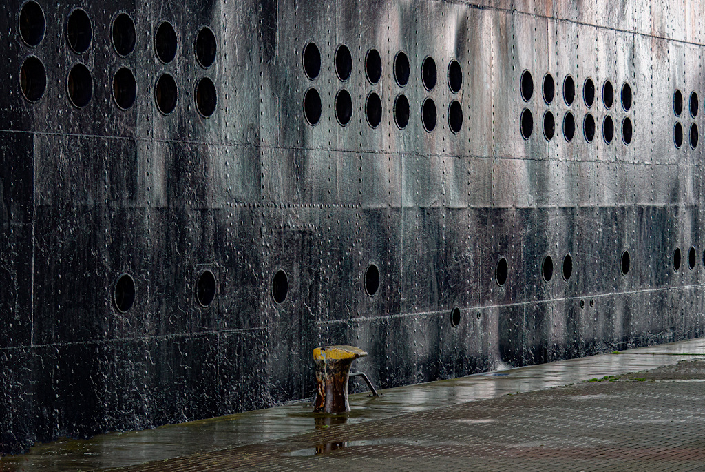
This is an image of a small cruise ship moored on a quay in the Baltic. It was straightened up, cropped, the dark areas darkened, detail added to the light areas and a bit of dehaze and text detail added.
This round’s discussion is now closed!
8 comments posted
Hey Andrew, This month, group 40 is doing my favorite kind of photography. I really like the tone and texture of your shot and it looks monochrome but it's not. I did one in Silver Efex Pro but I like your's better. It has more subtle texture. But my rivets are too much. This is my favorite image of your's so far. Posted: 03/07/2025 01:00:54
Thanks, I also wondered about trying it in mono but I think the colour is better. Posted: 03/13/2025 09:43:32
Hi Andrew, I love the almost monochrome treatment in this image. There is plenty of interest. Maybe crop a little off the left to move the bollard a little more off the centre line. Posted: 03/14/2025 05:02:28
yes I wondered about that -thanks Posted: 03/26/2025 19:15:04
Andrew,lots to absorb here. Obviously it was a rainy day causing reflections. The rivets are interesting, lines of them, but then an outline of something, probably on the interior of the hull. Then the repetitious grouping of 12 holes together. The yellow ballard centers the image. And the reflections of light from the wet metal add contrast and interest. I think your post processing really made this interesting which would have been a flat image without it. Posted: 03/16/2025 15:26:47
Hi Andrew,
I agree with Don this is one of my favorites of yours. Love the dark and shine of it. I also like the color version, subtle, but enhances the interest. Well placed leading line. I might try to lighten the post just a little. Posted: 03/25/2025 13:11:57
I agree with Don this is one of my favorites of yours. Love the dark and shine of it. I also like the color version, subtle, but enhances the interest. Well placed leading line. I might try to lighten the post just a little. Posted: 03/25/2025 13:11:57
Hi Andrew, I think you did a nice job post-processing this image. I like the patterns of holes and rivets. But the bright yellow is drawing my attention away from them, so maybe you could desaturate the yellow a little. I wonder if you could increase the saturation of the blues and reds on the metal of the ship. And compare that to monochrome. You might also want to erase the black dot and gray line on the yellow "ballard"(?) so that it doesn't look like the rivets are dripping onto the ballard. I'm not familiar with shipping so it confused me a little. Very cool image. Posted: 03/26/2025 03:20:59
Hi, Andrew,
I like so many different shades of grey in this picture. May be a black and white picture would make it stand out more.
This picture is very clean cut, there is no noise or eye distraction. I really like the pattern. Posted: 03/26/2025 06:56:22
I like so many different shades of grey in this picture. May be a black and white picture would make it stand out more.
This picture is very clean cut, there is no noise or eye distraction. I really like the pattern. Posted: 03/26/2025 06:56:22