Julie Deer
About the Image(s)
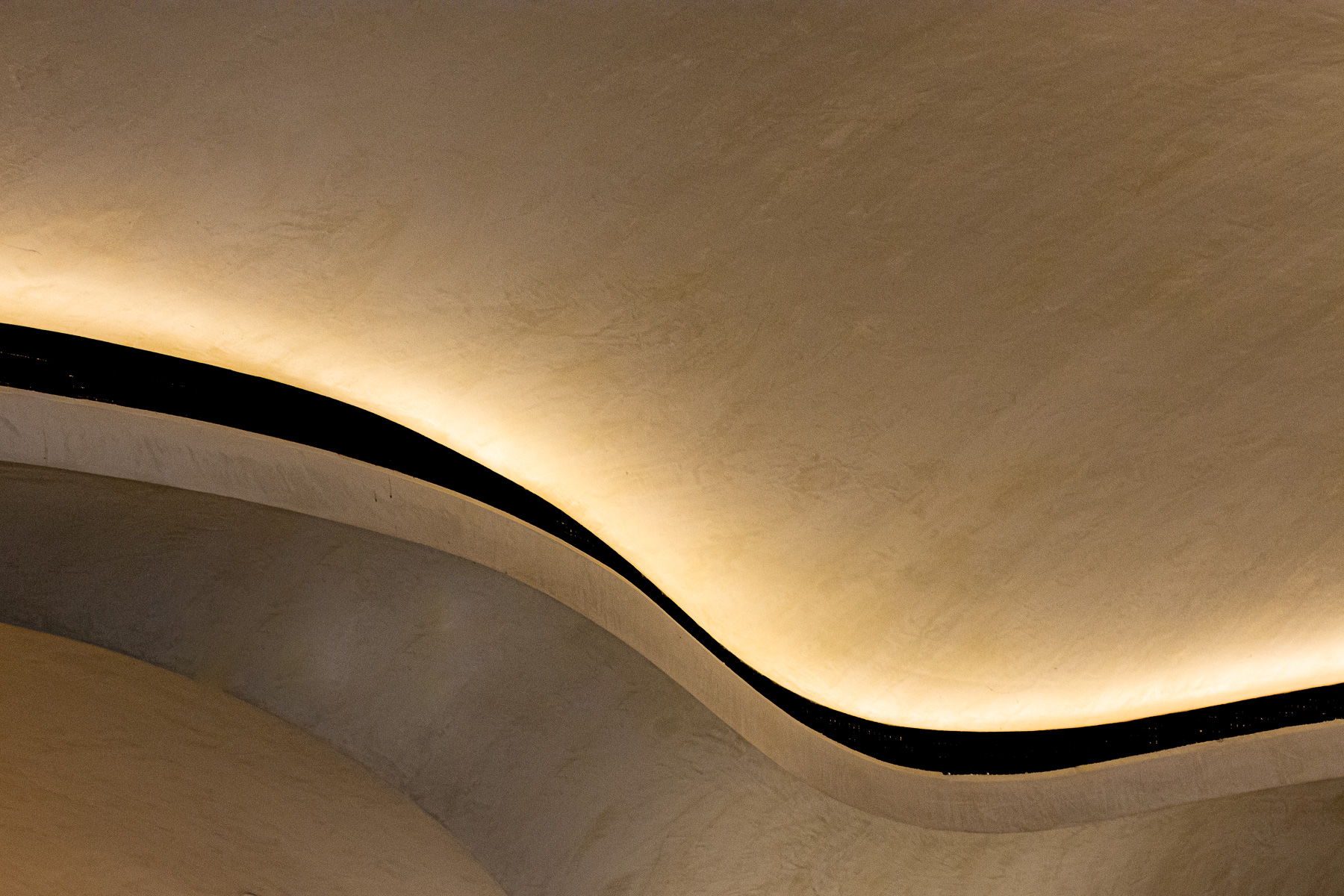
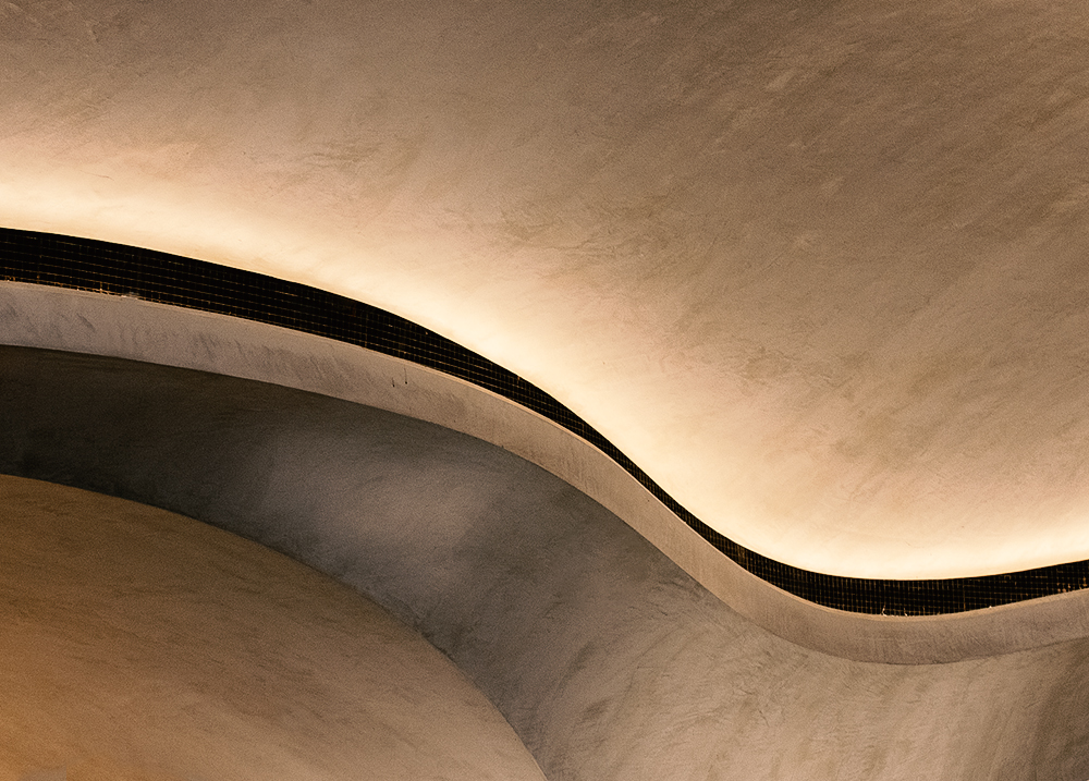
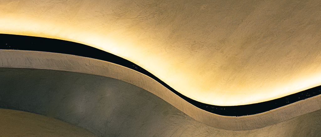
In the last few years there has been a new entrance added to the main railway station in the Central Business District. It is very photographic. I have been there a few times and taken abstract shots of the ceiling. This is one of them. What would you have done differently?
4 comments posted
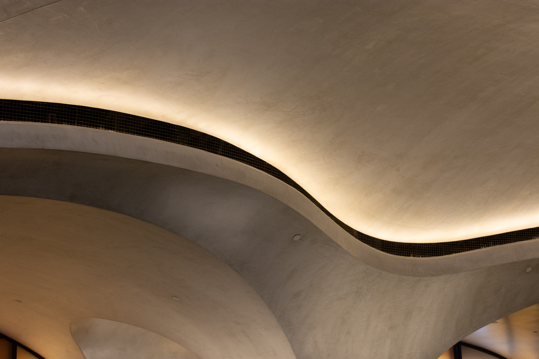
Hey Julie, I love your image. It is the kind of stuff that i like to shoot. I must admit, as with a lot of my shots, you do not know it is an interior of a building until the artist tells you. I have not been to this station so I do not know if the surfaces are smooth, as you have made them look, or have some texture. So, I opened your original and did not crop as tight and I added my texture, clarity and dehaze, and it started to have imperfections. I am not suggesting this is how the image should look, just my take on it. The black ribbon seemed to have some railing on it, so I kind of left it alone. I also added a film filter (I seem to be stuck on it). but did not add a DeNoise filter (just forgot). So Your image is really good and I really like it. Posted: 11/09/2024 16:20:06
Hi Julie, very nice image! I love the shape and texture! I also really like how you darkened the black grate/railing or whatever so that it appears smooth. I also like the curves on the left bottom of your original photo, but I'm not sure what you could do to get rid of the bottom right corner of the original. Posted: 11/17/2024 18:27:21
Hi Julie. Love this organic shape. I like your crop because the bottom has some distractions. The color really enhanced the lighting to make is seem very warm and gives it depth. Well seen! Posted: 11/19/2024 17:26:52


