Andrew Hersom, APSA, EPSA, EFIAP
About the Image(s)
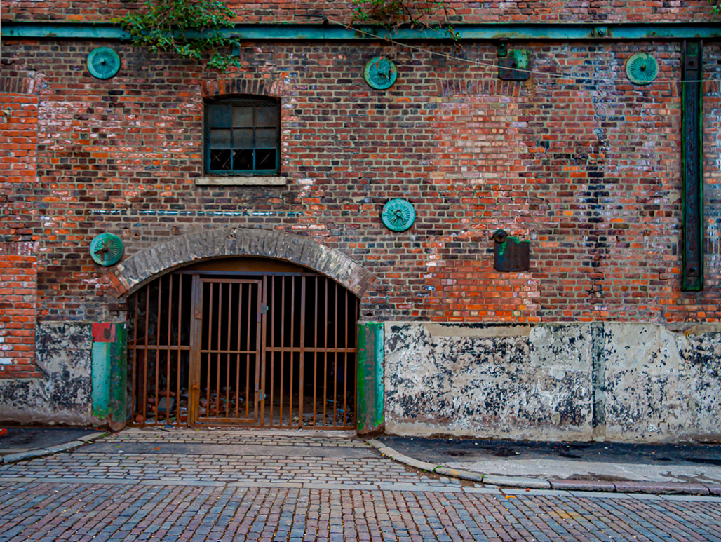
This was a disused warehouse taken a few years ago. It has probably been knocked down by now. I thought the large amount of "bricking up" of windows made it interesting. As usual very little post processing, just a slight crop to remove a skip and some added vibrance. The roadway and the building aren't quite horizontal. Someone suggested cropping off the right hand side leaving the grill central and a square format. What do you think?
4 comments posted
Hi?Andrew?
What an interesting brick work! Looks like the building has been patched up a few times. I like the patterns and various colors of the bricks; the legacy of the bygone era. I think it's perfect as is. The green bar on the righthand side provides a contrast and balance for the composition. Thanks for sharing. Posted: 11/09/2024 18:53:50
What an interesting brick work! Looks like the building has been patched up a few times. I like the patterns and various colors of the bricks; the legacy of the bygone era. I think it's perfect as is. The green bar on the righthand side provides a contrast and balance for the composition. Thanks for sharing. Posted: 11/09/2024 18:53:50
Wow Andrew, this image has a little of everything. I like the green, it sort of looks tarnished and adds a nice contrast. I my opinion it was cropped perfectly and I can not think of a thing I would change. Except, I wish I would have taken it. Thanks Andrew. Posted: 11/11/2024 03:34:09
Hi Andrew, I think this is a really nice image. The colors are very nice. I like the vibrance and the crop. Would it be possible, though, to add a bit more space to the top left plant so it doesn't look cut off at the edge? If not, then maybe remove some of the plant at the edge and add in bricks so it doesn't appear cut off. Also, can you straighten the bricks along the bottom edge, possibly using Lightroom Transform, but still keep the long metal bars level? Posted: 11/17/2024 18:14:57
Love this. Love that it is beautifully broken. Colors are great - the texture of the brick and that green is striking. I really like the way it is and I see the beam at the top is level. I always get comments on my falling down buildings are not straight. I might try to crop it on the right to the line in the brick wall. The black vertical beam pulls my eye and it might stay in the picture more bouncing between the green circles. Posted: 11/19/2024 17:23:40
