Ricarda Dudek
July 2025 - Beautiful blue lilies
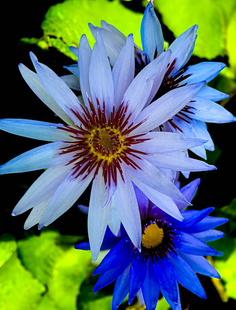
About the Image(s)
This photo was so fun to take. At the Naples Botanical Garden, once a year the patrons are allowed to get in the Lilly Ponds and “Walk with the Lillies”. For the occasion you can use a camera of your choice or your iPhone. Fortunately, there were many Lillies in bloom and it was a beautiful day. Although, I did my share of post-processing on this photo I am anxious to hear everyone’s comments on what I should have done and what I should not have done. Each month I welcome the comments on my photos as a learning lesson from another photographer’s view.
The information for my June entry is as follows:
Name: Beautiful Blue Lillies
Camera: iPhone 13 Pro Mac
1/150 sec @ F1.5, ISO 50
7 comments posted
Nice composition & color contrast Ricarda! Beautiful! It's amazing what kind of images our cell phones are now capable of! The largest flower captures the eye and it is sharply defined. Very nice! Perhaps the green could be toned down a bit so that there are less competing elements. And the eye knows where to go. Posted: 07/17/2025 13:13:04
Thank you for your comments Kathy. I agree that the green should be toned down. Posted: 07/17/2025 18:40:08
This is a professional and impressive image of blue water lilies, with strong colors, dynamic composition, and sharp focus. The shallow depth of field and flattering lighting do a great job of making the flowers stand out against a blurred background. Although the high contrast heightens the drama, you can consider slightly reducing it to soften the image a bit and give it a more dreamy feel. Overall, the image is of very high quality and is suitable for professional and artistic uses. Posted: 07/19/2025 08:41:25
Thanks Joseph for your positive comments. I will try your suggestion to slightly reduce the contrast for a more dreamy feel. Posted: 07/19/2025 12:50:20
Beautify color and very sharp and the green does need to be tone down. I wish the flower tips had not been cut off but since nobody else cited that, it must be a personal preference. You could use a hue/saturation layer in PhotoShop to both reduce saturation of the green and its brightness. A brightness/contrast layer can also be used to turn down the background. Or a combination. I'd see which works best.
I think slight sharpening on the lower right flower might be in order
Posted: 07/19/2025 16:00:03
I think slight sharpening on the lower right flower might be in order
Posted: 07/19/2025 16:00:03
Nice and sharp with great detail. Sounds like a fun shoot. As the others recommended, I would darken the leaves a bit. Posted: 07/20/2025 21:11:52
Ricarda, A vibrant, eye-catching photo with excellent detail in the central bloom and bold color contrast. The greens could be slightly toned down, as their brightness competes with the subject for visual attention. Reducing their saturation and luminance would help isolate the flower more effectively and guide the viewer's eye more directly. A hue/saturation or luminance adjustment in post could achieve this while preserving color richness. Also, watch for clipped petals in future compositions.
Overall, an impressive result using a smartphone - well-composed, joyful, and full of visual energy.
Posted: 07/21/2025 23:56:29
Overall, an impressive result using a smartphone - well-composed, joyful, and full of visual energy.
Posted: 07/21/2025 23:56:29