Kathy Hradecky
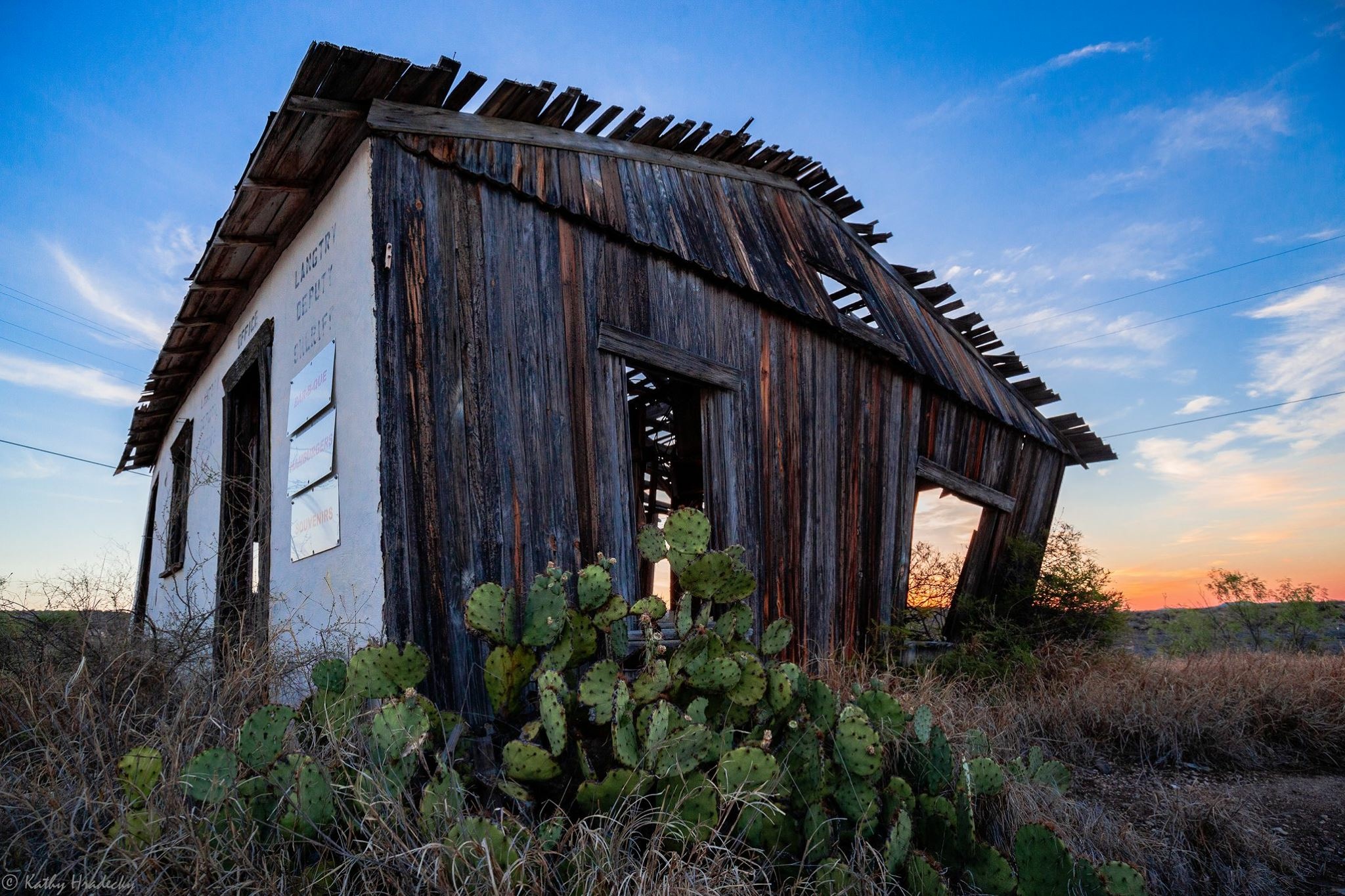
April 2025 - Langtry Deputy Sheriff - (lightly visible on side of building)
About the Image(s)
The image was taken in Terlingua Texas near Big Bend National Park. I was a last minute add-in to a group of 3 other hobby photographers, mostly going there for Astro Photography. This photo was taken at golden hour on an evening when we all just went exploring in the area. No tripod. Canon 6D, 16-35 lens I think. I loved the juxtaposition of the cacti to the dilapidated structure and all of the texture & color variation on it. Also, the sunset added warmth and beauty to the scene.
8 comments posted
I don't think the photo needs the explanation of the sign. It stands on its own and if anything the sign gets in the way.. The building has character and is the story. I might take some of the brightness out of what look like metal signs on the left side (probably tone it down on the entire side), just leaving the viewer with the idea there are signs there. Maybe more contrast for the building. The story is the building decay and somehow the setting sun adds to that sense of the end of this structure and it's well done. I like the cropping and the sky is nice. I might clone out the utility line on the left. Maybe lighten the extreme right of the building a bit to bring out detail. Just a very good job. Posted: 04/13/2025 22:54:03
Bob, yes I agree. I was in a hurry and didn't put enough thought into the title. I like Ricarda's title, "Time Witnessed." Another might be "Metamorphosis." Thank you for your feedback. Posted: 04/21/2025 04:14:33
As a documentary-artistic image of an abandoned building - this is a strong and characterful photograph, which well conveys a sense of time, neglect, and nature that overwhelms the person.
Strengths:
-. Composition at an unusual angle: The diagonal angle creates a sense of movement and instability, which reinforces the message of the building's disintegration. The choice of a low perspective with a cactus in the foreground frame adds depth and local context.
- Rich textures: The contrast between the old, peeling wood, the white of the plaster, the dry vegetation, and the living cactus - all together tell a story of time and climate.
- Story and emotion: The image tells a clear story of a forgotten place. There is a sense of nostalgia in it, and even a hint of sadness.
Points for improvement:
- Compositional balance: The building is cut off slightly on the lower right, which is a shame - adding a little more in the frame would have allowed it to "breathe" better. You could also consider a wider horizontal version that would give space to both the sunset and the building.
- Using line-leading: It would have been possible to introduce a small path or another element that would lead the eye into the building - right now the facade attracts a lot of attention but there is no internal flow to the image. Posted: 04/15/2025 07:53:06
Joseph, thank you for your considered reply. Leading line... As I remember, there was no road leading to the building. But I like the idea of it. I took this photo from an angle looking towards the roof. Not sure I could get the roof the same way if I was able to get a road leading to the building. But there might have been something else I could have used. I agree that there is no internal flow.
Posted: 04/21/2025 03:57:22
Posted: 04/21/2025 03:57:22
This photo captures the sun setting over an abandoned, weathered wooden structure with a partially collapsed roof, symbolizing the building's decline. The structure features a white-painted front wall and aged wooden siding, with prickly pear cacti growing around its base. The photographer has skillfully used golden hour lighting to create a striking contrast between the dilapidated building and the beautiful blue-orange gradient of the sky. The composition places the building at an interesting angle, adding dynamic tension to the scene. good job Posted: 04/17/2025 07:43:17
Thank you for your feedback Yamuni. Posted: 04/21/2025 03:58:52
This particular photo really spoke to me. The dilapidated building, given time, will fall as the life of the desert continues to live.
The focus is so sharp enhancing the grain of the building and the thorns of the prickly pear cacti. The warmth of the golden hour adds softness to the demise of the building in a very touching way. A good title for this photo: Time Witnessed.
The angle of the photograph compliments the angle of the building to lend a feeling of sadness. I agree with Joseph that adding more space on the right would enhance the composition. In all, a great capture!
Posted: 04/17/2025 14:38:14
I really like your title Ricarda! Much better than mine. Yes, I agree with both you & Joseph that some extra space on the right would improve the composition. Posted: 04/21/2025 04:02:52