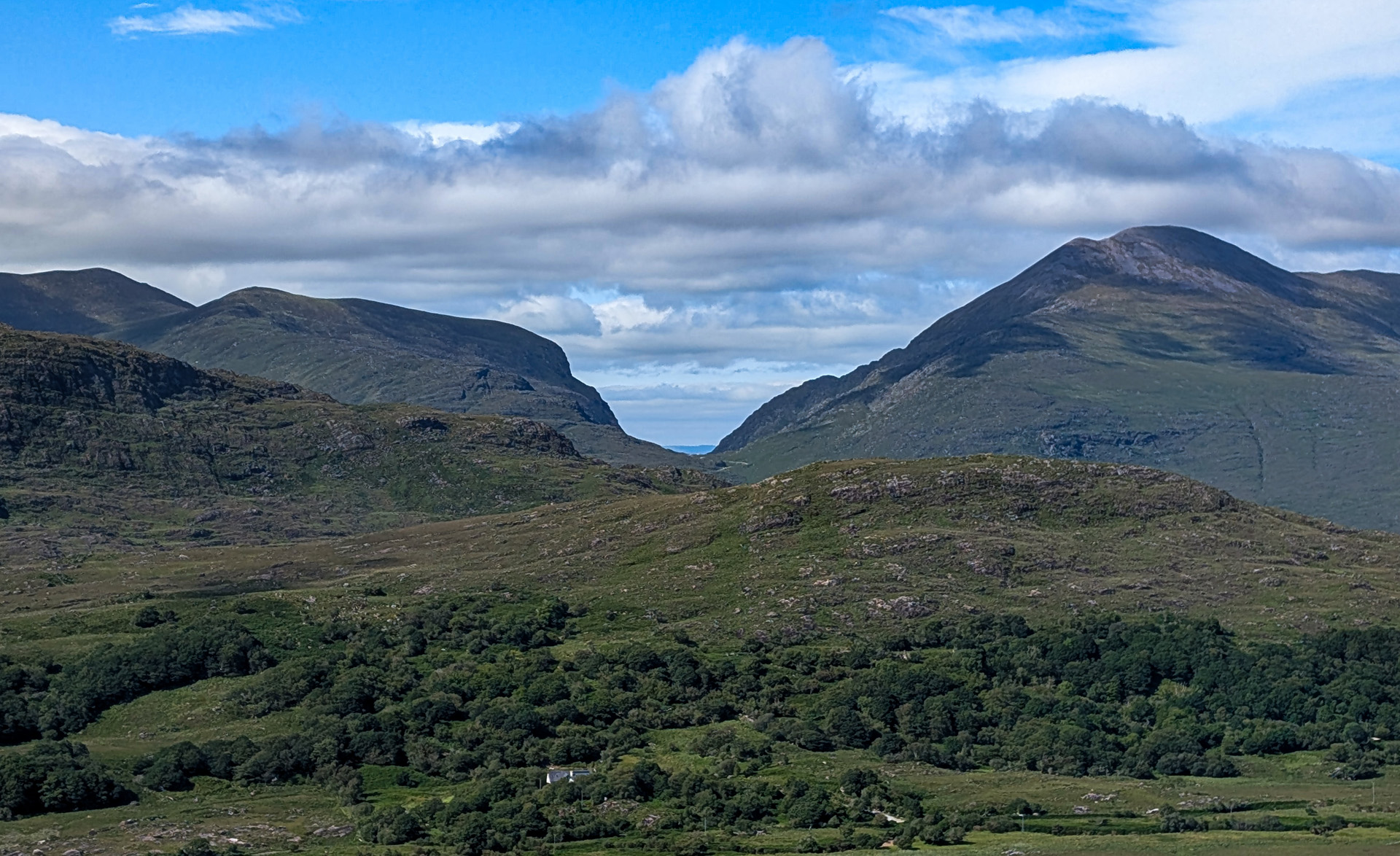
This is an image from a recent six-week vacation to Ireland. We had driven part of the Ring of Kerry about a week earlier and had stopped here. Unfortunately, the weather was rainy and foggy so there was not much to see. We decided to come back when the weather was better. This image was taken on our return visit.
Moll’s Gap was named after Moll Kissane who ran an unlicensed pub that used to be there when they were building the Ring of Kerry Road. It is only a 10 minute drive from Ladies View where I took last month’s image.
The image was taken on a Pixel 9 using the built-in camera app using the automatic settings and selected the optical 1x zoom lens. Post processing was done in Photoshop 2025
I divided the image into sky and ground zones and set up Camera Raw layers for both zones.
For the sky zone I did a light dehaze, then decreased the exposure by .5 stops, increased the contrast by 36, increased the shadows by 2, increased the whites by 13 and decreased the blacks by 51.
For the ground zone I did a light dehaze, then decreased the exposure by .5 stops, increased the contrast by 15, increased the whites by 16 and decreased the blacks by 8.
I then did some additional dodging and burning to bring out some additional features.
I used a mask to selectively increase saturation, mainly on the ground and done sparingly.
Finally, I cropped the image to get rid of part of the foreground that didn’t add anything to the image.
4 comments posted
Larry Treadwell
While the image shows a bit of green to celebrate the Emerald Isle I most feel that it lacks a compelling subject. The twin hills just do not create a compelling subject since they are so featureless. Now maybe if you had a large Irish Pub to add some purpose to the scene it would work. Without a pub or a compelling subject if just does not work for me. I also feel when you processed this you introduced a bit of halo along the horizon line. Posted: 12/13/2025 20:10:04
Bill Peake
Yeah I did not see the halo, I would have fixed that if I had noticed. It may have been made worse when I reduced that size to 1920x1080. I've noticed when I resize an image, it sometimes does some weird things depending on the method used. Posted: 12/17/2025 20:03:32
Barbara Gore
Hi Bill. This area must have been amazing to see in person. The sky has nice texture, and I can really feel the sense of place here. Personally, I think I prefer the original version with the extra texture in the foreground. At the same time, I have to agree with Larry as there isn't an obvious focal point to hold my attention. I don't think every image needs a single clear subject to be engaging, but it helps when there's something in the composition such as moodier light, complimentary colors, or leading lines to draw my eye in and keep my interest. Glad you had the opportunity to visit and appreciate the location. Posted: 12/17/2025 13:37:03
Adi Ben-Senior
Technically this picture is perfect. Exposure, composition, white balance, lens choice and edit. However, I do miss a subject. I think it makes a big difference. Posted: 12/17/2025 16:01:58