Barbara Gore
March 2025 - Turbulent Tides
Original
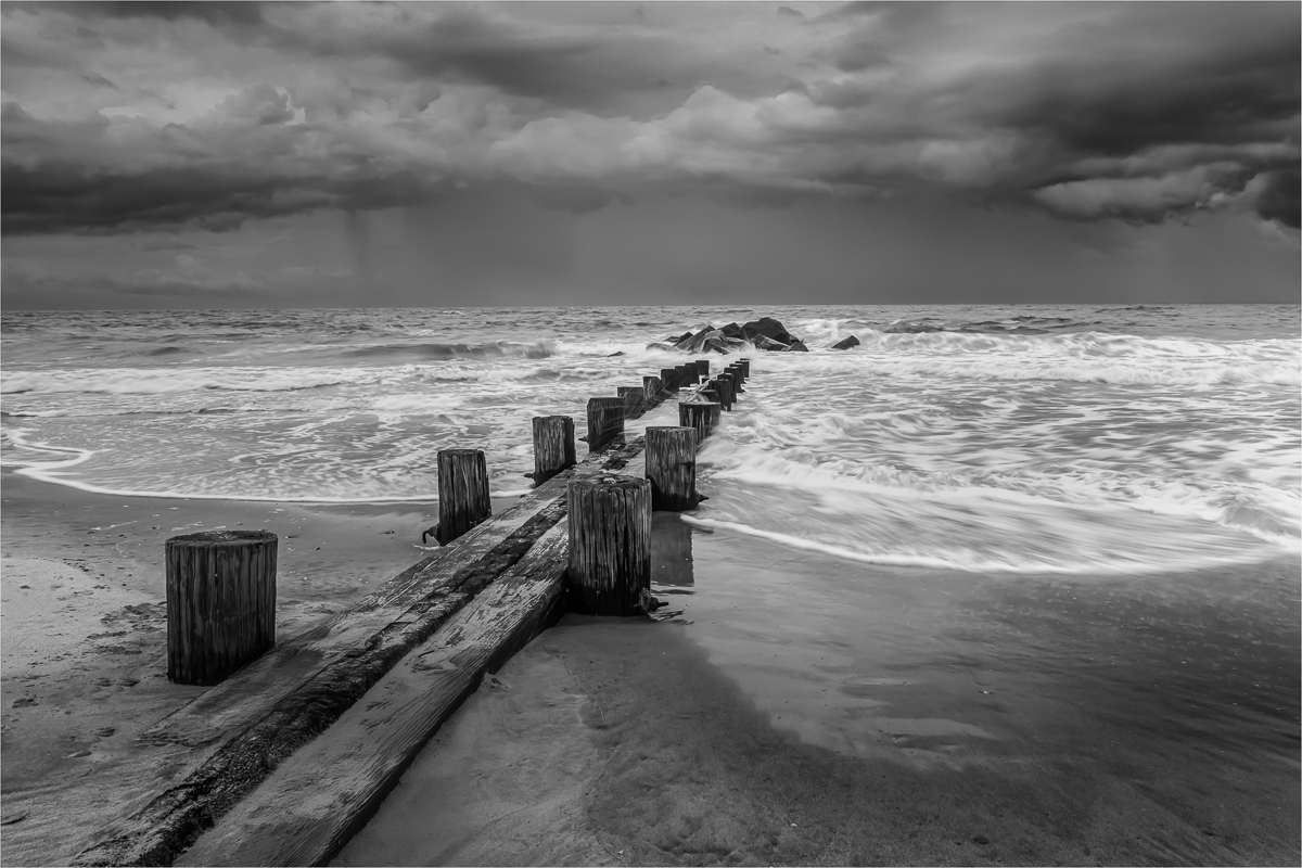
About the Image(s)
This image, originally captured in 2021, was recently converted to B/W as part of my ongoing effort to refine my monochrome processing skills and develop a keener eye for selecting images for conversion. For the editing process, I used Nik 7 Silver Effect to achieve the B/W conversion. In PS, I did a little dodge and burn, used the spot removal tool to eliminate a few minor distractions in the sand, and I added a stroke to frame the image. I look forward to your feedback and suggestions.
Canon R5
ISO 50
24mm
F/13
1/6 sec
Tripod mounted
This round’s discussion is now closed!
9 comments posted
First, I think you did a really fine job with the wooden area structure as it pops out easily from the background. Still I think the wood could be a bit sharper. I asked for the color because it is the area of the sky below the heavy upper clouds and the water that bothers me. There is a squall in those clouds and I feel if the the tonal ranger were a bit wider that rain would be really dramatic. Because it is right against the brighter water it is more easily seen and just seem flat. I'm not sure this is the best choice for monochrome. I really do like the receding run of the water across the sand on the right side. Posted: 03/08/2025 14:50:28
Larry, your feedback is appreciated. I did struggle a bit to make the squall stand out a bit more without making it look like a blob of darkness. I'll take another look at the image. Posted: 03/16/2025 08:34:58
B, This is ART. I love it.
I would recommend you try a higher contrast and darken the sky on top. It may give it a more moody feeling. Great work! Posted: 03/09/2025 09:11:32
I would recommend you try a higher contrast and darken the sky on top. It may give it a more moody feeling. Great work! Posted: 03/09/2025 09:11:32
Thanks Adi. I appreciate the tip and will relook to see if more drama can be added.
Posted: 03/16/2025 08:36:15
Posted: 03/16/2025 08:36:15
This to my eye is a terrific image. I like your choice of B/W because it keeps the focus on the pier leading out to the rocks. It is well composed and has a good tonal range. To Larry's point, if you wanted more drama in the rain, one approach is to duplicate the layer and use a blend mode of Overlay just for the sky Posted: 03/09/2025 12:04:53
Thank you Michael. I never thought about duplicating the layer. I will definitely try this. Posted: 03/16/2025 08:37:06
Barbara, it's a very nice capture with pier leading out to the water and rocks. I would have wanted to have more drama in the sky withough doing the layering. Posted: 03/19/2025 22:44:02
Barbara - the B&W treatment is so compelling - I think you've done a nice job. If you want to darken the sky as suggested by other folks, if you use Lightroom Classic, you can create a linear mask (type M, then draw down on the + symbol to position and lengthen or shorten your mask. Playing with contrast and shadows instead of exposure can bring more depth and foreboding to the upper sky. I find that technique helpful in adding drama to skies. I like the edge stroke too! Posted: 03/20/2025 19:38:49
Wow! I really like the black and white treatment, and the clouds look fantastic. I like some of the suggestions, particularly adding a second layer with overlay. Another thing you could do is just burn in selection areas of rain to give a sense of columns of rain showers. Posted: 03/27/2025 22:30:15