Michael Jack, QPSA
March 2025 - South Haven Morning
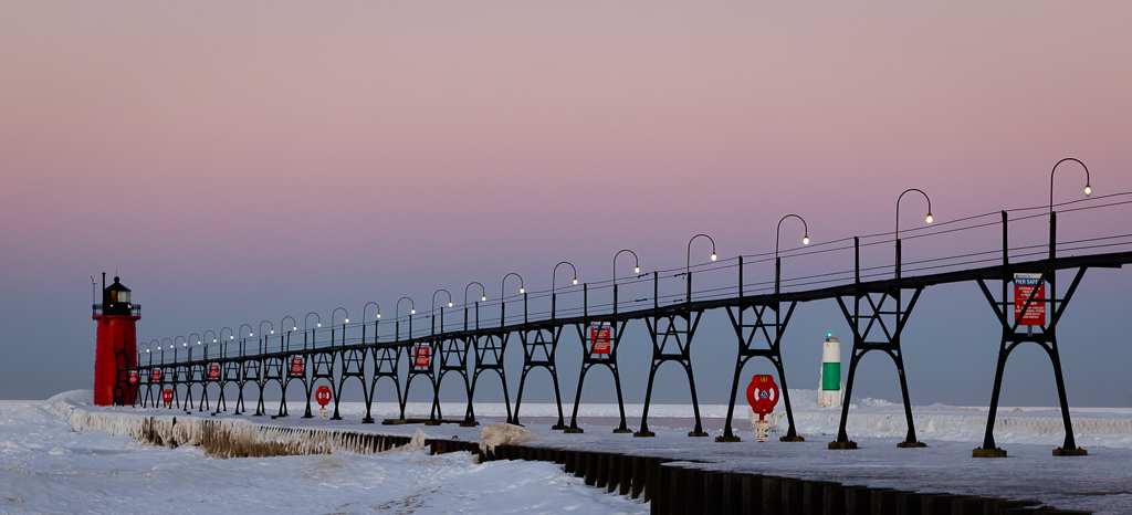
About the Image(s)
Attached is my March image. February's image was the South Haven MI lighthouse at sunset. This image was at sunrise. By popular demand, this image has cooler tones than the previous one. Earth's shadow darkens the low sky. It took a number of shots to get the light on the northern lighthouse even though I had it down to every six seconds. I think it was 14 degrees. .Processing incorporated Topaz Photo AI to remove some noise although the R5 is pretty good at 1600 ISO
Canon 5R, ISO 1600, 88mm, 1/125 sec, f9
This round’s discussion is now closed!
8 comments posted
Ok, I'll agree that this image has cooler "natural" colors than the image from last month. But the thing I noticed the most is how much those red banners dominate the scene. Even the green tower on the right has become an attention grabber. The image is, of course, technically sound and I like the natural colors. But between the two I believe the image from February feels more like winter even with the warmer colors. I enjoy seeing both images and if I had not seen last month's I would likely rate this as excellent. But I'm going back to February so I can feel cold since it is getting warm here in Florida. Posted: 03/08/2025 15:35:11
Personally I like this ver. more than the other ver. Not for the colors but for the texture. The reflections from the snow and the tonally range here gives the picture a smoother easy feeling that allows the viewer to concentrate more on the pier and lighthouse. More so, the red lighthouse on the blue background is more visible than, on the orange colors in the other picture. Posted: 03/09/2025 09:00:27
Hi Michael. After looking at both images together, each photo conveys a distinct mood for me. The February image suggests a scene showing winters harshness while March presents a more peaceful, soothing and welcoming location even though it was taken in 14 degree weather. For me, the calming and serene atmosphere created by the cool blue tones is nicely complimented by the vibrant reds, purplish-pink sky and stark black pier. Also, the pop of green gives off a nice visual contrast for me. Posted: 03/12/2025 09:20:31
Michael, aside from the leading lines formed by the pillars and lamp posts, what I appreciate about this picture is the emotion it brings out. The leading lines give a sense of an adventure coming to an end, which brings a feeling of calm to my mind. Posted: 03/21/2025 00:20:45
Michael - I went back and studied your sunset scene and compared it with this sunrise scene - balancing chaos at sunset against a soft serene sunrise scene. To me, the sunrise scene has more impact. I love the sunset scene's golden hour color so pleasing, but feel find the scene's waves (snowdrifts??) distracting on lower left that keeps drawing my attention away from the leading line and the central subject lighthouse.
Last month's dramatic image has beautiful golden light and is sharp and crisp. But then seeing your peaceful sunrise scene with its soft morning pastels and brighter red and green highlights on the leading line add dimension and purpose. And the angle of this month's sunrise crop is more effective as the leading line stands nicely in front of the low horizon gray color.
Nice images - both! Posted: 03/21/2025 02:23:49
Hi Michale
This is just a test to see if messaging is working. Tom Pickering asked me to see it the adjustments from IT are working. Posted: 03/26/2025 19:20:46
This is just a test to see if messaging is working. Tom Pickering asked me to see it the adjustments from IT are working. Posted: 03/26/2025 19:20:46
I did not see any messages Posted: 03/29/2025 14:03:20
So I agree with the others that last month's image seems more wintery despite with warmer colors. After comparing the two images I think it is because February's image shows more of the frozen water, where this months is more centered around the walkway and lighthouse. The colors definitely stand out more in this months image. In last months image I could not tell that the lighthouse was red. The pastel colors in the sky are also quite pleasing as well as the leading lines to the lighthouse. I would have like to have seen an image taken from last month's vantage point to compare them. Posted: 03/27/2025 22:52:10