Arne Skinlo
About the Image(s)
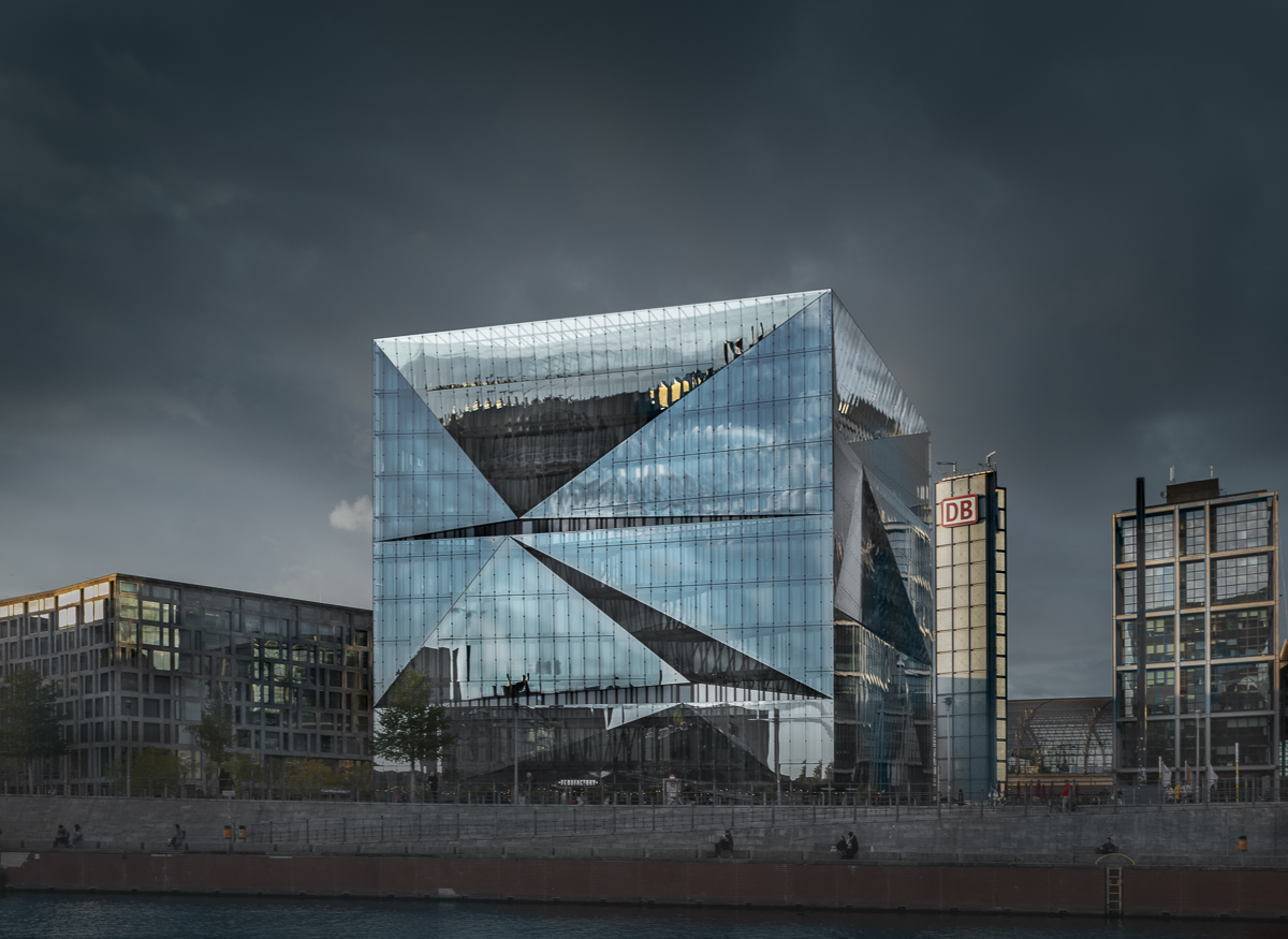
I attended a workshop with Joel Tjintjelaar about a month ago in Berlin. It was about black and white architectural photography, but sometimes colour works better. This is late afternoon, and the light is low. The buildings are masked out so I could process them differently from the sky. The post processing is mainly lighting the main building to make it stand out.
Camera: Fuji GFX 100S with Canon 24 mm TS lens
Settings: ISO: 125, 1/25 sec, f/9
Tripod
2 comments posted
I like the sharp crisp lines of the building but for me it is the matching sky that elevat3s this image. The simple moody color palette just brings this to life. For me the sharp diagonal lines of the building along with color make the subject so dominant that the flanking buildings seem to be hardly noticeable. I really like the mood created here. Posted: 11/14/2024 21:51:10
I like the way the center building seems to leap off the page with the brighter color and almost arrowhead design emerging in the image. I agree with Larry that the sky sets the mood. Keeping the busy foreground dark works very well. I am confused by the reflection in the building though - it looks like a partly cloudy blue sky while the sky in the image is a foreboding dark sky. I would have liked to have seen the B/W - it should be a great image as well. Posted: 11/14/2024 23:13:42
