Larry Treadwell
About the Image(s)
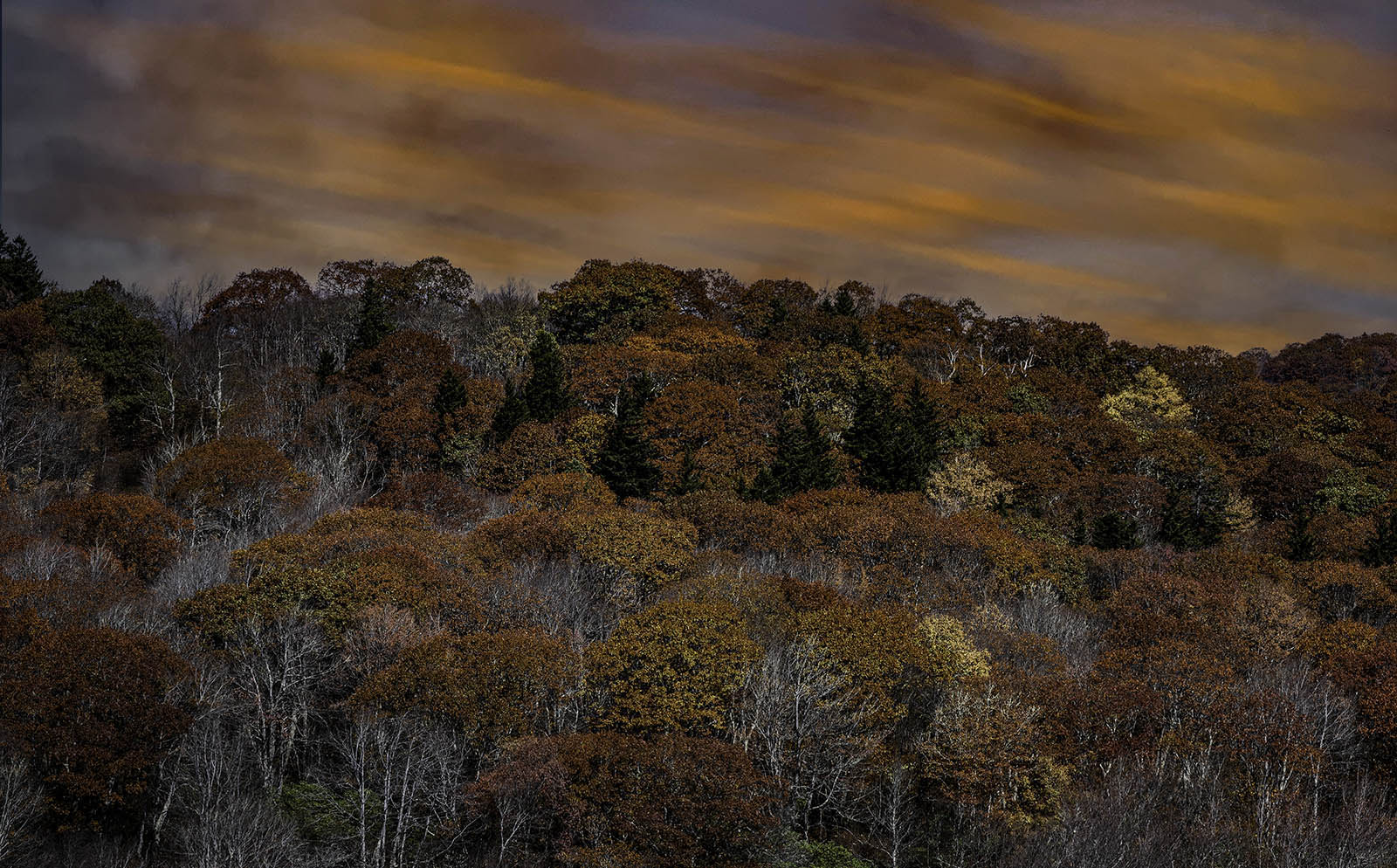
Autumn Rust
Nikon D850, 80-200mm f2.4 Nikkor lens @ 105mm, ISO 200, f8, 20 seconds, tripod.
I was in northern rural Georgia to see Anna Ruby Falls and hopefully get some fall color. I was heading back after not finding any interesting fall color and driving back roads through the Chattahoochee-Oconee National Forest (I love the southern names of forests) and was somewhere on Hwy 19. The day was ending, but I was in thick forest and could see the sky was glowing orange. I kept telling myself, “I’ve got to find a foreground” but was having no luck until a came around a bend where a gap in the trees allowed for a view of small field covered with some bare trees and some bushes well past their fall “prime”. Personally, I like working with a limited color palette as it intensifies the few color that remain. I used a longer focal length to limit my field of view to just a single part of the field. The setting sun was dropping behind the tree line and left the field in shadow, while the sky was quite bright. I didn’t want the sky to be the picture so I let the sun continue to set until the sky got much darker. Then I selected a slow shutter to let the clouds blur (streak?) so they would be less dominate. The foreground was much darker and so in post it required several masks to brighten it. I also used a number of additional masks to work on separate bushes to enhance their color and luminosity (especially the yellow trees). I increased the value of the whites to make the bare branches stand out and also used a color range mask to select the green trees and bring out the green color. Then, I selected the foreground and sharpened it in Lightroom. Originally, I liked the sharper foreground, but now I think I pushed it too far. My thought was to create some contrast between the blurred clouds and the sharper trees. But maybe that idea didn’t work too well either. I’m sure you guys will offer some advice on the issues I brought up.
