Bob Wills

November 2026 - Trek Trolls
Original
Original 2
Original 3
About the Image(s)
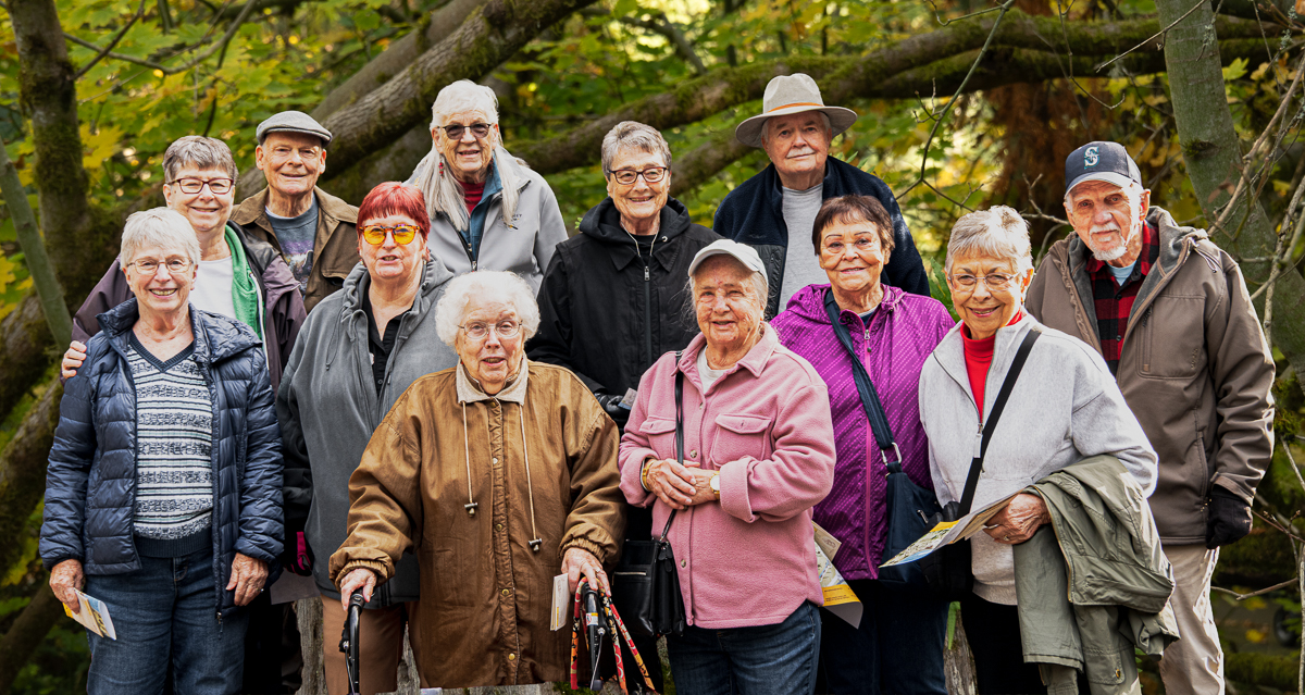
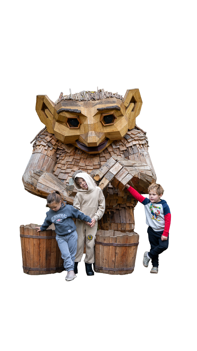
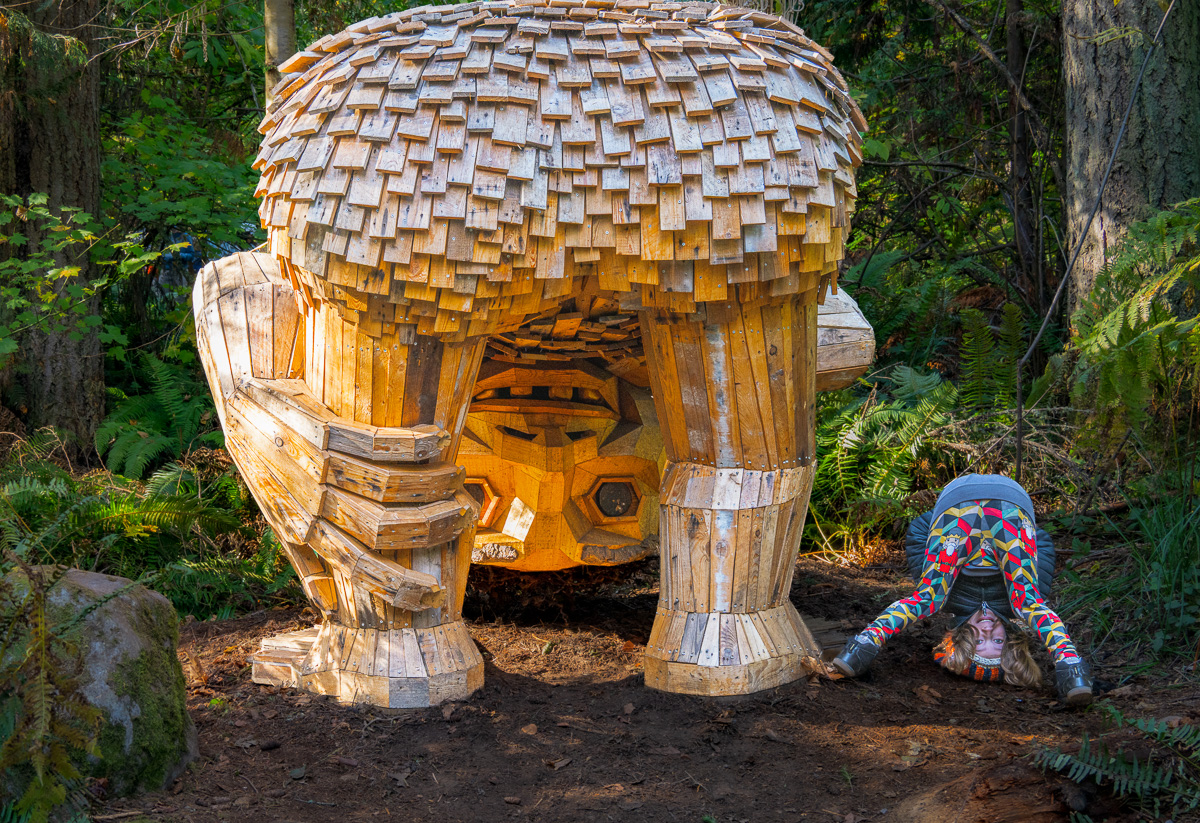
A busload of us “olde folks” climbed aboard a Patriots Landing bus for a trip to NW Trek in Pierce County to see the traveling troll exhibit by Danish artist Thomas Dambo. The exhibit features eight giant, multi-ton trolls tucked away along the park’s forested trails and throughout its natural habitats.
Dambo has created more than 172 trolls around the world, using recycled and reclaimed materials such as wood, pallets, and other locally sourced scraps. Many of these community-sponsored projects are built with help from local volunteers. We had more fun than work and thoroughly enjoyed the outing! I took lots of photographs and have already printed several to share with my neighbors. However, I haven't shown them this particular image yet.
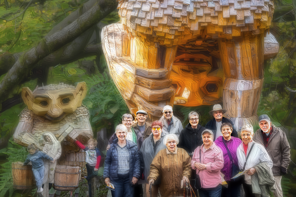
I started with a new gray layer and added the elements to that layer. I considered using Smart Objects, but I really don't know enough about them yet, other than understanding that they're a non-destructive way of working. I also tried to improve the blending, but I don't think I've quite gotten the hang of that yet.
I made a point of saving my work along the way, only to lose all my layers when I flattened the image and closed the individual elements in Photoshop. That's when I discovered that saving doesn't necessarily mean saving everything the way you intended!
At this point, I think my brain is getting a little fried from trying to incorporate too many new processes at once. I may need to slow down and master a few techniques before adding more to the mix.
Dorinda isn't particularly fond of the effects I used, so I'll hold off on showing it around until I hear what you all think. As always, I'm looking forward to your honest opinions and some good suggestions on how I might improve it!
17 comments posted
I think the images have been put together very well. I especially like having a group of "oldies" and some youngsters playing off to the side. You have chosen the right Troll as your main image as he seems to be looking at all of you. Not too sure what effect you have used but I like it and think it works well.
Well done. Posted: 11/01/2026 17:39:24
Posted: 11/02/2026 14:51:50
I love the composition. I thought it was one photo (not a composite) when I first looked at it. While I like it, I don't like the final texture as something I would hang on my wall. Posted: 11/03/2026 22:18:48
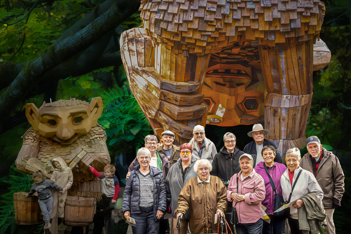
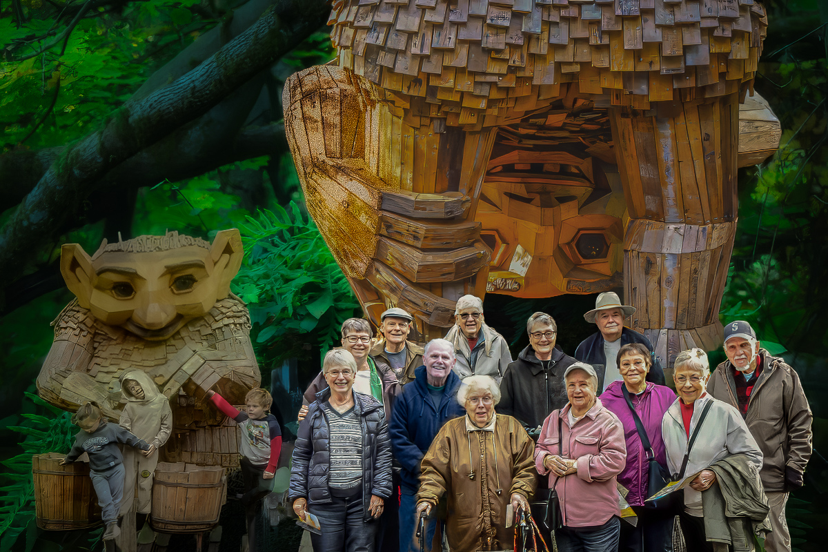
My sympathies on losing your layers; I've done that once or twice myself! Once I get to a point where I'm ready to flatten, I save the version with all the layers, then save a copy and call it XX-flattened.tif. I open that copy and THEN flatten it. Once I have only one layer again (background), I duplicate the layer so I can experiment with filters and such but still have the flattened layer intact. The advantage to that is also that you can apply Poster Edges, for example, and reduce the opacity of that layer so it's less harsh over the top of the "background" layer. Sometimes I duplicate a layer for each filter I want to apply to build effects, but not lose the previous layers. Not sure I'm explaining this very clearly.
The Poster Edges filter is a favorite of mine, but it definitely doesn't work great on faces, so I usually completely or partially erase the effect there. I've also found that in order to keep things subtle, the Edge Thickness and Edge Intensity sliders work best at no more than 0 or 1, and Posterization all the way to the right.
This will be a fun and unique reminder of the outing you and your neighbors participated in. Great times! Posted: 11/08/2026 00:12:48
I think I made the background layer (50% gray) at 1200 x 800 to meet the DD requirements. I probably should have made it larger to give myself more room to fit everything in. I've included a copy of what I've managed so far, but it's definitely taxing my brain to get it looking right. I tried starting over twice with the original elements, but kept running into dead ends.
Thanks for the sympathies and the workflow advice. I'm trying Poster Edges mostly because you've used it so successfully. Me, not so much! Maybe I'm trying to add too much too quickly. And Adobe keeps changing things with AI faster than I can learn them, making my workflow feel dated before I've even figured it all out! Posted: 11/17/2026 00:49:38
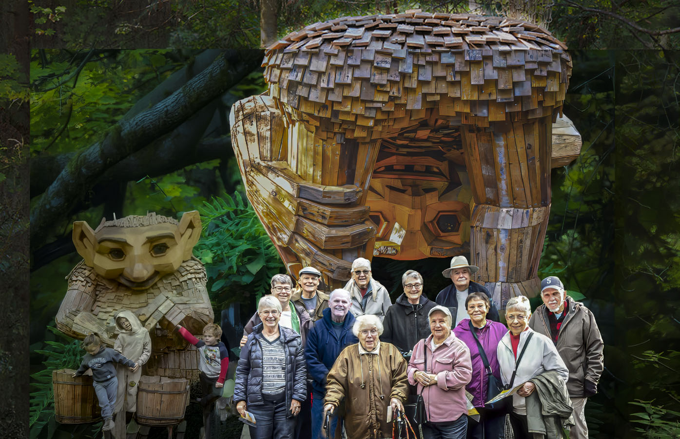
Just curious...Why did you start with a gray background? Which of the three images did you open first in PS? One suggestion for making Poster Edges less harsh (and some other filters too): keep the original size of your starting image (usually the background) when you start post-processing. Sometimes mine are 3,000 or 4,000 pixels wide. When the filters get applied to a larger image, they have more pixels to spread themselves out over. Not exactly a scientific explanation, but that's how it seems to me. I don't reduce the size of my final image for DD requirements until the very last step. Posted: 11/17/2026 18:34:53
As far as the highlight, I am creating this image for my Activity Coordinator, not competition. She wanted us to be the stars, so we are. Posted: 11/18/2026 15:49:31
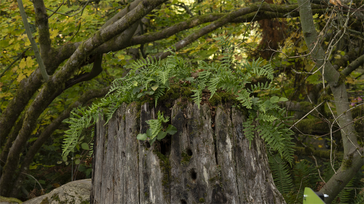
I think the composition of the three elements is fantastic and scaled well. Like others I don't think the filter you used does not work on the faces. I think this is a fun and whimsical image and scaled really well Posted: 11/08/2026 02:24:13