Angela Bonner, PPSA  


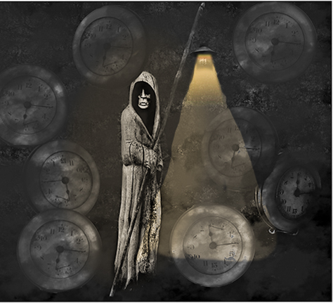
Time is Ticking by Angela Bonner, PPSA

October 2026 - Time is Ticking
October 2026 - Angela Bonner, PPSA

Original

October 2026 - Angela Bonner, PPSA

Original 2

About the Image(s)

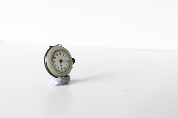
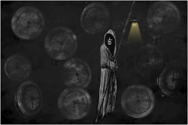
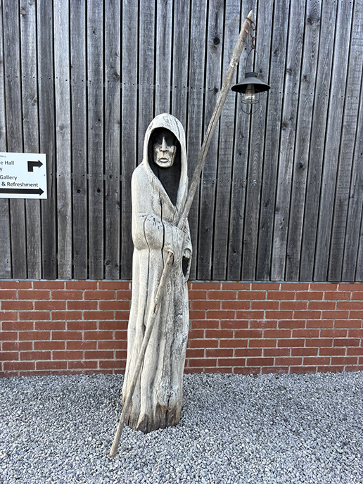
Rather a morbid image but something we all have to face!! The "statue" is a wooden sculpture taken outside a gallery where my camera club held an exhibition and sale of members images. It was taken with my iPhone. The watch is a very old one and I am not too sure where it has come from but may have been my mothers watch when she was nursing around the early 1940's!! If you are trying to work out my age I am 81!!!

I selected the watch and made numerous copies and placed them around the image resizing and flipping some of them. The "statue" was then placed slightly off centre. Using one of my cloud brushes (Jane Lazenby) and black colour, at a reduced opacity, I then brushed over the whole image except for the figure. I wanted it to have a dark murky look to go with the subject. Finally I "made" the light by using a method shown in the latest PSA Photoshop Projects summit. I then felt that the staff holding the light was a bit lost in the murk so using a brush in overlay and white I lightened it up a little. Finished then with a white keyline.


11 comments posted


Leonie Lewis   Leonie Lewis
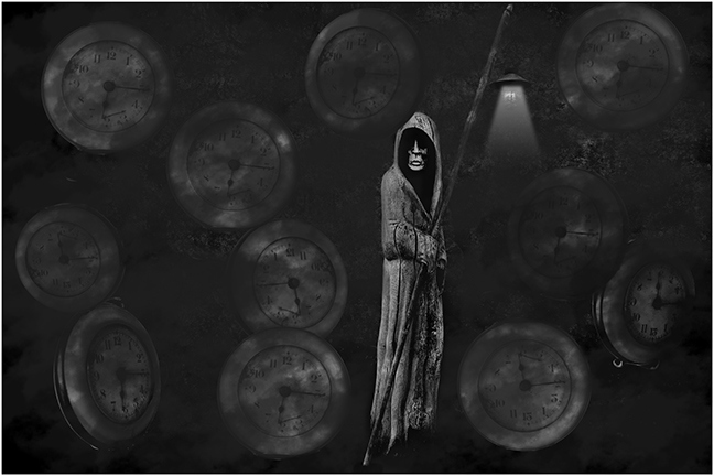
There's a strong Halloween concept here, and the black-and-white treatment definitely adds to the darker mood. For me, though, the composition feels a little busy, with the combination of the Grim Reaper and multiple clocks competing for attention. I wonder if simplifying the elements or creating a clearer focal point would give the image more impact. I'd also be interested to see a shadow on the reaper to add some seperation.   Posted: 10/03/2026 02:28:53


Angela Bonner   Angela Bonner
Thanks, Leonie. I agree the image may have too many clocks. Got a bit carried away. There is a shadow round the Reaper but it has got a bit lost in the background.   Posted: 10/03/2026 13:44:05


Sylvia Williams   Sylvia Williams
Angela,
Very cool! I love all the different angles of the watch. I wish there was a bit more room above and below the reaper.
As the rest of the photo is black and white, I think the light should also be a shade of white, not yellow.
but over all amazing image!   Posted: 10/05/2026 00:25:58
Comment Image


Angela Bonner   Angela Bonner
Thanks,Sylvia. I agree that there should be more room at the top but didn't really notice that till I it was uploaded. I take your point about the light also.   Posted: 10/05/2026 06:50:07


Bob Wills   Bob Wills
Hi Angela,
What a great idea-and it certainly makes for a gruesome story! I don't mind the yellow light nearly as much as I do the clutter. I cropped the clocks, although I really liked the one in the lower left. I just thought the crop gave the image a little more balance. I also think you had some room at the top, but that disappeared once you added the border.

Nice camera work on both images. I think we're improving!   Posted: 10/07/2026 23:29:00
Comment Image
Angela Bonner   Angela Bonner
Thanks, Bob. I like your crop also extension of the light which now goes down to lower clock.   Posted: 10/08/2026 06:52:02
Bob Wills   Bob Wills
Thanks, Angela. I couldn't quite get the light to make that nice, straight line the way you did. I also think the light should "bleed" a little into Mr. Reaper, which, IMO, helps him blend into the image more naturally. Great image!   Posted: 10/08/2026 14:53:12
Angela Bonner   Angela Bonner
Yes agree with you again Bob!! I was well pleased with how my light turned out but can see needed more wotk.   Posted: 10/08/2026 16:40:10


Steve Wessing   Steve Wessing
I agree the crop is too tight, and there are too many clocks. I think the yellow light would be fine if the edges were a bit softer. What seems most off to me is that the clocks should be starkly visible, and the reaper should be more obscured.
  Posted: 10/09/2026 04:17:07
Angela Bonner   Angela Bonner
Thanks, Steve. Lot of different views this month!,   Posted: 10/09/2026 06:56:13


Jan Handman   Jan Handman
A very spooky and appropriate image for October Angela. Combining clocks and the Grim Reaper was a great idea. I do think fewer clocks would support the concept but not detract from your main subject (maybe 3 to 5?). Perhaps make them different sizes, in addition to the different angles and opacities you have done. I like the way you tapered and darkened the bottom of the reaper; it makes him look like he's levitating. I think I prefer the B/W version of the light beam, but the yellow one has its charm too. Nicely imagined and processed!   Posted: 10/10/2026 19:22:17


Please log in to post a comment