Frans Gunterus, QPSA  


Toward the Light by Frans Gunterus, QPSA
July 2026 - Toward the Light
July 2026 - Frans Gunterus, QPSA

Original

About the Image(s)

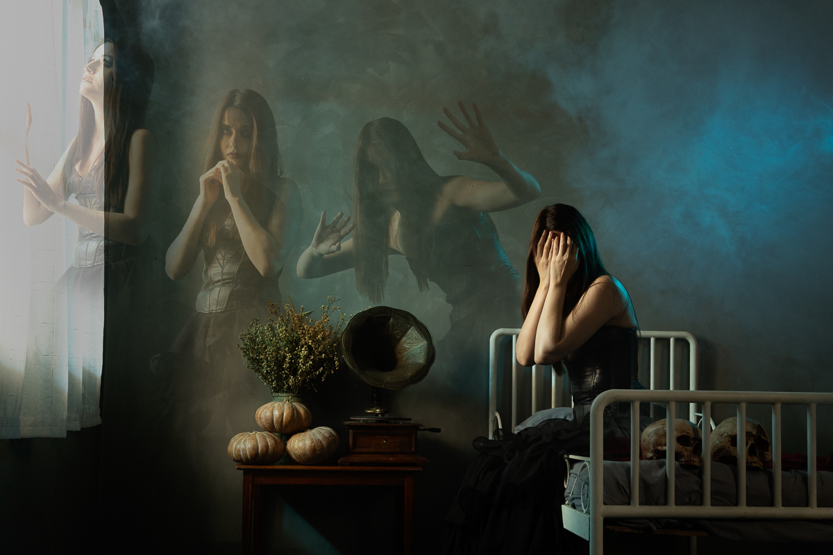
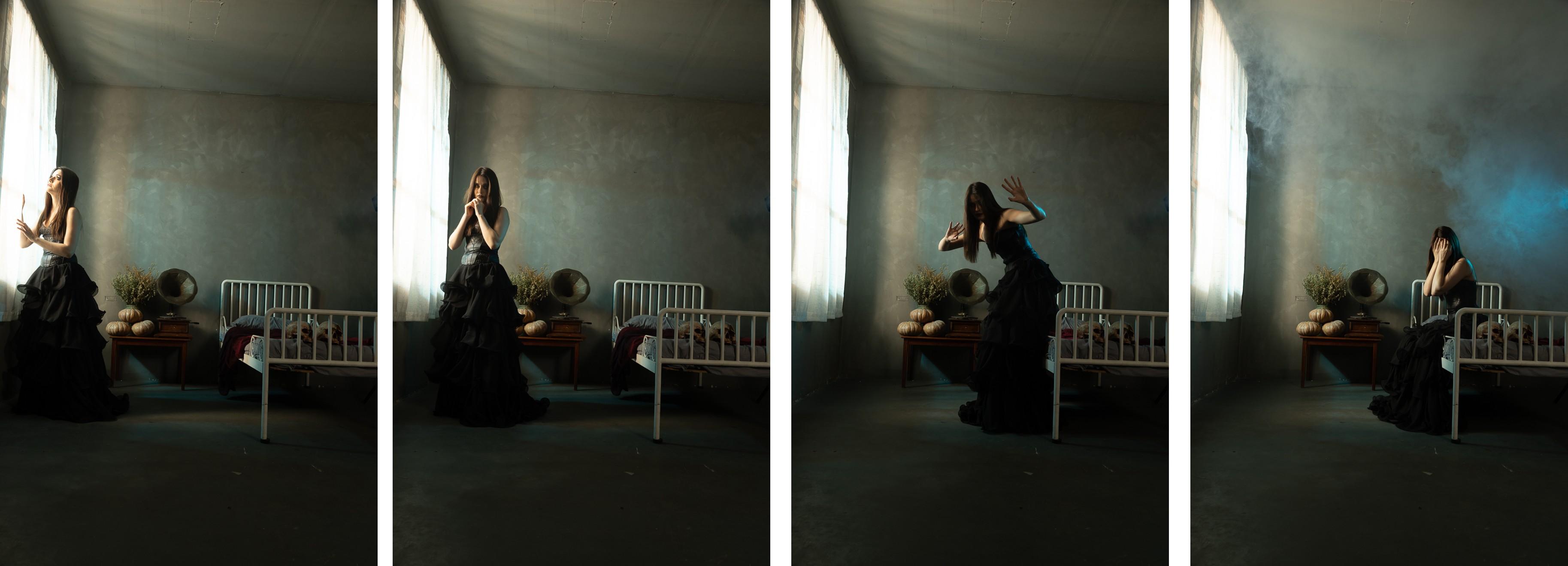
Created from four carefully selected images out of forty-two captures, this conceptual composite explores the moment when the spirit begins to leave the body. I invited my model to imagine her final moments, as her soul slowly detaches and is drawn toward the light beyond the window.

Through compositing and gradually decreasing layer opacity, I sought to create a haunting yet ethereal sense of movement, as if multiple stages of consciousness coexist within the same space. The apparitions symbolize the soul's transition, while the seated figure represents the final struggle between attachment and release.

My intention was to create a dreamlike visual narrative that invites viewers to reflect on mortality, transformation, and the unknown journey beyond. Constructive comments and suggestions are most welcome.


13 comments posted


Angela Bonner   Angela Bonner
A rather morbid concept but all has been very well done. You have certainly captured the soul making it's way to the light through using different levels of opacity. The dark and swirling background works very well and adds to the atmosphere as do the two skulls on the bed.
Well done!!   Posted: 07/02/2026 12:37:16
Frans Gunterus   Frans Gunterus
Hi Angela. Thanks for your comments. Please review my response to Sylvia Williams.   Posted: 07/08/2026 08:17:46


Bob Wills   Bob Wills
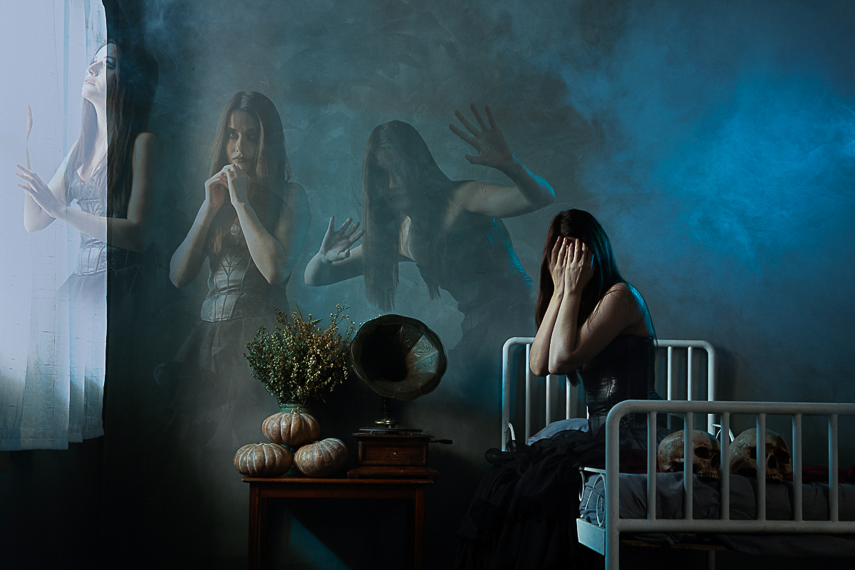
Hi Frans, I am in awe of your idea, and ability to imagine how it would look. Beautifully done. I think you probably anticipated some response like Angela's and made the image more warm. If I had been imaginative enough to create this striking image, I might have embraced the dark more, since it contains a concept relating to belief.
I just added more blue to the WB, and masked then toned down the plant, pumpkins and subjects arms in LR. Just my thoughts on a terrific image.   Posted: 07/05/2026 15:28:12
Comment Image
Frans Gunterus   Frans Gunterus
Hi Bob. Thanks for your comments and suggestions. Please review my response to Sylvia Williams.   Posted: 07/08/2026 08:18:31


Sylvia Williams   Sylvia Williams
Frans,
Very cool concept, and well done. For me, the original picture does give the impression of a woman who has had a disappointment or embarrassment, not a woman whose spirit is about to leave her body. The middle two images are very well blended.   Posted: 07/07/2026 00:50:51
Frans Gunterus   Frans Gunterus
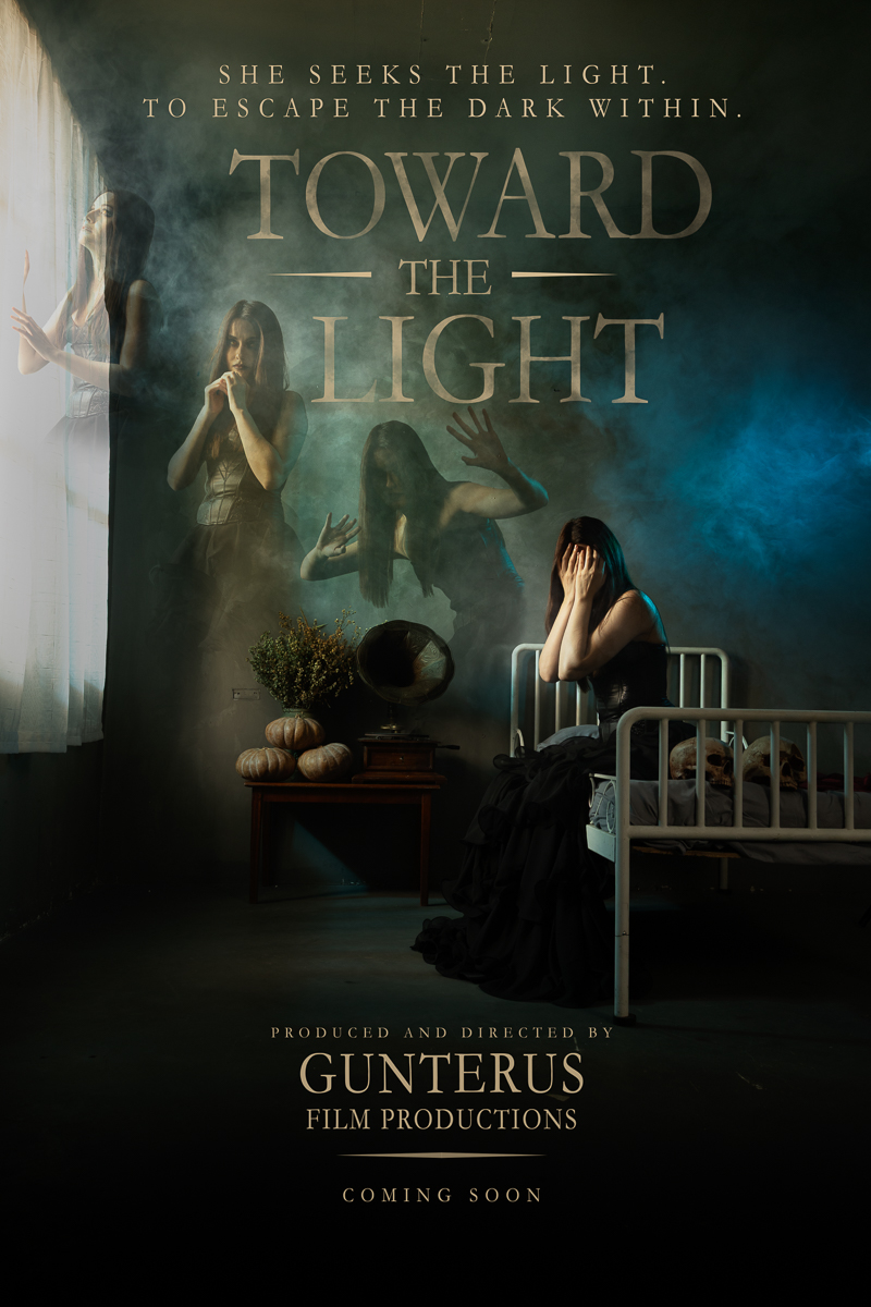
Hi Julia, thank you for your thoughtful comments. They have inspired me to reconsider the composition and perhaps reconstruct the composite to better convey the spirit's transformation toward the light. I'm even imagining presenting it as a movie poster, similar to the attached concept. I'd love to hear your thoughts (and other friends in this group) on this approach.   Posted: 07/08/2026 08:17:01
Comment Image
Angela Bonner   Angela Bonner
That looks brilliant and very professional!
Can also see as a book cover and a book I would like to read!
Well done.   Posted: 07/08/2026 11:35:12
Frans Gunterus   Frans Gunterus
Hi Angela. Thanks for inspiring me to make a book cover for next episode.   Posted: 07/09/2026 00:42:55
Bob Wills   Bob Wills
I like the table items being Darker in the poster. The woman seems too close to the top of the window for my taste. I like the half in/half out original without a defined window. If you feel the window needs fully shown, I would give her head a little more room. I think the subtle light path of the spirit journey leads them out of the window better than the original composite.
Nice finish as always, Frans.   Posted: 07/08/2026 14:48:02
Frans Gunterus   Frans Gunterus
Hi Bob. Thanks for your comments and suggestions.   Posted: 07/09/2026 00:43:31
Sylvia Williams   Sylvia Williams
I love your movie poster! Great concept.   Posted: 07/08/2026 19:49:51
Frans Gunterus   Frans Gunterus
Hi Sylvia. Thanks for your encouraging words.   Posted: 07/09/2026 00:44:31


Jan Handman   Jan Handman
Beautifully and adeptly composited Frans. I love the details and lighting of the original room shot. The poster version is fantastic. My only suggestion would be to increase the space at the top (as you did in the poster) so that the images could progress in a more upward direction, rather than mostly horizontal. The harsh, strong line between the dark room and white curtains distracts the viewer's eye away from the important final image of the young woman; maybe try softening that line a bit? You are indeed a master of imagination and compositing. Extremely well thought out, photographed, and processed!   Posted: 07/12/2026 20:21:25


Please log in to post a comment