Sylvia Williams
April 2026 - Reimagined Bloom
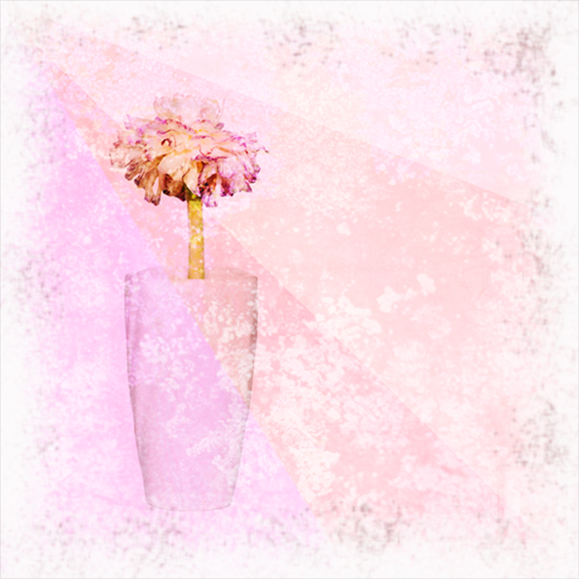
Original
About the Image(s)
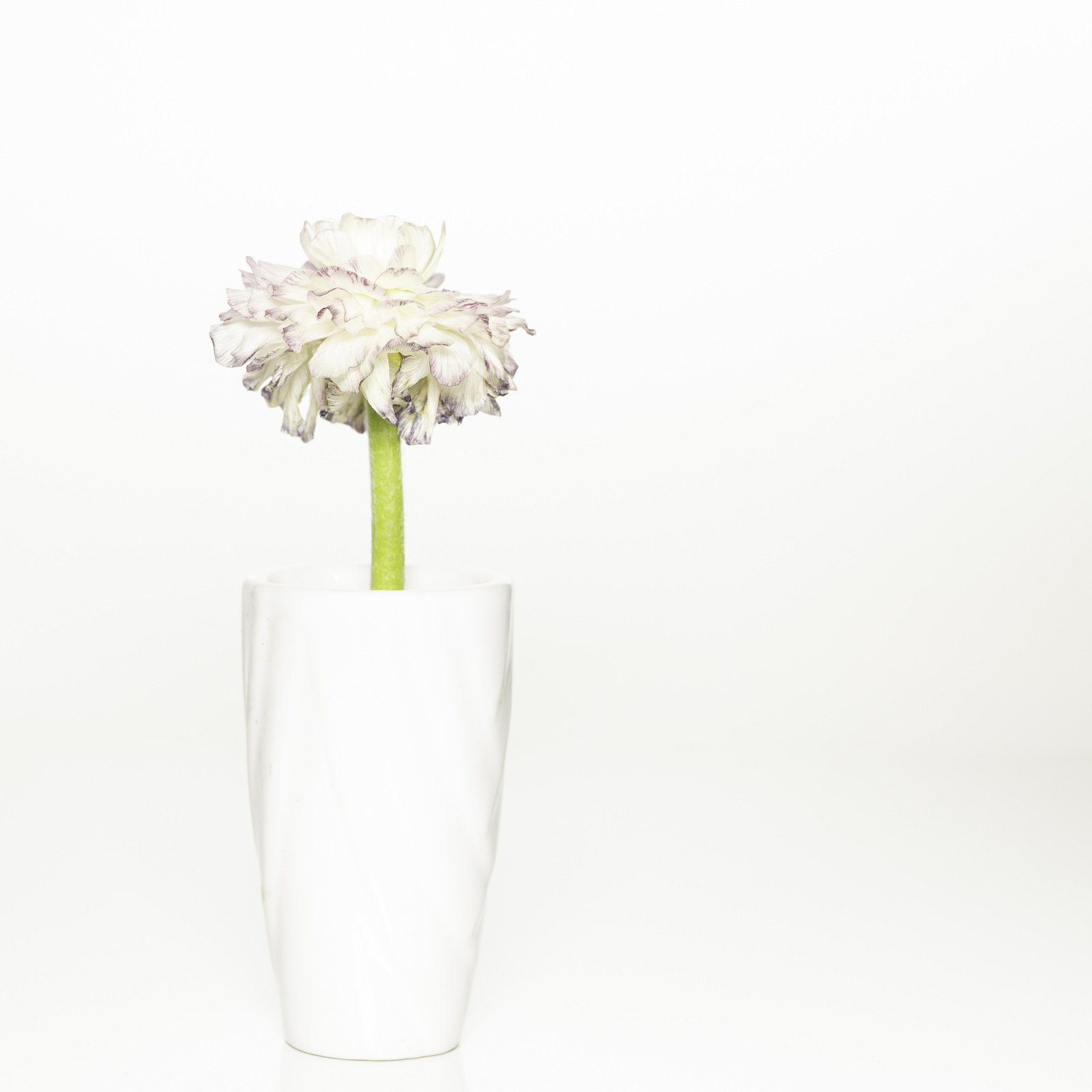
This month I had a hard time coming up with an idea (not unusual). So I opened up the original photo that I did for a 'high key' challenge in March. I don't love the original so I used my own textures to come up with an artistic edit and border.
I am thick skinned when it comes to my photography so happy for any comments or suggestions!
8 comments posted
I think it is always a good exercise to look back on previous images and re-imagine them as you have here.
You have used a lovely texture and I like what looks to be light shafts coming in from top left. For me the vase looks a bit "floaty" and perhaps needs a slightly darker base for it to stand on? Just my view! Posted: 04/02/2026 14:10:06
You have used a lovely texture and I like what looks to be light shafts coming in from top left. For me the vase looks a bit "floaty" and perhaps needs a slightly darker base for it to stand on? Just my view! Posted: 04/02/2026 14:10:06
I see what you are saying. I am not sure I have the skills needed. Posted: 04/02/2026 19:08:58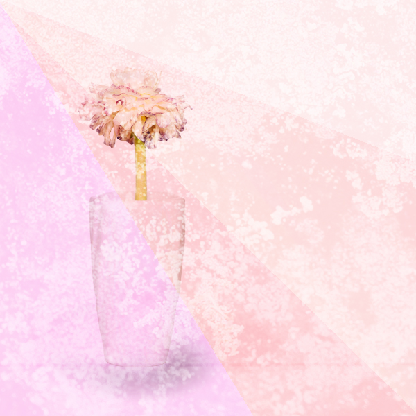
Hi Sylvia. This is a very nice image for April and Springtime. Your high key original is really lovely too. The blossom is especially pretty in the original, with its ruffled colorful edges. I think the texture you used in your final adds a lot to everything except the blossom; it seems to have made it look withered and dry. You could have used a layer mask to remove the texture (or part of it) on just the blossom. Are you familiar with layer masks? I agree with Angela regarding the vase needing a slight shadow to ground it. I played with your final to illustrate. I enlarged the blossom, removed most of the texture from it, and painted a shadow beneath the vase. Posted: 04/04/2026 19:50:52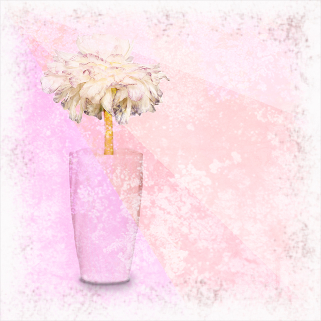
Thanks Jan!
I am familiar with layer masks and did remove some of the texture from the bloom. I was worried it would look too washed out, but I like your version better.
I have not tried making the shadow but can see that it adds a lot to the image. Posted: 04/04/2026 23:19:57
I am familiar with layer masks and did remove some of the texture from the bloom. I was worried it would look too washed out, but I like your version better.
I have not tried making the shadow but can see that it adds a lot to the image. Posted: 04/04/2026 23:19:57
Hi Sylvia, I like both versions, and I agree with most of the others' comments. I like Jan's version of the vase, except for the color. The flower does look a bit old with the texture color additions. I tried using the Color and Vibrance adjustment then the Clarity and Dehaze adjustment in PS to work on the flower. Then In LR I used the local mask adjustments to add more color to just the bottom of the glass. The shadow adds gray to an otherwise nice pastel, and that throws me off a little. We get an advance course here from Jan. Nice image. Posted: 04/12/2026 17:55:26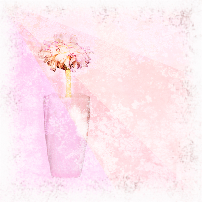
You are absolutely right Bob; I should have used a dark pink brush rather than a gray one for the shadow. I was thinking it wouldn't be noticeable enough with pink. Your edit helped the bottom of the vase surface look a little more contoured, which worked well. But to my eye it still needs a shadow under the bottom to keep it from looking like it's floating. Just me being nit-picky. Posted: 04/13/2026 21:45:04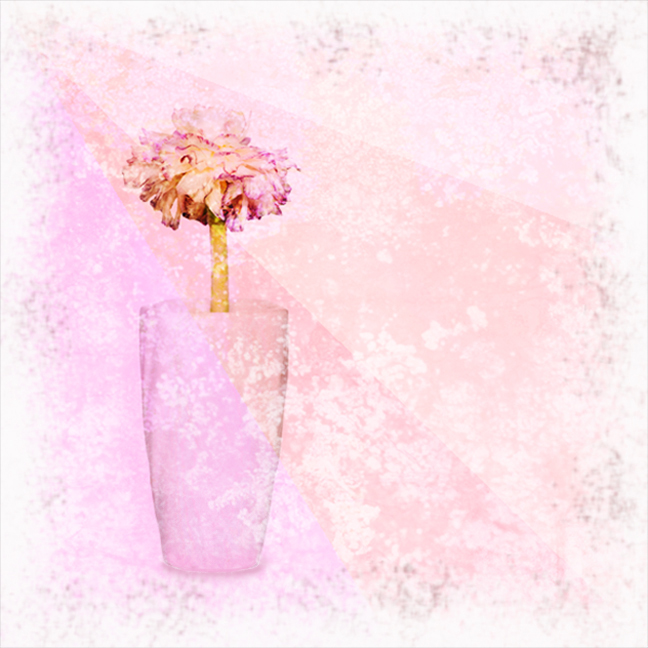
Nit-picky is what artists have to do. Posted: 04/13/2026 23:09:29
I like this a lot. You've added interest, depth, and leading lines to an already excellent high key image. Well done. Posted: 04/13/2026 07:46:04