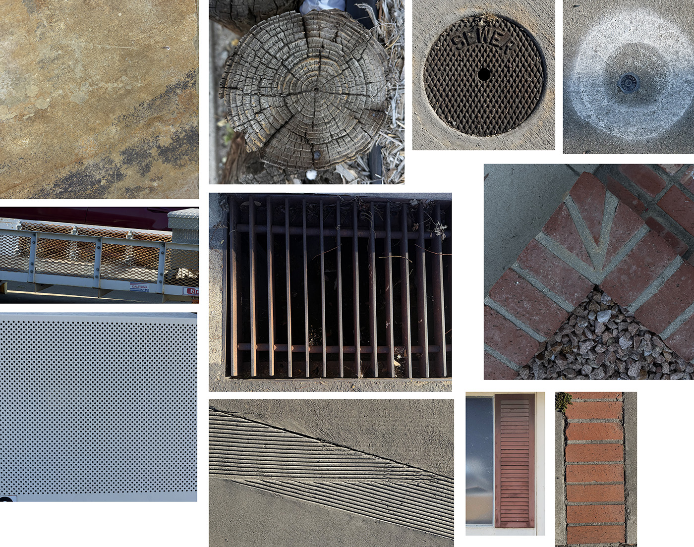
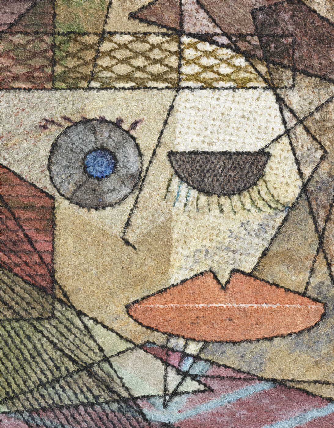
Something silly this month. I was sitting in a waiting room staring at a cubist painting and decided to try my hand at it. I needed to figure out a way to incorporate photos into the project for DD of course, so I thought maybe shooting different textures and geometric shapes I come across on my morning walks would give me something to work with. I started with the tan texture as a background for the face and then just placed other photos on separate layers over it. I thought it was going to be easy to recreate the cubist look, but it took a lot of trial and error. After I had the textures/shapes placed, I drew the characteristic black lines with a hard brush tool and the pen tool. The pen tool can be really frustrating! After I had the black lines done, I added the canvas texture so it would look more like a piece of “art.” Original 2 was the result of processing the final PS file in iColorama on my ipad, and I kind of liked the lines being more sketchy, but the textures aren’t as recognizable. Which do you like better? It ended up being a pretty corny result, but I had fun doing it. Picasso I am not.
10 comments posted
Sylvia Williams
Jan,
I LOVE what you did here! Very clever. Great composition. Very well done. I brought up your original to pick find the images in your composition - great use of shape and textures.
I greatly prefer the image you selected over the original 2. Posted: 04/01/2026 22:46:25
Jan Handman
Thanks Sylvia! Yes, I like the more defined lines and textures too. Posted: 04/02/2026 19:13:43
Angela Bonner
I wouldn't even know where to start to get something like this!!. It is really good and I like the final image better than the original. I like the way it looks as if you are winking to the camera. The canvas texture finishes off a great image and a great colour pallette!! Posted: 04/02/2026 14:22:12
Jan Handman
Thank you Angela. It was really just a matter of using the quick selection and polygon selection tools to cut out the pieces from the various texture photos and dragging them onto the tan background image. Then placing them where I wanted them and changing the blend mode and/or opacity on some of them so they showed through other pieces. That creates a lot of layers, of course, so sometimes it gets kind of tricky to keep track and manipulate the layers. But that becomes easier with practice. Posted: 04/02/2026 19:26:44
Angela Bonner
My biggest problem is having the idea!! I am sure I will get plenty from this group!! Posted: 04/03/2026 14:10:48
Bob Wills
Hi Jan, I think your Picasso-ish composite is terrific, hardly silly. I like the more muted O2, only because my one experience at an exhibition with a century old Picasso seemed more muted in my waning memory. Your final is probably more appealing to all because it is more vibrant. Great work and explanation. Posted: 04/12/2026 20:21:30
Jan Handman
Thanks Bob! Posted: 04/13/2026 21:52:16
Steve Wessing
You may not be Picasso, but you've improved this image. I'm reminded of Oleg Shuplyak. Posted: 04/13/2026 07:56:51
Jan Handman
Thanks Steve. I hadn't heard of him so I looked him up. Really interesting work. Kinda trippy. Posted: 04/13/2026 21:54:22
Bob Wills
You are a vast store of artists. Posted: 04/13/2026 23:05:16