Peter Katz  


The Mines of Syracuse by Peter Katz

December 2025 - The Mines of Syracuse

December 2025 - Peter Katz

Original

December 2025 - Peter Katz

Original 2

December 2025 - Peter Katz

Original 3

About the Image(s)

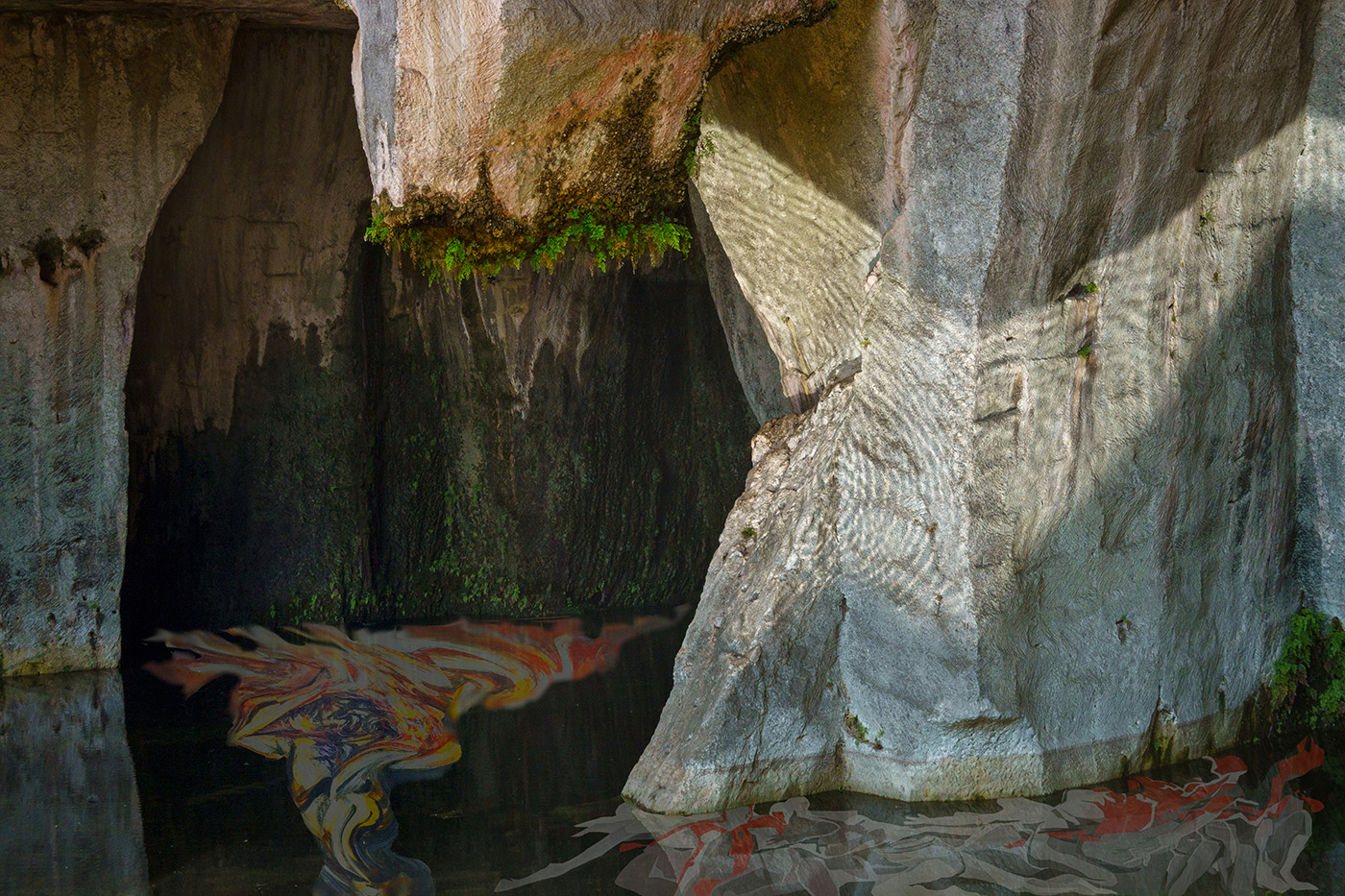
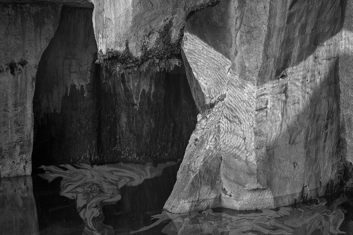
I took the background photo in an archaeological park in Siracusa, Sicily. (Sony RX-100, 1/125 sec, f 7.1, ISO 100, 21.56 mm.)The photo was of an underground mine (not so much underground since an earthquake altered the terrain in 1693.) This Huge limestone quarry was a hard labor prison in ancient times. The Athenians, imprisoned by the Syracusans after the defeat of the Athenian expedition in 413 BC during the Peloponnesian Wars, were doomed to end their lives as slaves here, carving out the limestone used to build the city.

The site had a strong emotional effect on me, (and no doubt on most of the people who know it.) The feeling was that of a concentration camp - an example of the horrible potential humans have to subject others to unbearable hardship and cruelty.

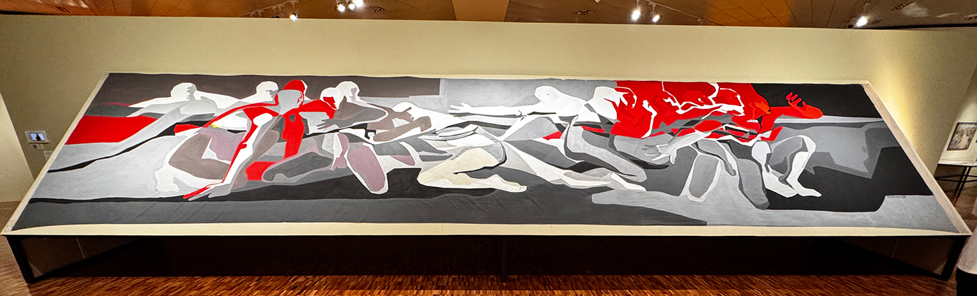
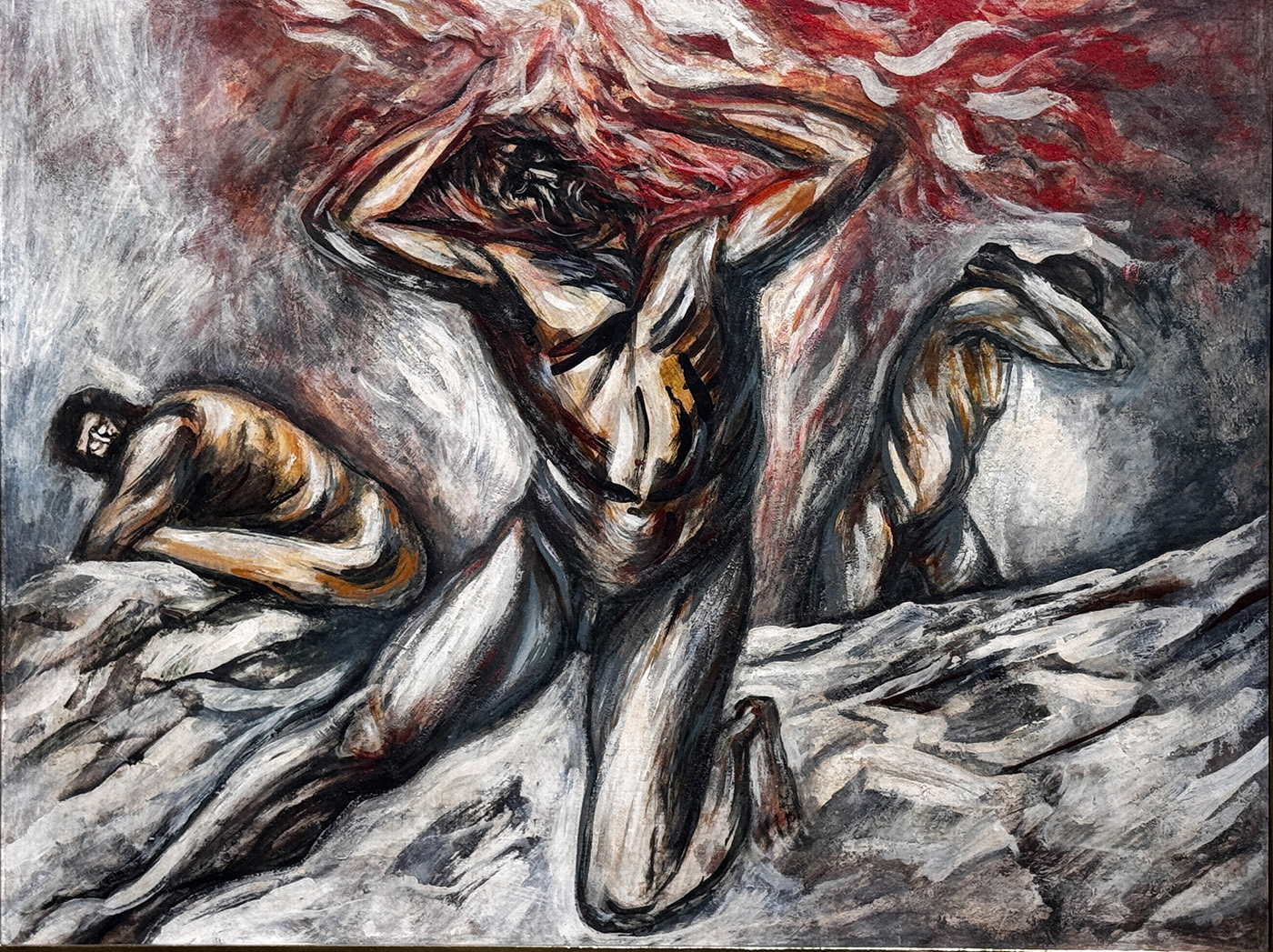
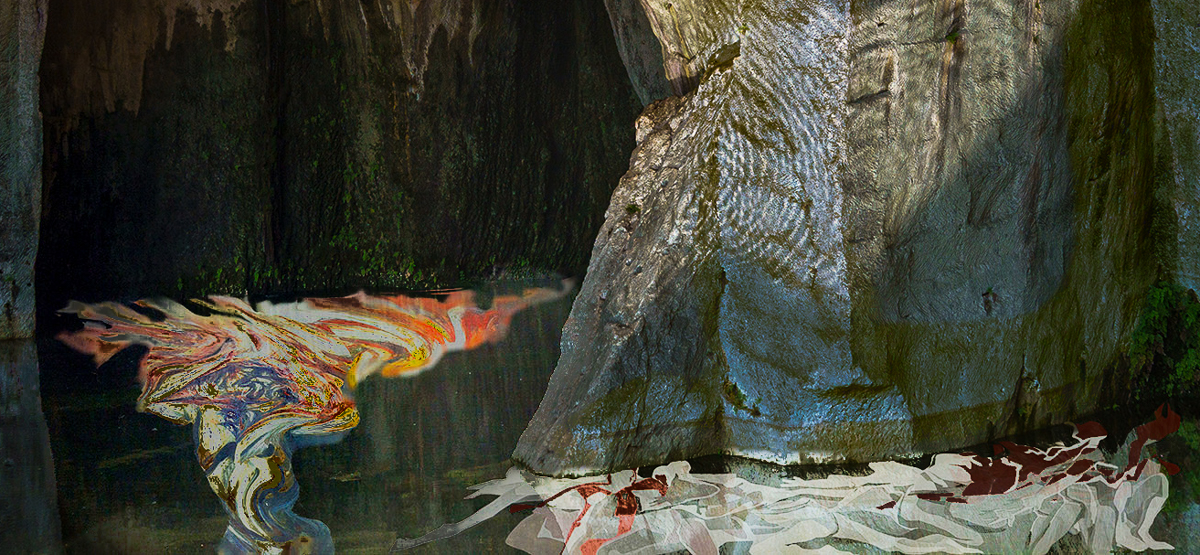
Upon returning from a trip to Mexico last month, I had taken some photos of paintings at the Museum of Modern Art in Mexico City which expressed human suffering (taken with iPhone 15 Pro.) I placed these images under the water in the background image and manipulated them using the warp tool in Photoshop to appear under water.


8 comments posted


Bob Wills   Bob Wills
Hi Franz, I think the selection of your images could make the story you wish to tell. The composite though doesn't give me the same strong emotional feeling. My eye is drawn to the lightest and most detailed. The left side and bottom of the image is dark and not as detailed. Your two underwater images of pain and suffering are lost in darkness and O2's odd angle makes it less impactful. I might consider looking at the image in B&W to evaluate where the brightest areas of your image are.   Posted: 12/06/2025 17:06:09
Comment Image
Bob Wills   Bob Wills
I am including an image that puts more emphasis on the suffering, which is what I think your emotions might have been. Just an idea.   Posted: 12/06/2025 17:09:05
Comment Image
Peter Katz   Peter Katz
Thanks Bob. In this case I was too wedded to the original image to crop off the top. I like your rendering in black and white.   Posted: 12/15/2025 01:05:21
Bob Wills   Bob Wills
I use the Tone and Color Evaluation tools developed by Blake Rudis. https://youtu.be/nTIlBJ4QkCc?t=15. Along with focus evaluation to help guide the viewers eye. Those tools help the technical artistry but not the story-telling and impact. That is more of the struggle for me.
The attached file is from the PSA website. © Tatsiana Rusetskaya
https://psaphotoworldwide.org/?

  Posted: 12/15/2025 15:08:53
Comment Image


Jan Handman   Jan Handman
Your background image is indeed very powerful once the viewer knows the story, but I think you created a huge task for yourself to convey strong emotions of human suffering and cruelty to your viewers. I think Original 2 is a little too abstract and angled to do that, but Original 3 definitely has the potential to do so (especially the tortured face of the main figure).

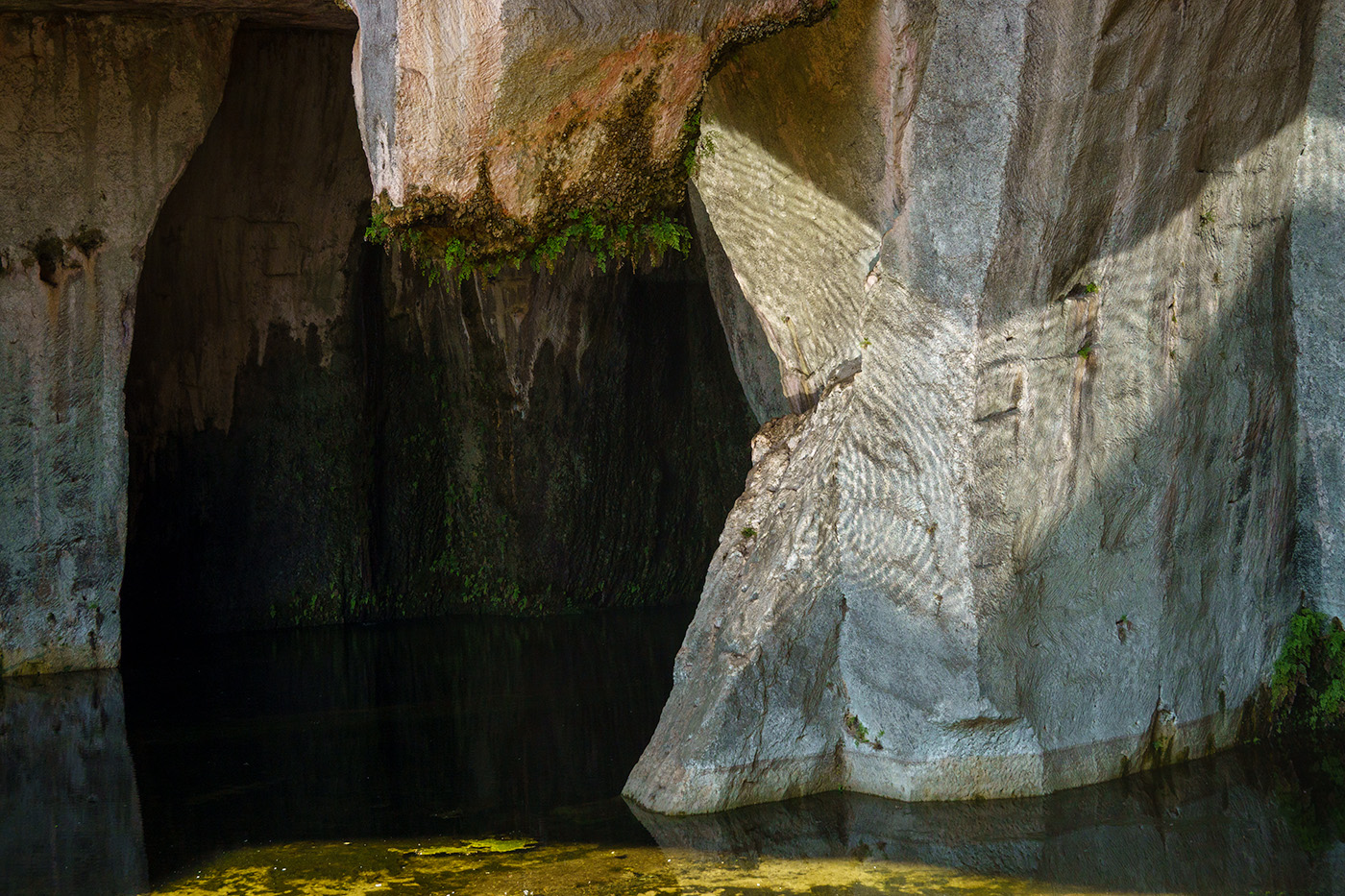
You did a good job of lightening up the wall where the ferns are growing and the detail there is wonderful. You also did well eliminating the bright sunlight in the water at the bottom.

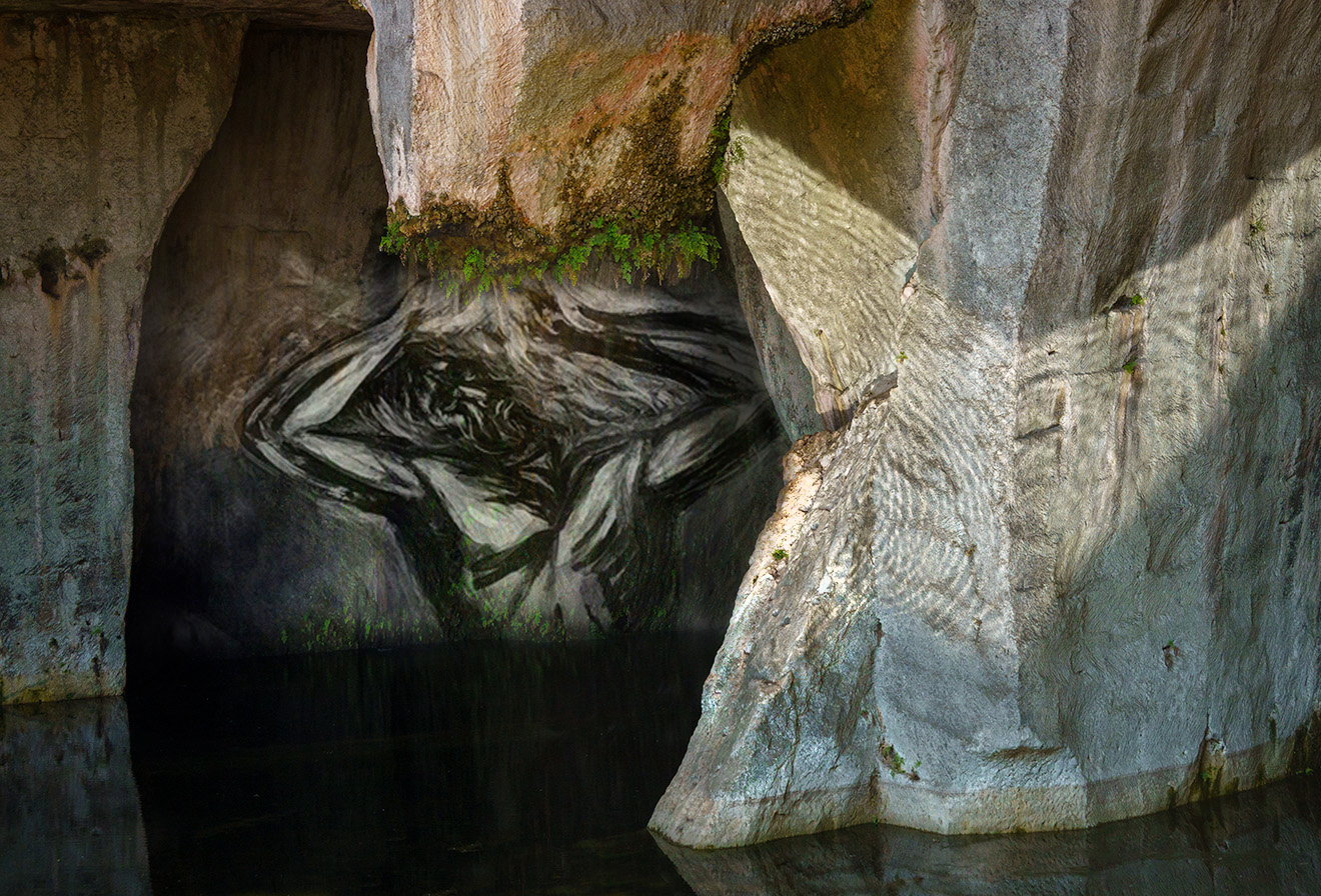
I used PS to see if I could emphasize the strongest parts and simplify the overall image a bit, so that the viewer has less interpreting to do. I used Luminosity Blend Mode on the man and a mask to eliminate the parts of that image that weren't needed. Perhaps it isn't at all what you had in mind; just another perspective to consider.

I really applaud your ambition in tackling this project, especially considering you haven't been doing composites for very long. You have a strong vision for creating impactful images.   Posted: 12/11/2025 23:04:23
Comment Image
Peter Katz   Peter Katz
Thanks Jan, I like your placement of the tortured man and the desaturation of the color. However, I had it in my mind that the figure would be (buried) under water, but I think I could have done it more subtlely.
The original photo was one of my favorites - it initially was so dark that you could hardly see anything, but thanks to the RAW format, i was able to lighten it and that is when the circular mineral deposits on the cave wall became visible.   Posted: 12/15/2025 00:58:18


Steve Wessing   Steve Wessing
Emotional gravity is very difficult to convey visually. The starkness of your original image conveys the foreboding tragedy better than the softer composite, and both require an explanation to convey the true gravity. The image itself is well composed, but also more confusing than the original. I might have used more transparency and less warp to make the water appear more present.   Posted: 12/12/2025 16:12:34
Peter Katz   Peter Katz
Thanks Steve, I struggled over how to make the figures look more under water. Ultimately I settled on some warp and some selective twirling of the tormented man. I experimented with different opacities of the figures under water, but each time when I lowered the opacities, I felt that the figures were not pronounced enough.   Posted: 12/15/2025 01:10:34


Please log in to post a comment