Peter Katz  


Enchanted Shopping Center by Peter Katz

July 2025 - Enchanted Shopping Center

July 2025 - Peter Katz

Original

July 2025 - Peter Katz

Original 2

July 2025 - Peter Katz

Original 3

About the Image(s)

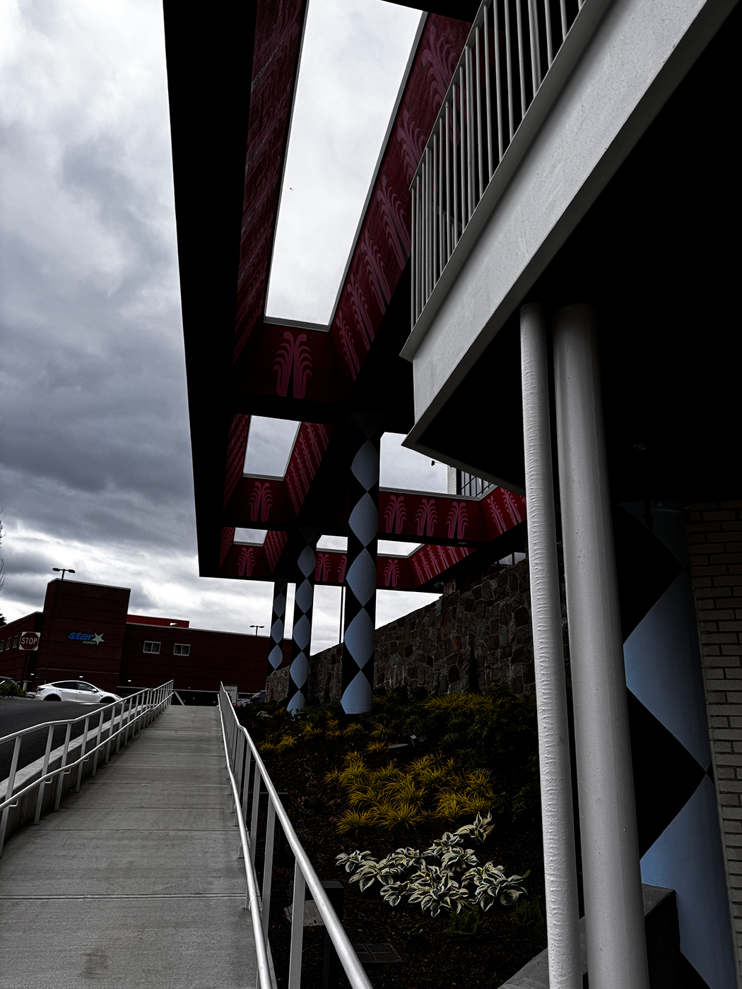
I started with Shopping Center.jpg - taken with iPhone 15 Pro. For some reason the camera was all wrong with the exposure settings - others photos I took of the same area were much brighter and more saturated. Once I lightened and increased vibrance in PS. I do not recall doing anything else with that photo. (Unfortunately I did not save the pdf - so I do not recall exactly.)

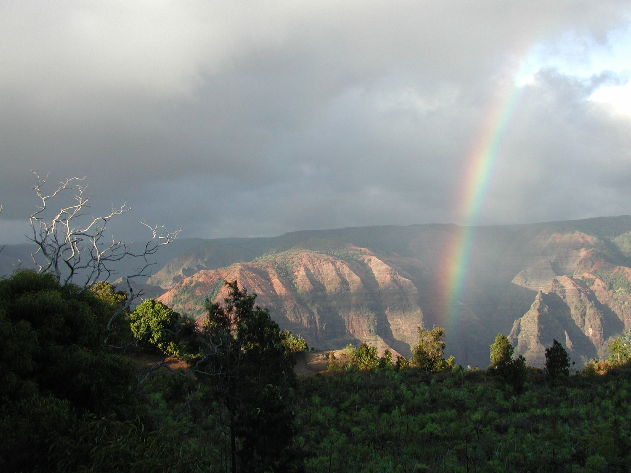
Next I brought in an old photo from Hawaii, taken with an Olympus C3040Z ( f/2.8, 1/400 sec, 100 ISO) I thought that the rainbow and mountains added a magical feel for the background to the shopping center. I flipped the background horizontal so that the rainbow would not be hidden behind the foreground. I used a clipped layer to insert the background through the skylight openings of the whimsical structure in the foreground.

I used AI to continue the stone wall in the right side foreground of the picture (where there had been a tan brick surface.) I also used AI to replace the building at the end of the ramp with vegetation.

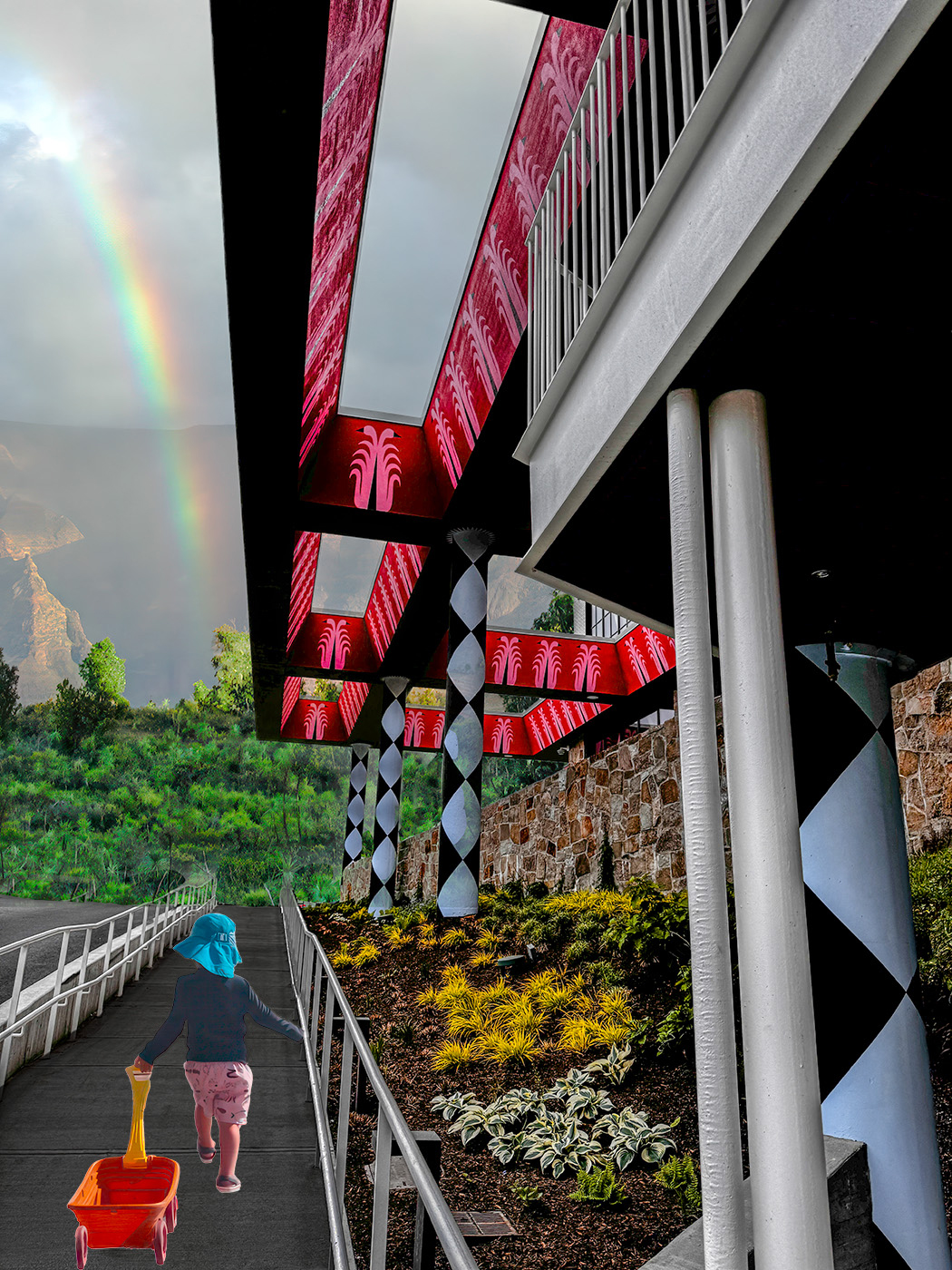
Finally, I brought in a photo of my grandson pulling a wagon behind him down a boardwalk to the beach. (iPhone 16 Pro.) I think that this was the missing element to give the composite a center of focus. I flipped the boy with the wagon horizontally to be mindful of the direction of sunlight. At this point, for the same reason, I darkened the handrail on the right side, and brightened it on the left side.


8 comments posted


Patrick O’Brien
Good attempt Peter! Still needs work. Its good you flipped the human subject to match the unseen light source but the lighting overall is still inconsistent. The highlights on the child are from direct sun exposure coming from the right, while there is a wall and building on the right actually blocking the sun. The overall composition is OK, but the inconsistent lighting makes it look too obvious and fake. For the sake of authenticity, inconsistent lighting details are probably the easiest to spot and the most bothersome.   Posted: 07/11/2025 06:41:21
Peter Katz   Peter Katz
Thanks for your comments Patrick. I struggled a bit with the light on the child's right leg, and in other places. I tried adjusting with brightness/contrast, but when I did that, the color was way off - and adjusting colors is one of the things I need to improve on in PS!   Posted: 07/14/2025 20:40:19


Jan Handman   Jan Handman
Fun image Peter. I love the bright colors. And you did a great job of pulling out the details from the dark original. I sort of disagree with Patrick about the lighting. There are faint shadows from the handrails on either side of the walkway, which indicates to me that there's diffused light coming from mostly straight above. Your grandson is definitely lit from the side, but I think you could mitigate that by reducing the contrast on the original, rather than increasing it as it appears happened in your final. The issue for me is that he looks pasted in because there's no shadow beneath him or the wagon. The original shadow is much too slanted, so I just painted in one more directly under him and the wagon to ground him to the walkway. Not done with much finesse, but you get the idea.   Posted: 07/11/2025 22:46:03
Comment Image
Peter Katz   Peter Katz
Thanks Jan - the colors of the structure above the wall were quite vivid to begin with. That is what initially drew my eye. I was a bit confused as to where the light should have been coming from, and the light on the boy's leg did seem a bit out of place.
Regarding the shadow - yes, I see how your modification improves the cut and paste look in my version. Could you describe how exactly you painted in the shadows?   Posted: 07/14/2025 21:08:17
Jan Handman   Jan Handman
Peter, I tried to answer your question, but I guess it was too wordy and wouldn't post. I'll send it by email instead.   Posted: 07/15/2025 21:59:58


Steve Wessing   Steve Wessing
Yet another perspective: I would try brightening and warming the entire walkway, and dropping a new shadow from the railing.
That said, I love the overall image even with the inconsistent light.   Posted: 07/23/2025 17:30:05


Frans Gunterus   Frans Gunterus
Hi Peter. I like the overall look of the image. I also like to see how you response to Patrick and Jan suggestions. I agree with the groups. Consistent light directions is really vital in arranging composite elements. To me, the light of the child is just nice if you did not it. I would then include a bit of child light shadow to make it touching the ground.   Posted: 07/25/2025 00:09:12


Peter Katz   Peter Katz
Thanks Frans. I had trouble with the lighting from the very beginning. (so much to learn...!)   Posted: 07/26/2025 17:38:07


Please log in to post a comment