Jan Handman
About the Image(s)
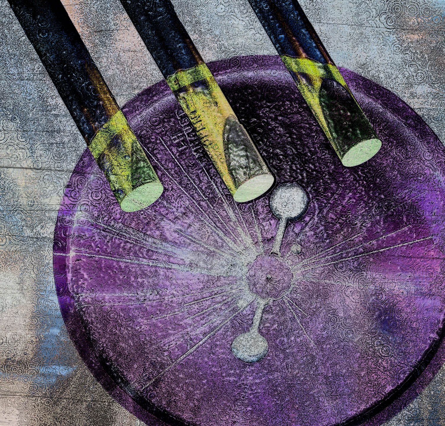
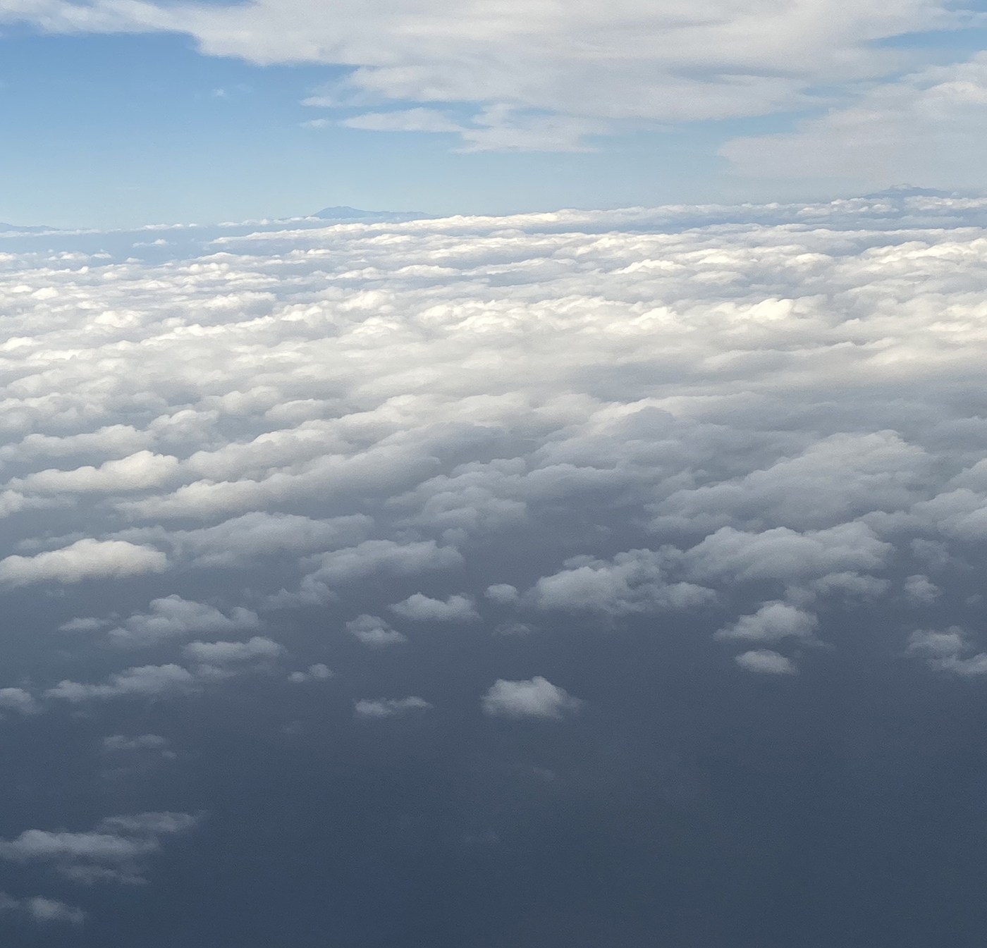
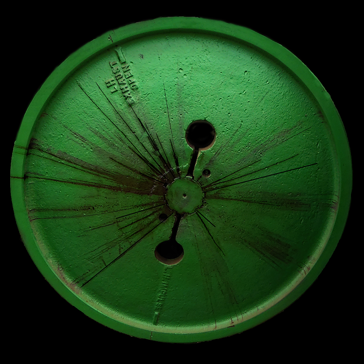
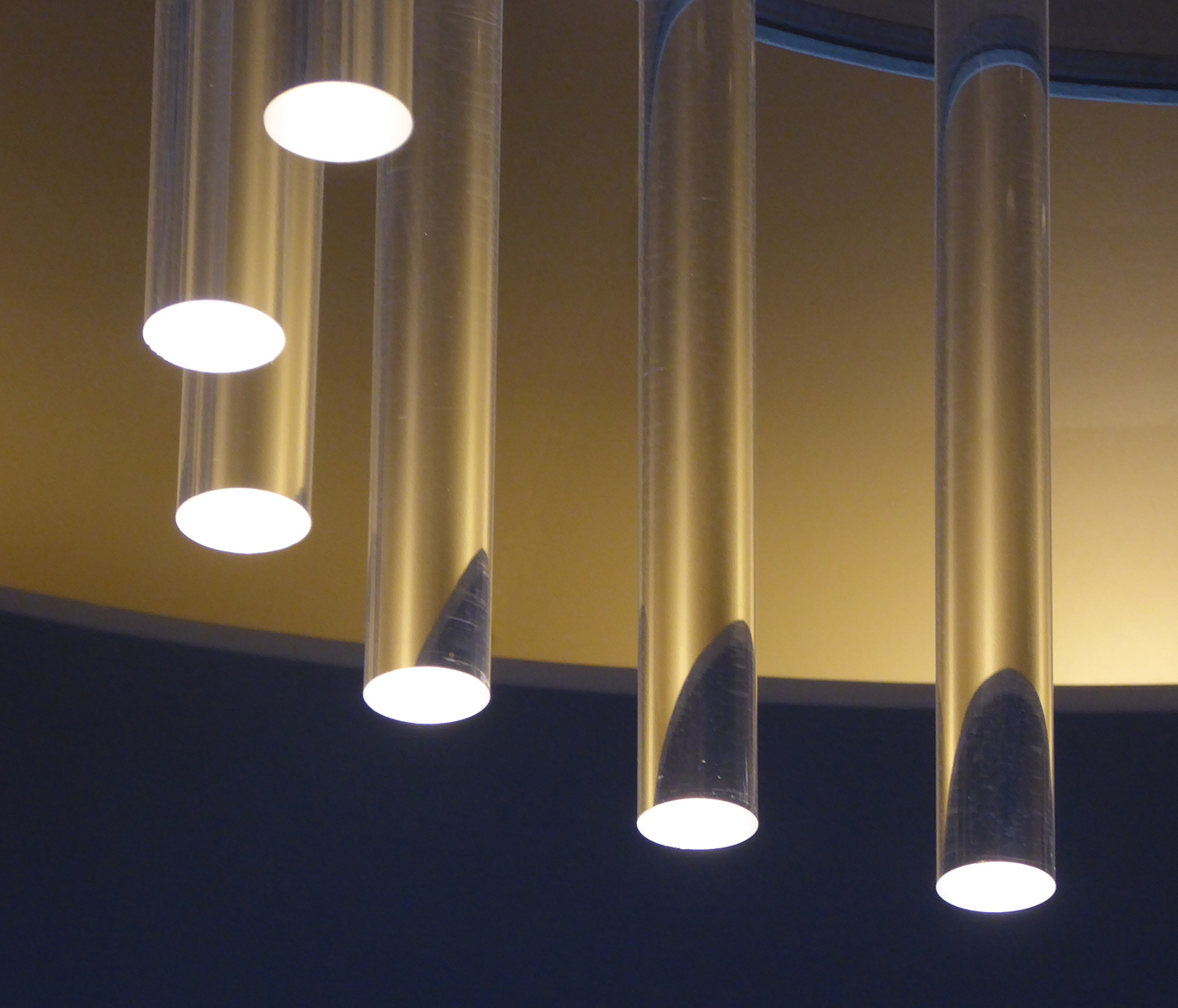
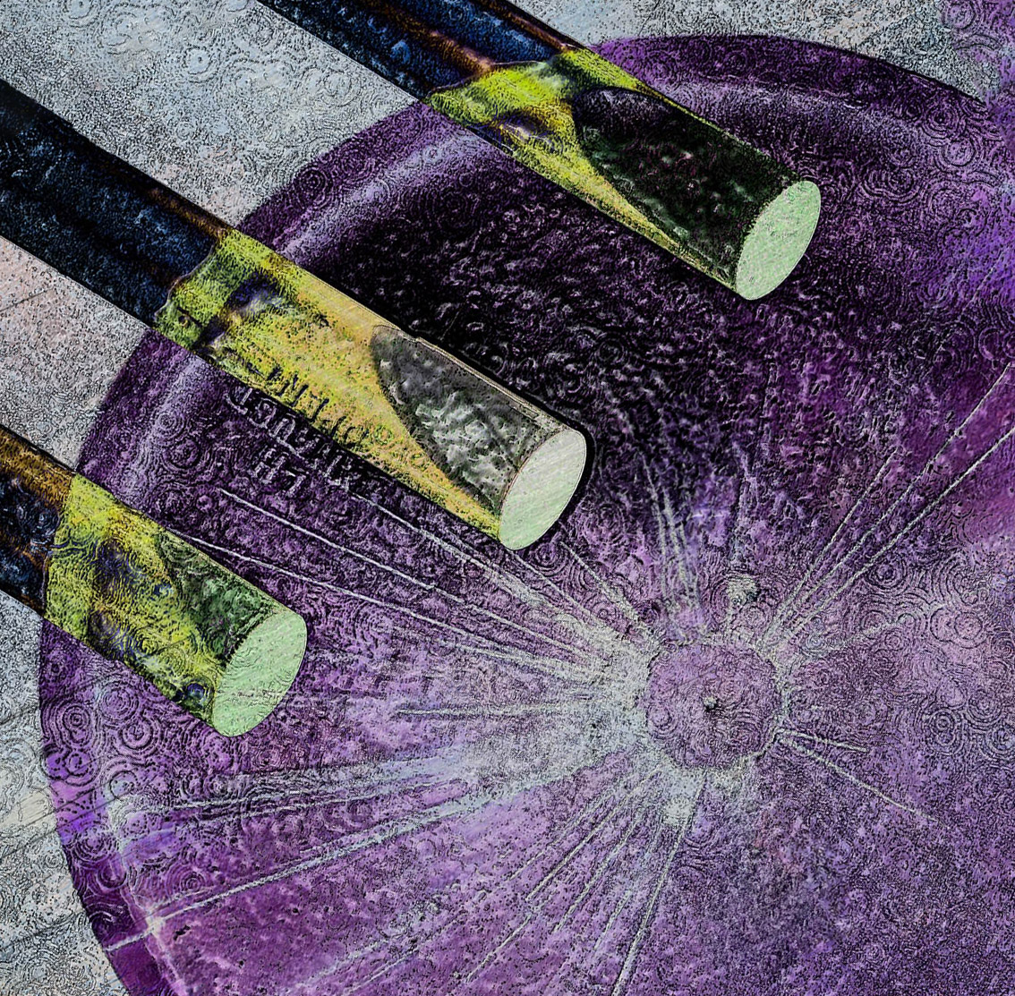
Just a simple abstract constructed of multiple layers. I started with the sky image as a background and then stacked the other images on top. It was a matter of trial and error to find the Blend Modes and layer order that appealed to me the most. The experimentation process never ceases to be fun to me to watch how the image changes with each step. After I had that done, I added PS filters Plastic Wrap and Ink Outlines to give it a little more punch. Then into On1 for scratched metal and vignette filters.
2 comments posted
I find Abstracts very hard to critique. After the first impression of the overall image, I generally notice where and how my eyes travel through the picture - is there a logical path - ie a specific colour or shading or composition that guides my eyes. If there is not, is there anything else in the image that my eyes keep getting drawn to. Finally I ask myself what overall impact has this picture made on me.
In this image, my eyes land on the rods, but have no clue where the next logical point of interest is. Or what the relationship of the rods and rounds is. Sorry, hard to explain, but the picture is not impactful for me. The appeal of Abstracts is so very subjective.
I played with it a bit - simplified it and turned it's on its side, but still does not grab me. Posted: 11/11/2024 01:20:21
I completely agree with you about abstracts being very subjective and hard to critique. I used these images because I liked the juxtaposition of circles and straight lines throughout. In my mind the main point of interest is where the oval of the center rod almost meets the dark circle on the wheel and creates tension. Your aim was to simplify the image, but to me you took out the most dynamic part. But again, very subjective. Posted: 11/15/2024 20:40:33
