Mike Cowdrey, MPSA
About the Image(s)
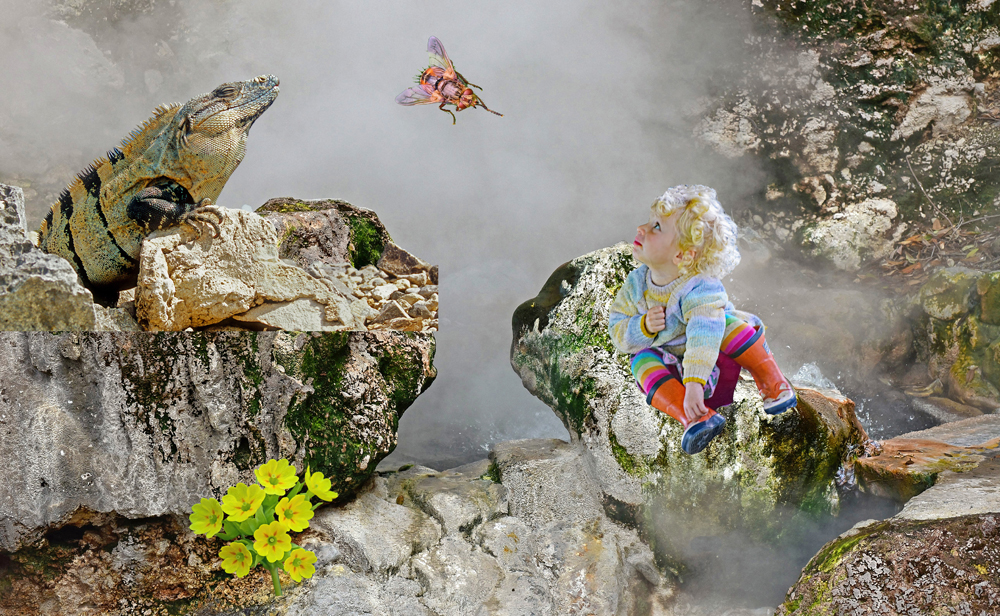
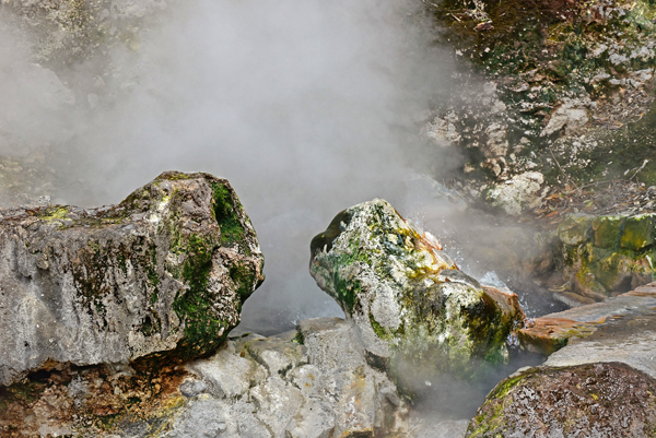
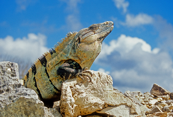
The background was taken at a hot spring in the Azores some years ago. The iguana was from Mexico awhile back. Shots taken this October were my granddaughter Grace, the hoverfly, and the yellow flowers. All the additions were cut and pasted into Original 1. The giant hoverfly was added at the last moment to take it's attention away from Grace!
I have apologised to Jan for stealing the picture idea from her October contribution!
2 comments posted
Holy Jurassic Park! Very nicely done - and I do hope the Iguana takes care of that nasty fly, or maybe the fly is just adoring little Grace. Nice job of compositing. Posted: 11/11/2024 01:25:09
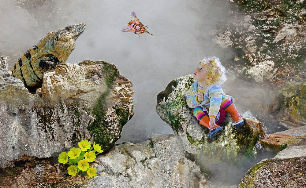
What a fun image Mike. Your sense of fantasy is on full display here. I did notice that where the rock in original 1 meets the rock in original 2, there is a very sharp horizontal line that needs blending or softening; and the outer edge of the rock right below the fly has been cut off vertically, so as to look unnatural. I would also suggest taking out the stem of the flowers so they look more like they're growing out of the crevice in the rock rather than pasted on. Grace could also use a little shadowing beneath her to ground her on the rock. This all sounds very critical, which I do apologize for, because this is a really great image and I really like it. The main reason I bring these issues up is because I have learned after suffering through many harsh comments from judges, that in order for a composite to be believable and sellable (even though it might obviously not be real) it needs to incorporate basic laws of nature like shadows so that it doesn't feel off to the viewer. I've done a very quick edit that's far from perfect -- it's much easier to work with the layers before the image is flattened -- but at least you can see what I'm getting at. Posted: 11/15/2024 21:54:12


