Judy Burr, APSA, MPSA
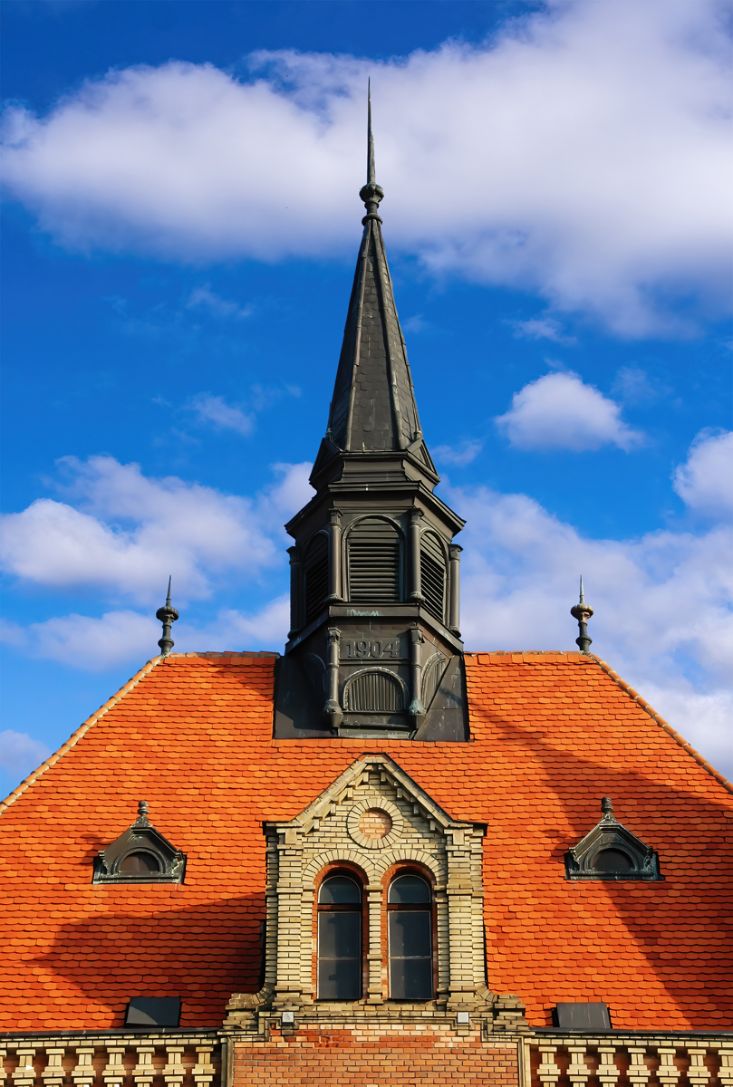
November 2026 - Bratislava Tower
About the Image(s)
Another ancient photo taken in Slovakia with a Nikon D70S and 18-200 mm lens at 105mm. SS was 1/250. aperture f 8 and ISO 200. I processed it in Elements, NIK and Topaz.
14 comments posted
Judy,
I'm taking a bit more time with this review because your capture is Impressive, with a capital I! This is, in my opinion, a professional-level capture. Architectural symmetry is far, far more difficult to capture than it might appear. And what I've discovered over time is that the human eye is extraordinarily sensitive to even the slightest imbalance.
And that's precisely why I'm so impressed with how well you handled this image. The centered steeple, matching roof ornaments, dormers, and twin windows create a wonderful sense of architectural harmony. Even the triangular brickwork echoes the shape of the steeple. Add the striking contrast between the orange roof and blue sky, and you have a photograph with both impact and visual interest. Great eye and terrific execution!
Symmetry is one of those rare compositional techniques where the closer you get to perfection, the more noticeable any remaining imperfections become. Creating perfect symmetry on a computer is easy. Capturing it in a real building, constructed by human hands more than a century ago, is another matter entirely. Between the building's own irregularities, perspective, and precise camera positioning, getting this close is an extraordinary accomplishment. In my opinion, this is the kind of architectural capture you might see once in a hundred attempts!
In my VF, I made a very slight crop down and in from the upper left to fine-tune the symmetry. I also opened the shadows, particularly in the steeple, to reveal more of the architectural detail that was somewhat hidden in the darker areas. My only other thought concerns the bottom of the frame, where the building seems to end a little abruptly. I would have loved to see just a bit more of that beautiful brickwork to give the composition a more finished appearance. But these are small considerations in what I regard as a stunning architectural photograph.
You've recognized something special in this architecture and captured it with remarkable precision. And I hope you'll take my suggestions in the spirit intended, because when the only improvements I can offer are refinements this minor, it's a pretty good indication of just how much you've gotten right.
Kudos, kudos, kudos! If I'm judging, this gets a 10 on a 10-point scale. Posted: 11/07/2026 22:34:36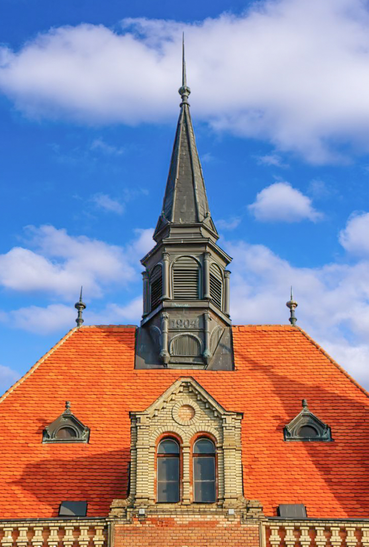
I'm taking a bit more time with this review because your capture is Impressive, with a capital I! This is, in my opinion, a professional-level capture. Architectural symmetry is far, far more difficult to capture than it might appear. And what I've discovered over time is that the human eye is extraordinarily sensitive to even the slightest imbalance.
And that's precisely why I'm so impressed with how well you handled this image. The centered steeple, matching roof ornaments, dormers, and twin windows create a wonderful sense of architectural harmony. Even the triangular brickwork echoes the shape of the steeple. Add the striking contrast between the orange roof and blue sky, and you have a photograph with both impact and visual interest. Great eye and terrific execution!
Symmetry is one of those rare compositional techniques where the closer you get to perfection, the more noticeable any remaining imperfections become. Creating perfect symmetry on a computer is easy. Capturing it in a real building, constructed by human hands more than a century ago, is another matter entirely. Between the building's own irregularities, perspective, and precise camera positioning, getting this close is an extraordinary accomplishment. In my opinion, this is the kind of architectural capture you might see once in a hundred attempts!
In my VF, I made a very slight crop down and in from the upper left to fine-tune the symmetry. I also opened the shadows, particularly in the steeple, to reveal more of the architectural detail that was somewhat hidden in the darker areas. My only other thought concerns the bottom of the frame, where the building seems to end a little abruptly. I would have loved to see just a bit more of that beautiful brickwork to give the composition a more finished appearance. But these are small considerations in what I regard as a stunning architectural photograph.
You've recognized something special in this architecture and captured it with remarkable precision. And I hope you'll take my suggestions in the spirit intended, because when the only improvements I can offer are refinements this minor, it's a pretty good indication of just how much you've gotten right.
Kudos, kudos, kudos! If I'm judging, this gets a 10 on a 10-point scale. Posted: 11/07/2026 22:34:36
Butch, I really appreciate Your kind comments. I hate to admit I don't know what VF is, but then I am not as advanced as you are:-). Posted: 11/13/2026 22:38:04
Visual Feedback :-) - and this is a tremendous image for a lot of reasons Posted: 11/13/2026 22:43:33
Hi Judy, I like your image the way it was presented. Very sharp details with vibrant colors. Love the contrasting colors of orange and blue. With Butch's edits, I feel you loose the vibrant colors. Posted: 11/08/2026 13:10:59
Thanks Kathy - I never touched the colors, I wouldn't dare! :-) It must have s something to do with the calibration of screens because there's no difference on my screen - so I just learned something. And if you wouldn't mind, would you post the image I'd like to see it from your computer - thanks again. Posted: 11/09/2026 20:13:34
Hi everyone, monitors, whether calibrated or not, can display colors differently depending on the manufacturer, display settings, and graphics adapters. Therefore, it is not advisable to make comments or provide feedback based solely on color differences observed in uploaded files, as these differences may not accurately represent the original colors.
Posted: 11/09/2026 23:34:58
Posted: 11/09/2026 23:34:58
Kathy, Thanks for your comments about the color. Posted: 11/13/2026 22:38:48
The contrasting orange and blue are what immediately caught my eye. The symmetrical composition is so pleasing and the details are so nice and sharp. This is such a wonderful photo. Posted: 11/08/2026 18:20:30
Maryellen, Thanks for your kind comments. Posted: 11/13/2026 22:40:52
Hi Judy, What a terrific Travel image. The color palette is perfect and the symmetry is close, as Butch noted, and since judging varies it may not matter. It is sharp and the composition is terrific. I hope it placed well in competitions. If I had more PS skills I would remove the shadow on the roof from a nearby church. Then I would hang it on the wall, but as a travel image that might not be allowed. Posted: 11/10/2026 16:25:29
Bob,
I haven't tried this in competition, but I will now:-). For travel, I could not remove the shadow and wouldn't know how to anyway! Posted: 11/13/2026 22:42:03
I haven't tried this in competition, but I will now:-). For travel, I could not remove the shadow and wouldn't know how to anyway! Posted: 11/13/2026 22:42:03
I'm glad to hear you're not finished competing yet! Dorinda hasn't submitted anything in quite a while, and I've found myself getting more interested in compositing than simply editing photographs. Your images are always so sharp and beautifully composed that they really don't need much editing. You have a wonderful eye for getting things right in camera.
Posted: 11/13/2026 23:37:37
Posted: 11/13/2026 23:37:37
Hi Judy, great image as the others have already said. Butch's minor crop helps but I don't feel it is necessary. Personally, I sort of like the shadow on the roof. Posted: 11/14/2026 01:01:51
Hey Judy, I really love this photo with the bright colors and especially the contrast of the blue and orange. I also love the symmetry in the tower and its windows! Posted: 11/16/2026 23:56:20