Bob Legg

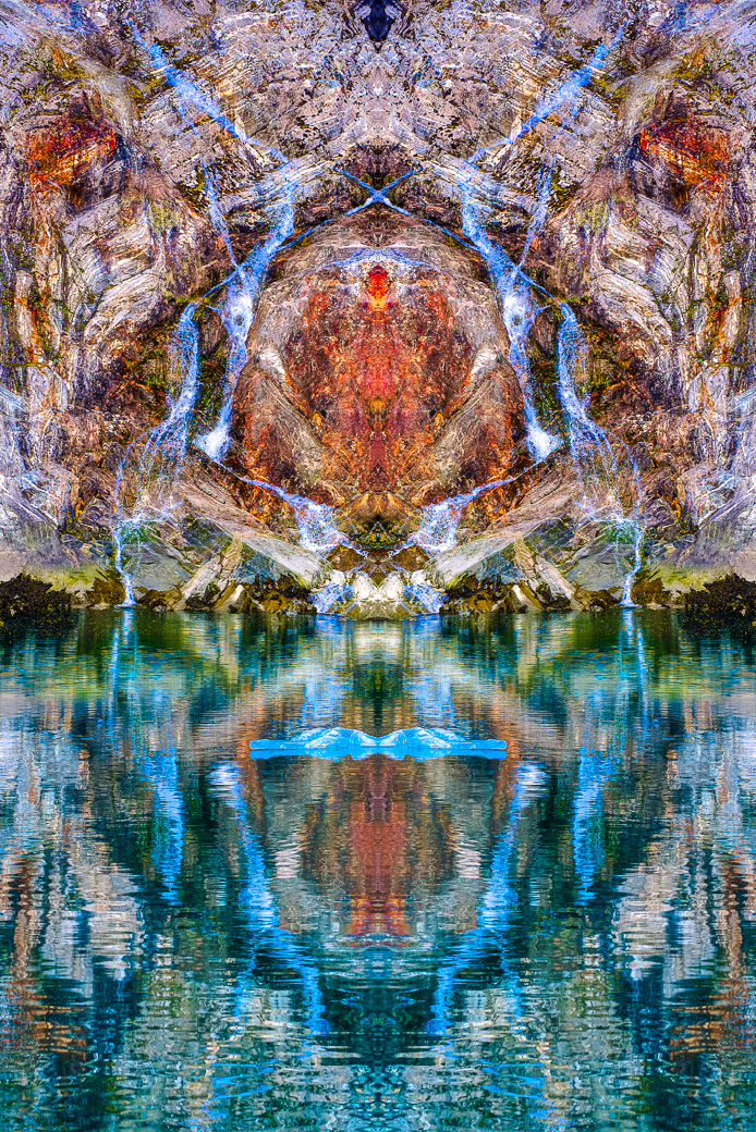
July 2025 - Reflected Beauty #531
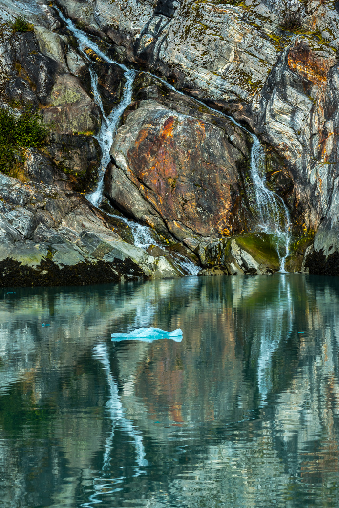
Original
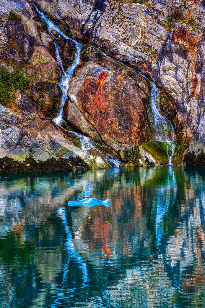
Enhanced Original
About the Image(s)
This image was taken just about 7 years ago in Alaska from a slow-moving ferry boat from our cruise ship. The image was taken at ISO 400, 1/1500 sec @F6.7, 200mm on my 28-300 Nikon lens. It was only a small water feature. Bright overcast was helpful to the idea of a reflection. Many features of this scene interested me: Like the small blue iceberg, the reflections in the water, the patterns of the water running down the cliffside and the awesome colors in the rock face. Too much to pass up. I believe it was in Tracy’s Arm Fjord area. It’s taken me a few years to use newer masks in Lightroom classic, the improvements of sharpening in Topaz Photo And most important the idea of making a mirror image of the edited image. Sometimes you just have to wait for the fruit to ripen. The devil is in the details.
17 comments posted
Posted: 07/10/2025 22:24:49
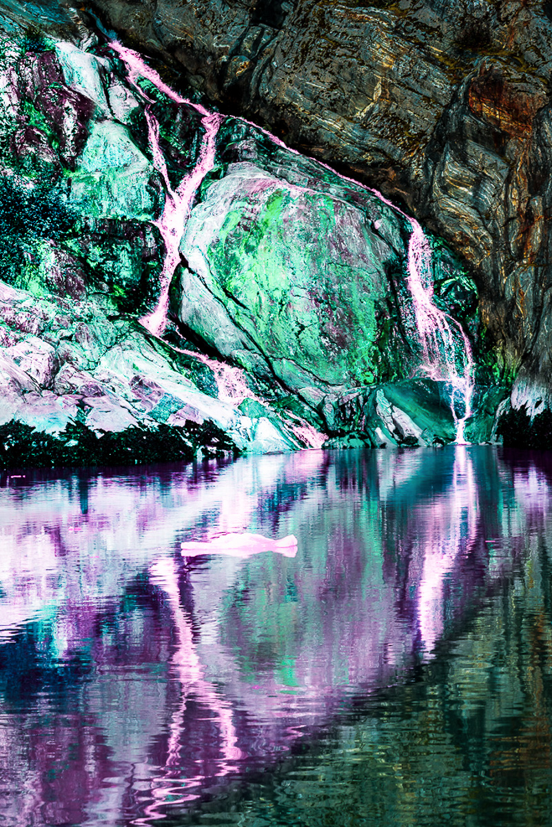
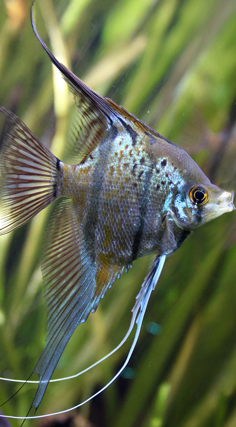
I cropped from the left to start the fish to help define it. Had I just used the image as is, I see a freshwater Angel fish defined by the waterfall rivulets. If left alone the rivulets would make it a fancy Angel. It seems that either my seizures or medicines now cause me to see things inside other things. You can call me Mad Bob!
The fish is half in green above the water and reflected in purple in the water. I just tried a linear gradient to highlight the fish I see, along with sharpening and some clarity. The colors weren't meant to do anything but add definition to the fish. I darkened and blurred the rest of the stone and its reflection
The fish starts on the entire left frame, decreasing diagonally to a small white toothy mouth. The eye in green above and just behind the mouth. The dark stone and reflection become the opposing triangles. The whites are too bright for my taste and probably detract from a decent fish image, but I don't mean to create a finished product.
Hopefully this is a better description of my comment. I guess dialogue is a better way of commenting than one and done. I struggle to not read things into written words using my own developed bias, education and experiences. Talking is my preferred communication method, as I am able to clarify my thoughts easier. Posted: 07/11/2025 13:28:24
How many layers did you end up using? Posted: 07/11/2025 19:36:59
Sorry, I don't see your fish in my photo. I do see your lovely angel fish. BTW, you should have used extended margins so the poor guy could eat or kiss you. :-)
Here's my finished image. Posted: 07/17/2025 22:13:35
BTW, you are off to a fantastic start with your image and point on comments. Posted: 07/17/2025 22:20:17