Bob Legg

March 2025 - Big Foot
About the Image(s)
“Big Foot” was taken at the outflow of a bog area and I was taken by the design nature had made. Just basic editing and removal of junk that had gotten stuck. My meta data was iso 1600 (gray day) 300 mm, f6.3 and 1/800 sec with no tripod.
This round’s discussion is now closed!
10 comments posted
(Group 18)
I like this nature shot quite a bit - you captured the intricate shapes and tones of the ice really well. The composition is also quite strong as there is a natural flow for the eyes to follow. In my version attached, I cropped it a bit, to highlight the ice. Posted: 03/08/2025 12:20:14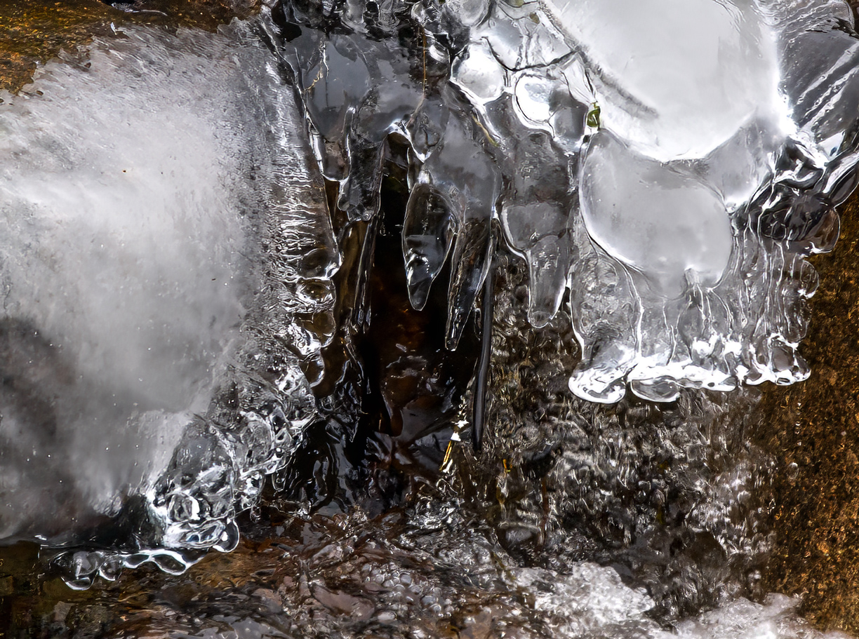
Thanks for your idea and cropping of the image. Posted: 03/09/2025 13:40:50
I love ice pictures, but I think this is just too busy. What do you think of this? Posted: 03/11/2025 13:52:44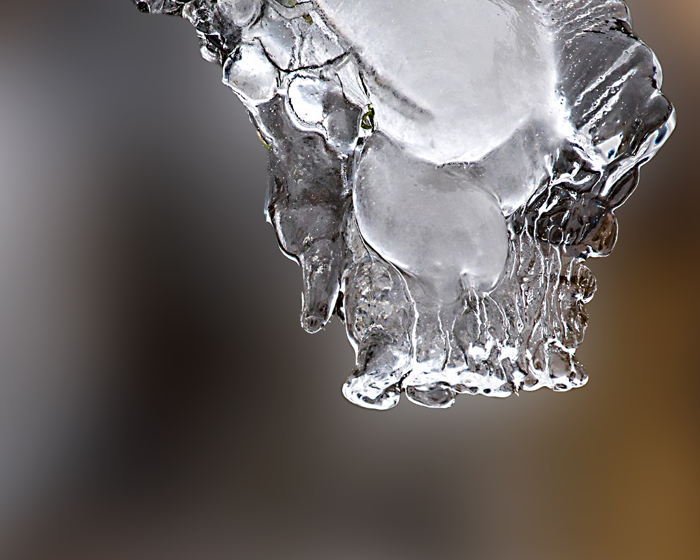
Hi Bob, back for more!
Your image makes me cold, which is a tribute. It is sharp and well exposed. I do agree with Karen that it is busy, and I think a B&W conversion helps. The brown doesn't add anything to the subject. I converted it in LR and added some High Key radial gradients to areas that I thought were interesting to me. I didn't leave the black twig(?) black, but that was just my choice. Fun image to play with. Posted: 03/13/2025 13:49:16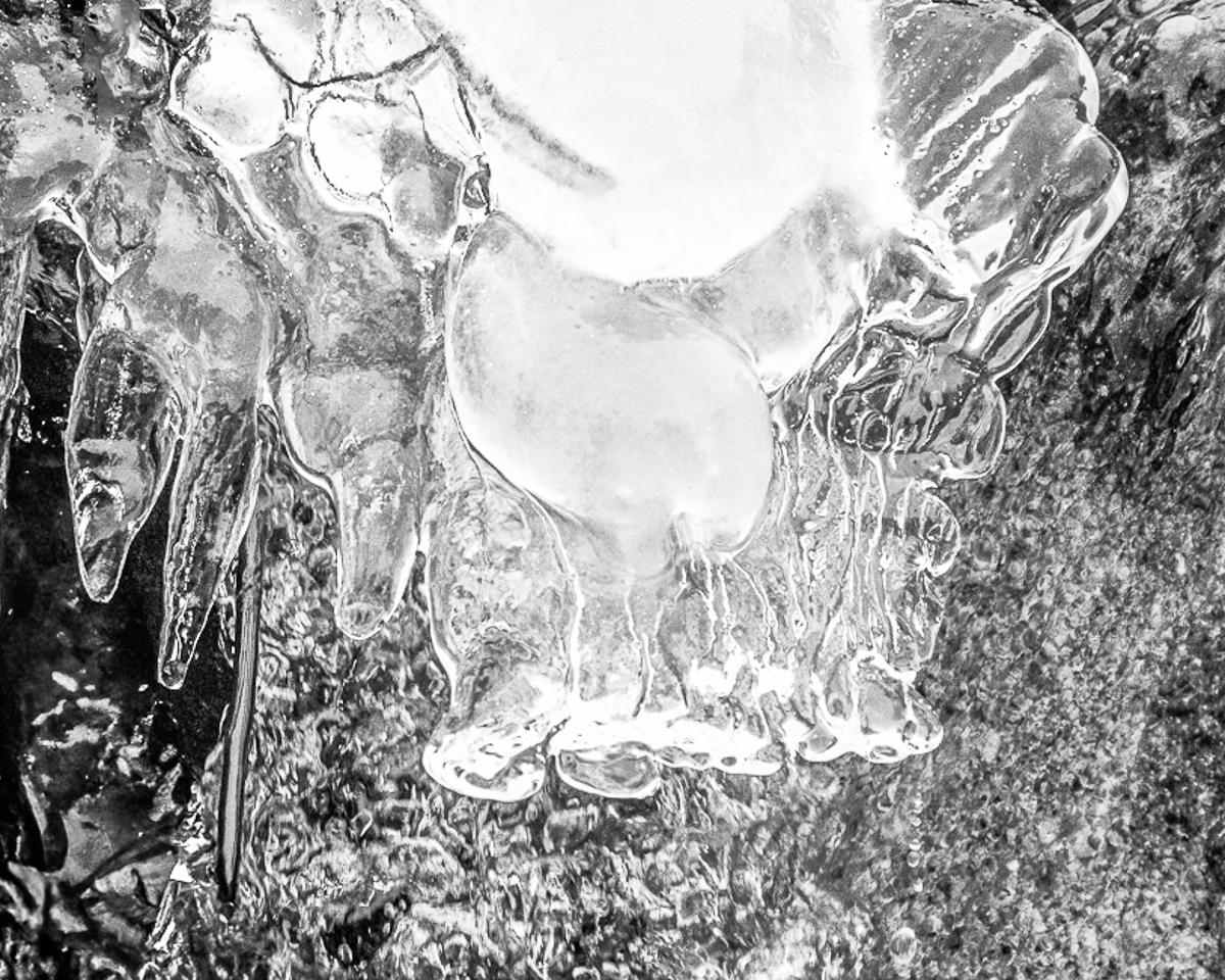
Your image makes me cold, which is a tribute. It is sharp and well exposed. I do agree with Karen that it is busy, and I think a B&W conversion helps. The brown doesn't add anything to the subject. I converted it in LR and added some High Key radial gradients to areas that I thought were interesting to me. I didn't leave the black twig(?) black, but that was just my choice. Fun image to play with. Posted: 03/13/2025 13:49:16
Thanks for all the praise and suggestions. I find Karen's background to be the best looking. It brings out the textures and tones in the subject area of the ice. Bob W , I'm not "warming" up to your edits here. I believe that the reduced dark tones and definition of the subject "Big Foot" is difficult to see. My intent was to show the work that Nature makes with ice and your edits do that but with a faster shutter speed. Now we wait for Judy to come in and make creative stairs of it. :) Posted: 03/13/2025 16:48:31
Hi Bob, Yep really get the big foot allusion.
I like the natural presentation, I di find the ornagey blob in the bottom left corner a little distracting and would consider getting rid of that other than that I would leave it natural.
other than that I really like Karen's version for its bold simplicity. Posted: 03/19/2025 06:30:50
I like the natural presentation, I di find the ornagey blob in the bottom left corner a little distracting and would consider getting rid of that other than that I would leave it natural.
other than that I really like Karen's version for its bold simplicity. Posted: 03/19/2025 06:30:50
Good seeing. Bob. You gave me a challenge, so I had to play.
I like Karen's version and I agree that the stone is a bit too dominate. It could work well as a monochrome, but different from Bob's version. I added a texture and a twirl, just for fun. I couldn't figure out how to make steps out of it:-). Posted: 03/19/2025 16:55:57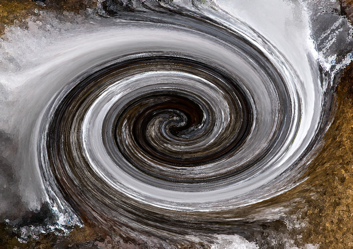
I like Karen's version and I agree that the stone is a bit too dominate. It could work well as a monochrome, but different from Bob's version. I added a texture and a twirl, just for fun. I couldn't figure out how to make steps out of it:-). Posted: 03/19/2025 16:55:57
Thank you Judy. How fitting as my twirls are almost as frequent as your stair creatives. You did an excellent job with the twirl but you lose points on originality.
?
Posted: 03/21/2025 01:46:52
?
Posted: 03/21/2025 01:46:52
Elaine Miller
I like the ice. I agree with Karen that it's a bit busy. I did a quick edit leaving both pieces of ice. Posted: 03/25/2025 15:28:59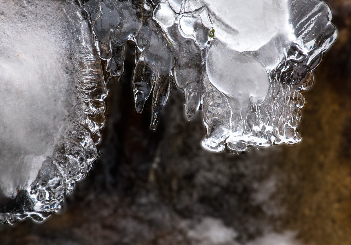
Thanks Elaine. Well we did get a variety of ideas and edits. Your edits are on the popular side to limit the details/distractions behind the ice. Posted: 03/25/2025 15:58:37