Bollin Millner
September 2023 - Formal Entry: Floyd Ave
About the Image(s)
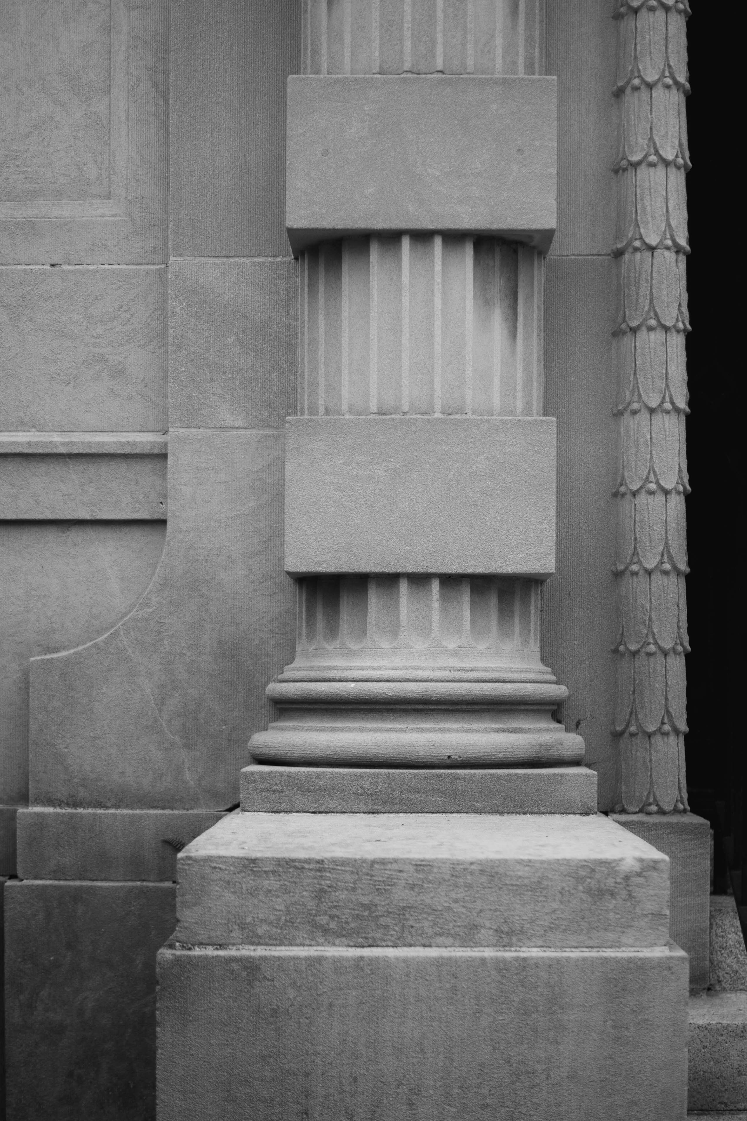
Taken down the street from my home in Richmond, Va. 50mm, f1.8, 1/1000
I should have added that I decided to just take pictures with my 50mm prime lens for a while...limit my choices and making me use my body more to frame shots. It was an interesting exercise. I had to let go of it for a while...suffering from COVID for over two weeks...but now I am back out there. This time I am using a 30mm lens which has the added plus of being a macro lens.
This round’s discussion is now closed!
9 comments posted
I really like the texture and detail of this image, as well as the many shades of grey from nearly white to black. I do find the right-hand edge blends into the black background of the site. I tried a thin stroke to separate it, as well as trying to desaturate the strip at the edge. Seems I can't attach two images at the same time, so here's the one with the desaturation, and I'll send the one with the desaturation next to see how they look. Posted: 09/09/2023 20:35:06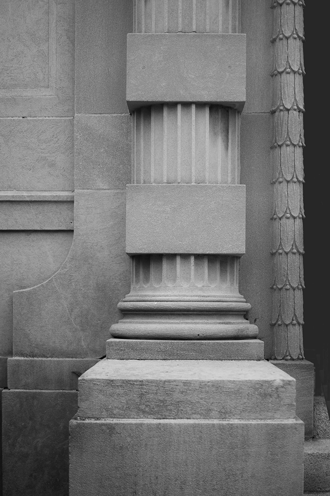
Here's the other image with the stroke. Turns out the only way to view them on the black background is to open them in a new window. In any case, I'm not sure either is really "better".
Posted: 09/09/2023 20:37:11
Posted: 09/09/2023 20:37:11
Can you say a bit more about what you did? You wanted to desaturate the black on the right? I think I see that in the first photo you posted. I am not sure what you mean by "a think stroke to separate" and would love to learn what it means and what you have done. Thanks so much for engaging the imag
e.
Posted: 09/10/2023 17:29:29
e.
Posted: 09/10/2023 17:29:29
Nice image Bollin - lovely textures. I agree with Audrey that a thin stroke around the image will help to contain it when on a black background. For my taste I would look at having a little more brightness in the image - i.e. a slightly bigger tonal range. Posted: 09/11/2023 02:52:24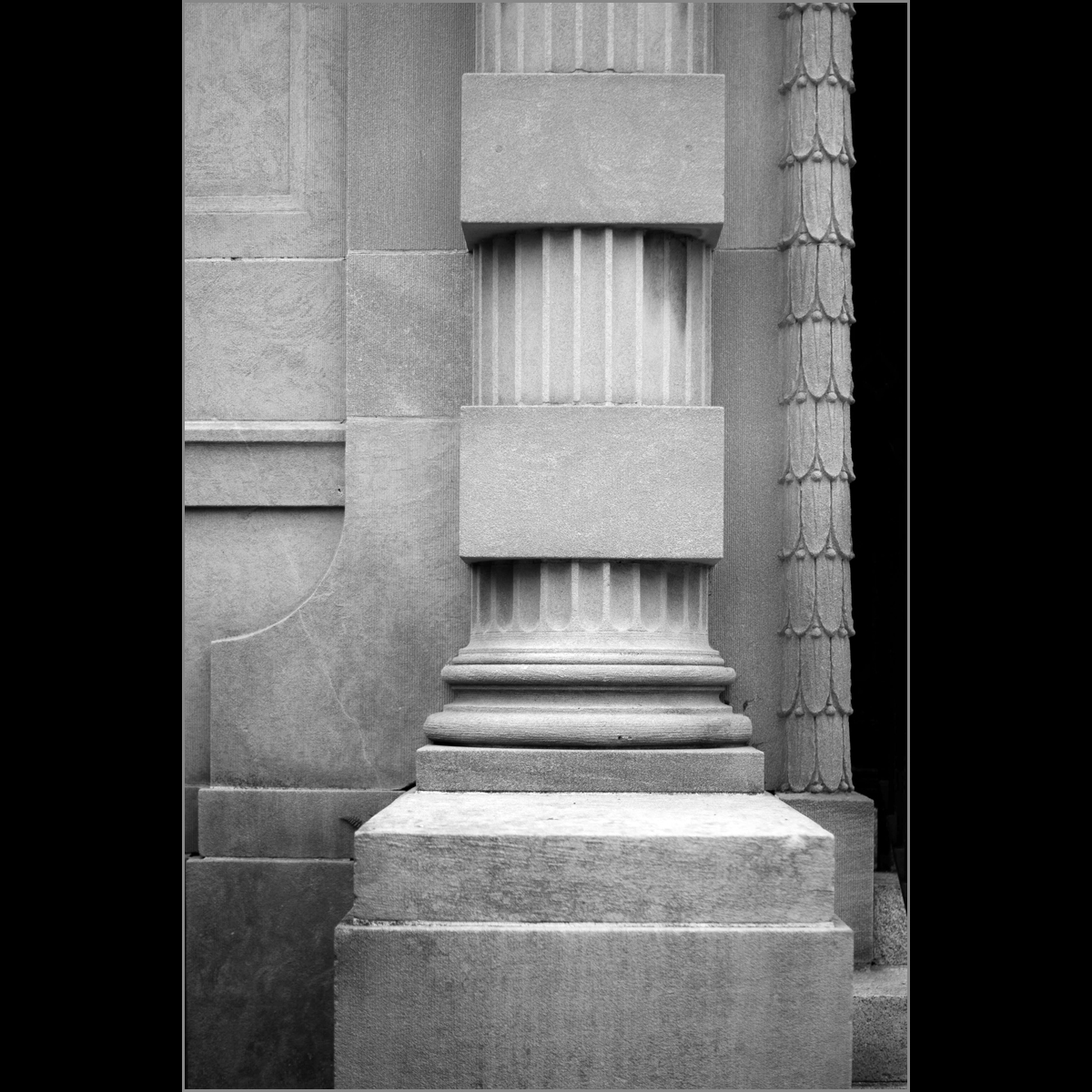
I definitely agree with Brian's idea of increasing the tonal range. And Thanks Brian for finding a way to illustrate the changes by including some black "background" - I was at a loss how to show the thin stroke, because with the gray background of the reply section, subtle changes are lost.
Another tip is that if you command (or control) click on any image in any reply, it opens in a separate window with the normal (black) background, which allows you to view the amended image full size and compare it with the maker's original. Posted: 09/11/2023 07:58:57
Another tip is that if you command (or control) click on any image in any reply, it opens in a separate window with the normal (black) background, which allows you to view the amended image full size and compare it with the maker's original. Posted: 09/11/2023 07:58:57
How do you put that frame around it. Always wondered. I like it. And I like it a bit brighter. Thanks for the great ideas everyone.
Posted: 09/11/2023 10:27:44
Posted: 09/11/2023 10:27:44
Here's the method I use: In Photoshop it's called a stroke. It will not work on the background, but if you create a new layer, you can then go to Edit>Stroke which will bring up a box where you can choose the width of the frame, the color, and whether you want it inside (works best for this purpose). Our group member Ruth also uses this feature a lot, so she might have advice on how she accomplishes it. Posted: 09/11/2023 12:14:12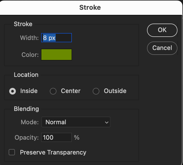
Hi, I use APS-CS6 this treatment gives an "ending" to the image as the picture is shown on a black B/G. 1.Select>All: Go to Edit>Stroke; Pop-up box will give Width and color. (Also gives location, Blending>modes and Opacity).
2. Also you can use any of the Marquee tools to make a double frame. Use any Marquee tool to select any part of the image then go to step #1. then repeat #1 selecting all to get the outside of image. Posted: 09/22/2023 07:25:25
2. Also you can use any of the Marquee tools to make a double frame. Use any Marquee tool to select any part of the image then go to step #1. then repeat #1 selecting all to get the outside of image. Posted: 09/22/2023 07:25:25
This is an interesting project you have assigned yourself. The composition is good with the repeating squares and round columns. As commented by others the tonal range can be expanded and depending on the background a stroke would help. If you are going to enter into a competition, I would suggest you check the edges. On the top the tips of the petals which make up the right column attract the eye, and the little bit of a step in the right bottom corner distracts. If it is not for competition, I would not worry about it. Posted: 09/20/2023 15:45:27