Audrey Waitkus  


Water: More or Less by Audrey Waitkus

July 2026 - Water: More or Less
July 2026 - Audrey Waitkus

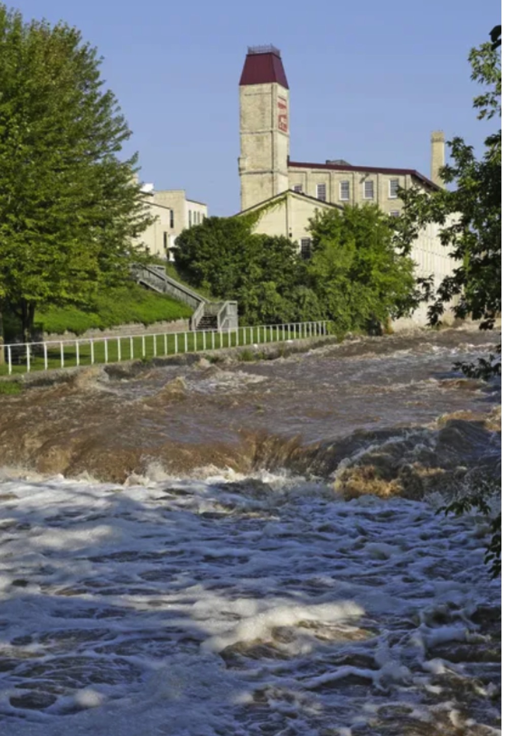
Normal Water Level

About the Image(s)

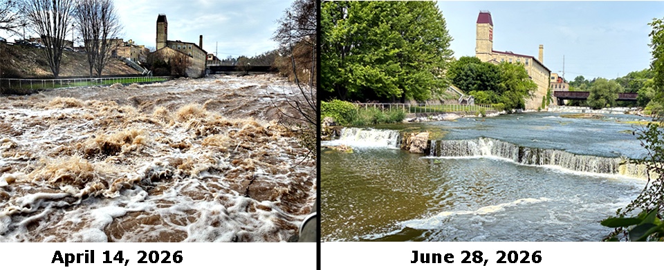
We've had a great variety of weather around here this year. One of the most striking contrasts began in April when the rain came down (and came down . . .) resulting in flooding and some spectacular river scenes. This was followed by a shortage of precipitation through May and June leading to near-drought conditions and abnormally low river flows. These photos are taken of the same falls (allowing for differences in time of day and exact position). A more normal view is shown in the thumbnail from our local newspaper (Credit: Gary C. Klein/USA TODAY NETWORK).

The photos were taken with the iPhone and were taken into Photoshop where I tried to balance the lighting and positioning of the subject for comparison. After cropping and adjusting lighting, I re-learned a lot of PS technique: masking, adding text, and creating the "collage" of the two photos. I finally saved the whole as a jpeg and added the divider.


5 comments posted


Bollin Millner   Bollin Millner
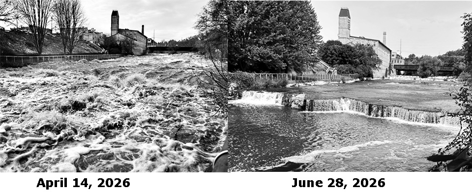
A compelling collage. I wonder what they would look like in black and white. Maybe I will play with that.   Posted: 07/07/2026 13:14:35
Audrey Waitkus   Audrey Waitkus
Interesting question. It might actually pinpoint the contrast in water flow by taking out the more obvious seasonal and lighting changes.   Posted: 07/07/2026 14:00:53
Audrey Waitkus   Audrey Waitkus
Couldn't resist trying the black and white. I have no skill at that sort of thing, so I just went to Photoshop and clicked on the basic preset for black and white. Lots of things I'd improve (like balancing the lighting on the building, etc) but you are absolutely right: the black and white version really really brings out the point of the story. Thanks for the tip.   Posted: 07/07/2026 18:08:37
Comment Image
Bollin Millner   Bollin Millner
I think B&W is the right choice. A friend of mine (and retired professional photographer) asks me about changing to black and white with a lot of my images. She thinks that if the color is not the point that often black and white conveys the idea better. She is usually right.   Posted: 07/12/2026 14:28:56


Jeremy Martin   Jeremy Martin
That first image looks dangerous! We have experienced the same thing in western NY this year. My pond was overflowing all spring and now is down about a foot from normal. The poor farmers! I'm not sure if you can slow the shutter speed with an iphone, but the right picture would look fantastic with motion blur from the water.   Posted: 07/10/2026 12:28:21


Please log in to post a comment