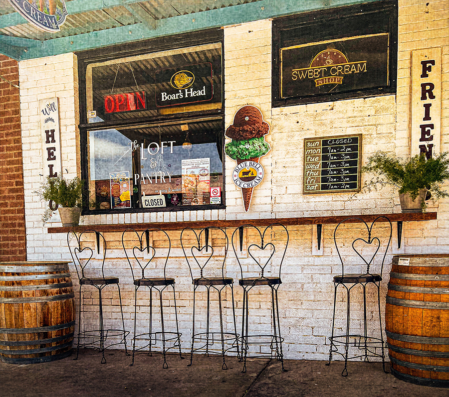
We were sitting in a barbecue joint in Florence, Arizona on a warm Sunday afternoon in April having lunch. I glanced across the busy street and noticed an ice cream shop but somehow it seemed out of place. It was a bright sunny day with pedestrians roaming by anxious for the cooling taste of chocolate mint ice cream. But, alas, none was to be had for the sign said "Closed!"
I took several angles of the shoppe finally settling on this one to take in a low right perspective with most of the barrels included. It got really busy on either side of them so I cut them off on purpose. After cropping and adjusting contrast and saturation I moved into Topaz Studio2 until I came up with the look I liked that gave some depth to the bricks and a little antiquing.
This round’s discussion is now closed! 5 comments posted
Mike Patterson
Excellent post-processing work. I especially like how you warmed up the scene and added some extra texture. The lower perspective also enhanced the viewpoint. Interesting elements throughout the image -- the stools, signs, etc. Too bad it was Sunday. The little chalkboard said that was the only day of the week that it was closed. Posted: 07/02/2024 12:00:27
Peggy Reeder
Nice work Al. It's a very pleasant image to look at. Might be good in some of their print advertising. I like that you were able to crop out much of the sidewalk, and also think that the texture from Topaz was a very good choice. Posted: 07/05/2024 15:20:37
Joseph J Zaia
My what a difference from the original. You surely brought this image to life. I love the crispness you created and the color tones are just right. My only suggestion is to possibly and if you want to, to eliminate the "cream" sign at the top left. Posted: 07/18/2024 15:05:56
Marti Buckely
As I was looking over the image, my eye went to that cream sign Joe mentions and I agree it might be better removed. The textured look works well on this image. Nice work. Posted: 07/19/2024 21:47:24
Jerry Biddlecom
Nice recovery from the original. Many different textures and contrasting shapes, as between the heavy barrels and the wiry look of the chairs. Funny little contradiction between having both an open and closed sign in the window. Maybe experiment with using various tools to 'straighten' up the left side of the image. Posted: 07/22/2024 12:11:19